science fiction... (Page 7)
for a complete alphabetical list of ALL reviews start here
A
- B - C - D
- E - F - G
- H - I - J
- K - L - M
- N - O - P
- Q - R - S
- T - U - V
- W - X - Y - Z
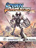 Seven
Samuroid 1984 (SC GN) 64 pages
Seven
Samuroid 1984 (SC GN) 64 pages
Written, illustrated, lettered by Frank Brunner.
Colours: Jan Brunner.
Additional notes: oversized, tabloid dimensions.
Rating: * * (out of 5)
Number of readings: 1
Published by Image International Publishing Corp.
Mildly recommended for mature readers.
The Seven Samurai/Magnificent Seven idea gets a hi-tech face lift in this graphic novel set in a galaxy spanning future. Millennia ago, robots with human minds were created to defend the defenseless, but eventually the robots became disillusioned and disappeared. Now on a planet being besieged by an evil warlord, a woman rebel uncovers one such Samuroid robot, who is reluctantly persuaded to join the fight for freedom, and he also sets out to recruit more of his long vanished comrades.
Written and drawn by Frank Brunner, this was a creator-owned property published by Image International -- no relation to the later comic book company. This was a branch of a New Zealand-based printing company that was, presumably, attempting to make forays into the comic book field. As a product, it's certainly well put together on glossy paper. As entertainment, it's O.K., but nothing more.
I'm not that familiar with Brunner's early work, such as his 1970s stuff on Dr. Strange that helped cement his reputation. Here, his style is a bit loose, and a bit rough, as though like a lot of artists as they progress through their careers, he was trying to open it up a bit, not being as rigid with his lines and details. It's certainly decent work, getting the job done (though there are a few panel arrangements that are confusing to read the first time through). But it's not exactly breathtaking, either, with neither the art, nor the composition, being that spectacular. It's the kind of art that is good -- don't get me wrong. But it works best in service of a strong story, but doesn't gloss over weaknesses in the script with awe-inspiring imagery.
And the story is only O.K., too.
There isn't anything that fresh here, which isn't unexpected, as the intentionally derivative title suggests. Brunner borrows plot ideas from The Seven Samurai, and a few sci-fi movies, with the central premise of a man's soul inside a metal body reminiscent of the comic book Rom, Spaceknight.
Brunner seems to have conceived of a much longer work that he, then, crams into 64 pages. There's a lot of exposition, a lot of telling us about things, rather than depicting them, or places where a couple of panels are bridged by a descriptive text caption. Handled right, it's a way a comic can cover a lot of ground, but here, there's just a sense we're more getting a synopsis, or an out line, of what should've been a larger work. Characterization likewise suffers. The main Samuroid, Ultek, is sweet on the woman who found him, but we kind of have to take his word for it, as it's another thing that is more referred to, rather than demonstrated. The story picks up most when Ultek discovers a space ship carnival where a couple of his embittered fellows are whiling away their years as exhibits. Ultek meets up with a quirky, misfit robot, Toto -- an "honourary" samuroid -- who probablyy displays the most personality of anyone, human or robot.
Brunner is best known as an artist, and his dialogue is largely workmanlike.
The history behind this is unclear. This was, apparently, one of the last things Brunner did in comics before moving on to other artisic ventures, and may well be the only thing he wrote on his own. So does that make this the culmination of Brunner's career, his dream project? Or was it just the last gasp of a talent getting bored with the whole medium? Did Brunner intend this to be his swan song...or did it just work out that way?
Certainly one can infer that Brunner was maybe intending to revist this reality, since there are things that are alluded to, but not followed up on in these pages. The story is self-contained, but cryptic references are made to "lost rune tapes" and a thread of robot rights/persecution is hinted at, but undeveloped. Or maybe Brunner was hoping to use this as a showcase for a marketing property -- after all, one can't help but notice the similarity to toys at the time, such as Rom, Shogun Warriors, and the Transformers. Though the occasional bit of "mature readers" material (violence, and one panel of a bare breast) makes it an unlikely commercial for kids toys. The back cover blurb acts as a kind of pre-amble, setting up the backstory for the book, and so should be read before you read the inside story.
Overall, the Seven Samuroid is a mild page turner rather than anything to get excited about. Because comics are so super-hero heavy, sometimes an SF (or whatever) story can be enjoyable just as a change of pace. In that sense, this graphic novel is O.K....but nothing more.
Sigil: The Marked Man 2002 (SC TPB) 208 pages
 Writers
Mark Waid, Barbara Kesel. Pencils by Scot Eaton, Kevin Sharpe, George Perez.
Inkers various.
Writers
Mark Waid, Barbara Kesel. Pencils by Scot Eaton, Kevin Sharpe, George Perez.
Inkers various.
Colours: Wil Quintana, Laura DePuy. Letters: Dave Lanphear, Troy Peteri.
Reprinting: Sigil #8-14, CrossGen Chronicles #4 (with covers)
Rating: * * 1/2 (out of 5)
Number of readings: 1
Published by CrossGen Comics
Sigil is a science fiction series set amidst a conflict between earth -- and related planets -- and a race of lizards, who not only are attacking humans, but who can literally evolve by eating higher lifeforms (meaning humans). The story concerns Samandahl Rey, a decommissioned earth soldier who finds himself inexplicably imbued with super powers thanks to a sigil branded into his chest, which makes him regarded as a bit of a random element by humans and saurians alike.
This second TPB collection follows on the heels of the first and has Rey and his misfit crew of three (including a hologram/ghost of his dead best friend) arriving on the home planet of the woman Zanniati -- whom they just rescued from her evil huusband, the sultan of a neutral world.
CrossGen is (well, was -- I don't think they existed more than a couple of years!) a relatively new comics company that has clearly staked out alternative territory to the superhero heavy DC and Marvel. Most of CrossGen's line involves fantasy or SF themes, and it's all attractively produced. A couple of other CrossGen TPBs I've read left me with the feeling that, though I moderately enjoyed them, the plotting seemed a bit thin. And The Marked Man is no exception. I hesitate to describe the plot in a synopsis, because I'm afraid I'd give too much away.
The book opens with a flashback story from CrossGen Chronicles (a comic I'm guessing is used to tell out-of-continuity tales about CrossGen's on going titles). It chronicles an early adventure of Rey and best buddy, Roiya Sintor (before she became a hologram), back when they were still in the army. It's basically aimed at the military SF/"Starship Troopers" crowd, as it covers the usual cliches (opening with a bar fight, then seguing into a tactical mission on the saurian world that turns into a running firefight). Despite my ambivalence toward that genre, it was briskly paced and O.K. (though Sam's personality doesn't gel with his personality in the body of the book).
Despite that beginning, the regular series seems not as much about "grunts-in-space", which should be good...but it's not really swashbuckling adventure either. The first few issues more concern the characters just standing around, chatting. When the action does kick in, it tends more to just be the big fight scenes that are too common these days (though a climactic scene where Sam must rescue a ship from destruction is moderately suspenseful). Yet despite the emphasis on talky bits, the story doesn't quite move up to being the complex saga of machinations and subterfuge it thinks it is. Zannitai has proof that the sultan is planning an alliance with the saurians, proof the sultan will do anything to get back. But, as mentioned earlier, though that's a plot...it's not quite a complex plot.
Much time is taken up with other stuff, such as character scenes, portraying the budding romances between Sam and Zanniati, and between the holographic Roiya and the enigmatic JeMerik Meer. Meer also possesses superpower and clearly knows more about Sam's power than Sam does and has set himself up as a kind of guardian angel. But all the stuff relating to the Sigil is meant to raise more questions than is answered here, as clearly Sam and his crew are caught up in the machinations of higher beings (and the comic, in ways that aren't addressed here, is presumably meant to have some connection to another CrossGen title, Mystic, a fantasy series about a woman with a similar sigil mark).
By focusing on the romantic aspect, one can admire the writers' intentions, attempting to create more than just a hit-'em'-tll-they-drop action saga. But though it's not ineffective, neither is it quite gripping stuff either. The relationships are less developed than they are simply stated. And the characters are, frankly, a little bland and unmemorable.
I also have a minor qualm with Sam's powers -- namely, they seem a touch too much. He's so powerful, there isn't a lot of suspense in the action scenes. And while addressing side points, the lack of ethnic diversity in Sigil seems a bit odd, particularly as sci-fi often promotes itself as racially progressive. It's not that there are no non-white principals -- it's that, other than in the George Perrez-drawn issue, there aren't even non-white people in the backgrounds!
The art engenders as much ambivalence as the writing. The flashback story is drawn by veteran George Perez is his meticulous, extremely detailed style and is pretty effective. Although Perez can almost be too detailed, filling his panels with so many lines and objects the key element can be lost in the clutter. The other artists are even more problematic. Both Kevin Sharpe and Scot Eaton are good artists with similar styles (Eaton is slightly more realistic, at least when drawing men's faces, though both tend to draw their women with a slightly gamine/Japanese manga flavour). But like with Perez, their art can be overwhelming with the detail, too the point where the images are just too busy. This is particularly significant in a series where, as noted, time is made for the human interaction of characters just talking. But those scenes seem cluttered, too, losing the intimacy. And everything has the same plasticy sheen: people, backgrounds, ships. And one planet looks much the same as another, one ship the same as another ship. What adds to the problem is the colouring, which can often tend toward shades of single colours for the background -- and darker colours, to boot. Or, conversely, bright colours that can actually be hard on the eyes. It means you have already busy panels, where it's all made even harder to focus on what you're seeing.
I know more and more readers who are starting to complain that when it comes to comic book art and detail...more isn't necessarily always better. There's a feeling that a lot of modern artists are better artists than they are storytellers.
Ultimately, I can't be too hard on Sigil: The Marked Man. Despite my criticisms, it was briskly-paced and there's nothing horribly wrong with it in writing or art. But it never really interested me. As an action-adventure, as a political thriller, or as a character story, it all was a bit bland.
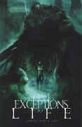
Silent Leaves: Exception to Life 2008 (SC GN) 160 pages
 Story
and art and letters by Christopher Shy, with Studio Ronin. .
Story
and art and letters by Christopher Shy, with Studio Ronin. .
Rating: * * 1/2 (out of 5)
Number of readings: 1
Additional notes: intro by novelist Michael Easton (scripter of Soul Stealer)
Suggested for mature readers
Published by DMF Comics
Silent Leaves: Exception to Life is a dreamlike science fiction story. And it's the second volume in a series -- though other than with the use of a sub-title ("Exception to Life"), it doesn't actually indicate that (ie: with a "Book Two" caption or something). Which is kind of important to know, because when you get to the end, it doesn't -- end, that is.
Artist Christopher Shy is probably better known for doing still, stand alone pictures of weird and dreamlike images, but has been branching out into the world of sequential storytelling.
Influenced a bit by "Dune", Silent Leaves is set in a desolate world populated by the remnants of various ancient factions -- including humans, who live in a walled city. But various characters become concerned that an ancient evil, the Prey, is on the verge of returning, threatening humans and others alike despite their mutual antipathy.
There are some potentially interesting ideas here -- unfortunately, in presenting them, Shy has a lot of trouble. Like a lot of would be SF/fantasy writers, Shy seems to have put too much thought into his world building...and too little into his story telling, or his characters. The first part of the book is deliberately meant to be vague and confusing, where you aren't really sure what's going on or why, as characters casually refer to things and beings where we aren't really sure who or what they're talking about. Then, the latter part of the book gives us (some) explanation, making some of the earlier conversations a bit clearer. But the result is a book that seems to consist mainly of a lot of talk and exposition...and not too much story to prop it up. There's a vague, dreaminess to a lot of it, as characters wander about, where the time span between scenes is often vague, or how certain scenes relate to each other is confused.
Not as confused as Shy's collaboration with writer Michael Easton on Soul Stealer, though. In fact what's frustrating about Silent Leaves is that it almost comes within touching distance of working.
In setting up the history, and the machinations, the different factions at odds with each other, there is some decent ideas. But these are simply the building blocks of a story -- it's like looking at the naked steel girders of a building, and the builder declaring it finished and fit for habitation.
The characters (what few characters there are) are vaguely presented, the "reality" of their reality almost non-existent. The story is mainly just set up -- which, when you get to the end of hundred and fifty pages, can feel like a rip off. And, as mentioned, the events can seem a bit disjointed and confused at times -- such as a later scene where the book's nominal heroine, Ian, goes off and has a big fight -- with who, why, or where, I have no idea.
Shy's imagery is part of the problem. On one hand, the painted (or photoshopped) imagery can be strangely hypnotic, surreal, and occasionally quite striking. On the other hand, it is frequently confused, failing to really tell the story through the imagery, with Shy recycling the same images, faces and figures over again, not as if it has some point, but simply because he had no other image to use. Heck -- Ian's hair goes from dark to fair part way through, and I don't know if that was symbolic of something, or just because Shy lost track of what she looked like. Which is easy to do, because another problem with the images is that in their vague, muddiness, it's often a bit hard to recognize characters from scene to scene. Or even with in a scene. And the conversations are often repetative and confusingly presented, where it's a bit hard to tell who's actually saying what.
At the end of the book are various appendixes, with maps, and a glossary of terms. On one hand, it shows what I said: Shy has obviously put thought into his world building. On the other hand, that's kind of what I mean about problems with his ability to convey information in the narrative. You shouldn't really get to the end of a hundred and fifty pages and still need text pages to make sense of what you just read, or where you get details of things that were never even hinted at in the story itself.
The problem with so much of modern storytelling -- from comics, to TV, to books even -- is that everyone wants the series, the franchise, the marketable product (the book even contains an ad selling statues of the heroine!). And the back issue shelves are full of unfinished sagas, left in limbo either because of poor sales forcing cancellation, or because the creators lost interest before completion (perhaps never having had a true vision of the climax to begin with). For all my criticisms, Silent Leaves has just enough interesting aspects that it might've struck me more favourably had it been complete. But what do you say about a work that has some okay ideas, but suffers from confused storytelling and presentation...and fails even to tell a story with an end, simply being one act in a vaguely promised longer work?
If Shy wants to convince readers to buy his later works, he kind of needs to convince us he can deliver with the work that's here.
Six from Sirius 1984/2005 (SC TPB) 120 pages
Written by Doug Moench. Illustrated and coloured by Paul Gulacy.
Letters: Gaspar Saladino.
Originally TPB released by Marvel/Epic; 2005 re-issue by Dynamite
Rating: * * (out of 5)
Reprinting: the four issue mini-series
Number of readings: 1
Originally TPB released by Marvel/Epic; 2005 re-issue by Dynamite
Reviewed: Aug 2017
Recommended for Mature Readers
I review the sequel mini-series here
Six from Sirius is one of innumerable collaborations over the years between writer Doug Moench and artist Paul Gulacy -- this time choosing as their milieu space opera. The Six of the title are a crack team of troubleshooters/commandos led by Jakosa Lone whose mission is to rescue an Ambassador crucial to negotiations between two hostile worlds. The catch is that she's being held by her own government. She believes it's for her own protection, but Six from Sirius' intel is that her government is seeking to sabotage their own negotiations.
After a jail break, and the Ambassador grudgingly realizing maybe her government had lied to her, we learn more of the back story (and warning: the comic can be quite verbose with conspicuous info dumps). Two worlds are at odds, with a moon inbetween that is inhabited by religious refugees from one of the worlds -- a moon that one world figures the other world has secretly been supporting and arming (as a loose analogy, think of the Cuban Missile Crisis, with two superpowers and the little country inbetween).
I had read the sequel mini-series to this some years ago -- and moderately enjoyed it (without much of it sticking in my memory). But I only just recently got around to reading this original story (which was the one collected as a TPB -- though weirdly enough the cover image for some editions is not only a touch more salacious than the inside story but actually uses imagery from the second mini-series!)
Part of the problem here is both that the story is kind of simple (fairly early we know all the parties and their agendas, none of which are that surprising) even as it's also overly complicated and confusing. Which sounds like a contradiction, I know. But what I mean is the basic story is fairly simple, even as it's overloaded with complications. And complications that themselves can feel a bit crammed in with little foreshadowing. Not to give away too much, but the second half of the story involves a twist involving Jakosa's past relationships -- even as earlier we had no hint of or reference to any such relationships!
It can feel a bit too much like they are making it up on the fly -- or putting the cart before the horse (an interesting editorial in the original comics supposedly recounts conversations between Moench and Gulacy, suggesting ideas were being developed as the pages were being turned in -- including expanding what was originally meant as a 40 page story into closer to 120 pages!)
This could explain what may be the series biggest problem: the characters. One can't help suspecting Moench settled on Six from Sirius because he liked the alliteration (in the aforementioned text piece he literally seems to have started with the title) -- and then he struggled to come up with six characters to justify it. The heroes have little real personality (in group scenes and long shots it was often hard to tell who was supposed to be speaking what lines) or contribute much to the story (despite having different specialities). Moench basically falls back on gimmicky crutches like one character -- an alien (whom Gulacy just draws as a human but coloured green) -- always referring to himself in the third person, or another (a supposed self-styled poet) who likes to narrate dramatically out-loud as things occur (and it's as annoying as it sounds). Towards the end of the story that character gets all sombre and remarks that he won't do that anymore -- which I guess is meant to serve as a character arc. But as I say: they're mostly interchangeable with similar gruff, Alpha Male personalities, and little sense of individual relationships (ie: character A is besties with character B -- save at one point intimating a female character has an unrequited crush on Jakosa, but again with little demonstration of it).
And if you don't really like or care about the characters -- it's hard to get too caught up in what befalls them.
A further problem is that in among all the action and shooting, Moench also wants to get abstract and head-trippy -- like Star Trek/Star Wars (or, given the story's underlining cynicism and even nihilism, maybe Blake's 7) meets 2001: A Space Odyssey. One of Moench's signature series (also at times in collaboration with Gulacy) was Master of Kung Fu with its lyrical, philosophical narration which Moench pulled off surprisingly well. But here it just feels kind of airy-fairy gobbiligook -- or maybe that's just my own inherent cynicism or maybe Moench's writing above my head. Or maybe the problem is that in a story with characters and emotions that don't ring true the dense philosophical text captions can seem empty and meaningless.
I've kind of skipped over the art. Arguably this was during Gulacy's peak period, achieving a kind of hyper-realism in his drawings (aided by elaborate almost painted colours lending it a further photographic aspect). Apparently this was at a point when Gulacy had temporarily dropped out of comics (in that aforementioned text piece detailing Moench and Gulacy's collaborations it's implied Gulacy had to be wooed back to the biz). With that said -- Gulacy's art can also suffer from a bit stiffness, and not altogether imaginative concepts and designs (as mentioned, the one alien is just a normal-looking guy painted green -- in the sequel series Gulacy would actually come up with more alien-looking aliens). Still, a sci-fi comic is partly about the reader escaping to this far future reality and Gulacy certainly achieves that. It's worth noting that the comic was produced with a mature readers vibe, so there are occasional panels of nudity -- but only occasional and that's certainly not what Moench and Gulacy are selling here (there was more conspicuous nudity in the sequel series).
So -- yeah. I can't say this really worked for me. Although, it's worth noting that I think the sequel mini-series (which hasn't been collected as a TPB) is stronger, with a more interesting plot and a feeling the characters are better settling into being personalities.
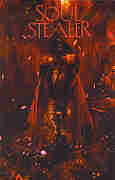 Soul
Stealer 2008 (SC GN) 148 pages
Soul
Stealer 2008 (SC GN) 148 pages
Written by Michael Easton. Illustrated by Christopher
Shy.
Editor: Jason Park.
Rating: * * (out of 5)
Number of readings: 2
Additional notes: intro by novelist Peter Straub
Suggested for mature readers
Published by DMF Comics
There have been a lot of people in comics in the last few years claiming that the old monthly comic is on the way out and the graphic novel is the future of the medium. That even though series are still published as monthly periodicals, their true destination is a collected edition down the line. It's also been pointed out that in Europe and Japan the graphic novel has long since replaced the thinner comic -- even when these "novels" are simply instalments in an on going series. .
And a book like Soul Stealer seems to be part of that movement. Because this is 148 page original graphic novel -- the contents not having first seen life as a serialized comic -- yet it is not a stand alone effort, but inside even bills itself as simply "Book One" of a proposed series.
Fully painted -- or photoshopped -- it's about Kalan, a man born thousands of years before but who currently wanders the streets of a near future New York pining for his lost true love who, like him, is timelost and somewhere out in the world. In it you can probably detects echoes of everything from The Highlander films to the Crow comics to the legend of Orpheus.
I mentioned that this is a whopping 140-some pages and sees itself as the beginning of something. That's important. Because, frankly, very little actually happens in these pages. Between writer (and actor and sometime poet) Michael Easton's vague, sometimes inarticulate story and artist Christopher Shy's out-of-focused images where the same faces are recycled panel after panel, reminiscent of Dave McKean (and not in a good way), even when something does occur -- it's often hard to know what, exactly. But even after a second reading, once I had a better grasp on what was supposed to be going on, one can't escape the feeling that the same material could've been squeezed into a regular comic -- or maybe two.
There are some sort of interesting, but only vaguely articulated ideas in Soul Stealer -- but ideas that in and of themselves aren't exactly that fresh or original. We get a flashback to Kalan's Iron Age origins, as he falls in battle to the demonic Apis Bull who kills both him and his lover, Oxania. And they are both resurrected, but separated -- apparently for millennia, partly due to the capricious whim of the Gods (borrowing names from the Egyptian pantheon, with a few nods to Judeo-Islamic-Christianity). But it's all kind of fuzzy why -- Kalan is both a favourite of the Gods, but also ticks them off. There's a lot in the book that is like that, either as if Easton hadn't really thought it through himself, or knew it so well he forget to explain it to us. At one point, toward the end, a woman confronts Kalan and says that a priest has warned her about him. But it's not clear how this priest would know anything about him. Heck -- even the reader still isn't really sure what his supernatural abilities are at that point or what he does with them. Midway through the book, he is summoned to a meeting by someone who wants his assistance...but that person never shows up so it doesn't really add to the story, or our understanding (you can learn more about the story reading the back cover blurb than reading the story itself!). So Kalan just mopes about, has a few flashbacks to his origin, and pines for the lost Oxania -- but doesn't really seem to have any plan on how to look for her. Eventually Apis Bull shows up again for a "climactic" battle...but again, with little logic for how or why (again, I suppose, it's put down to the unknowable whims of the Gods). .
There are even a few technical inconsistencies, like the whole book being narrated by Kalan in the first person -- except for one scene where Kalan leaves a room and the caption describes things he can't see. Easton is deliberately writing in a pretentious way -- the poet in him, I guess. So people say things like: "You're drunk with memory and there's darkness in your soul." Dialogue like that isn't very realistic...without being lyrical enough to work on a more heightened level.
And all this is compounded by Shy's art, which is supposed to be haunting and moody. And it is...sort of. It's also just kind of murky and repetitious and not really very good at storytelling. And let's face it, a comic book artist is first and foremost a storyteller. Instead, settings are often dark and blurred, while Shy just recycles the same faces over and over, so there are few changes of expression in the entire story, and he colours over the figures with lines and scratches so people often look like they're sporting Maori tattoos. A lot of the images look like he's playing with photographs, while occasionally borrowing poses from old Conan paperback novel covers by Frank Frazetta and Ken Kelley.
And perhaps writer and artist cancel each other out. Maybe Easton's airy script paired with rich and detailed images would've worked, or a textured and nuanced script coupled with Shy's vague, dream-like images could've been effective. But all it is is a vague script coupled with vague art.
There isn't a lot of action, per se -- despite my referring to fight scenes, there are only about two or three in the whole book (and are hard to make out). And other than Kalan, there isn't too much in the way of personalities, and even Kalan isn't really defined that much beyond his melancholy. It would be easier to get caught up in the tragedy of his starcrossed romance...if we cared about him more.
This bills itself as "Book One", and does indeed have the feel of a "pilot" -- just establishing the premise. But so little happens here, and there's so little indication where it would go or what it would do when it got there, that it's hard to get excited about a "Book Two".
Now, after that thoroughly negative review, let me point out an obvious point. I likened it to both The Highlander film and the visuals to Dave McKean of Arkham Asylum fame. Well, guess what? I didn't like Highlander and I didn't like Arkham Asylum. Soooo...if you did like those, you just might find something in this that I didn't.
And good luck to you.
ON TO > SF Page Eight
BACK TO < SF Page Six