Colours:
Justin Ponsor, Caesar Rodriguez, Laura Martin. Letters: Troy Peteri.
Colours:
Justin Ponsor, Caesar Rodriguez, Laura Martin. Letters: Troy Peteri.
Sojourn: The Warrior's Tale 2003 (SC TPB) 160 pages
Written by Ron Marz. Pencils by Greg Land, with Araon
Lopresti. Inks by Jay Leisten, Roland Paris.
Colours:
Justin Ponsor, Caesar Rodriguez, Laura Martin. Letters: Troy Peteri.
Reprinting: Sojourn #13-18
Rating: * * * 1/2 (out of 5)
Number of readings: 1
Additional notes: sketch gallery/pin-ups
Published by CrossGen Comics
Sojourn is a traditional High Fantasy saga set in a medieval-like world under the sway of an evil wizard, Mordath. The beautiful Arwyn is an archer who seeks to bring down the wizard, not the least because he killed her husband and child. With a fellow archer -- the roguish, free-wheeling Gareth -- and her dog, she seeks to assemble the parts of a mystical arrow that will destroy the wizard -- the parts being secreted in various lands, leading to assorted quests. All of this is, nicely and conveniently, recapped in an opening intro, so that a novice reader (like myself) won't feel left out.
This story arc (the third consecutive TPB collection) has Arwyn and Gareth arriving at Ankhara -- a city of mountain dwelling winged people who have been conquered and occupied by Mordath's troll army. Sneaking into the city, she and Gareth aid rebels in the city in their own quest for a powerful weapon, while also hoping to find a piece of the mystical arrow.
Sojourn: The Warrior's Tale is an enjoyable read, if perhaps a tad breezy.
Not the least of its striking aspects is the beautiful art by Greg Land which is detailed and realistic -- an idealized realism, that is. Looking at Arwyn, there's a nagging sense of familiarity, as if Land modelled her after a super-model, but I can't say who. In fact all the women are stunningly gorgeous, with plenty of bare midriffs (and Arwyn appears in a salacious scene -- albeit, it turns out to be Gareth's dream). In a break from traditional, Tolkien-esque European flavoured fantasy (which this series, one assumes, generally resembles), the cliff dwelling civilization of winged people is modelled after ancient Egypt, including sand stone buildings, hieroglyphs, and mummies. This adds an extra freshness to the familiar milieu, the visuals beautifully realized by Land's art and the warm, sun-drenched hues employed by the colourists. In fact, the colouring is a curiously effective technique, with backgrounds often seeming truly painted with coarsely mixed colours (though the characters are coloured in smooth, comicbook shades). Having flipped through the previous two Sojourn collections, I think Land's style may even have improved (though it was good from the beginning). In fact, the effectiveness of the art, the beauty and atmosphere -- and beauty of Arwyn -- can be a two-edged sword...because when Land is absent for an issue (Aaron Lopresti pinch hits an issue) my interest waned slightly. Lopresti is a perfectly good artist, but it's Land who makes the world breath.
Another break from traditional fantasy stories is that the Ankharans are black...a welcome pluralistic addition to a genre that typically tends to feature only white characters.
The plot itself is enjoyable enough, and moves along reasonably well. But like another fantasy-themed CrossGen TPB I read written by Ron Marz (Mystic: The Demon Queen), it can seem a bit...slight. For something that runs six issues, it's not especially complex in plot or character development. Well, actually, it's more like a five issue story, since the opening chapter is largely self-contained, focusing on the troll captain, Bohr, who has been pursuing our heroes (basically this series' Inspector Javert).
I don't mean that it's boring, or that there seems a lot of padding or extraneous scenes. I just mean that somehow, while still presenting an enjoyable enough romp, Marz manages to take a long time to do very little. Scenes may be a tad longer than they need...but not to the point of tedium. When you reach the end of the adventure, most of the challenges the heroes' faced were overcome fairly easily, and most of the plot twists weren't all that twisty.
An interesting side thought on gender and comic book sexism: here we have a story where the seeming principle character is the heroine -- and though she's certainly beautiful andd obviously meant to be eye candy, she is dressed respectably throughout (excepting the dream sequence to which I alluded earlier). So that even though one could argue there is a cheesecake aspect to Arwyn, it's not blatant. However, even though she is presented as the lead...reading the story itself it's not quite as clear. Gareth appears in as many scenes as she, is as likely to come up with the clever plan...and it's Gareth, not Arwyn, who narrates!
This TPB collects a story arc, with Arwyn freeing the Ankharans and winning yet another piece of her mystical arrow by the end, so that it can be read on its own. But there's an aspect that is left kind of dangling -- at least, so one assumes. A supporting character is killed off, which wouldn't seem like a "dangling" plot thread...except I'm guessing the character will return (the death scene seemed so perfunctory, and no body was recovered).
The Warrior's Tale is an enjoyable romp, full of beautiful scenery (and beautiful women), and the archer aspect was a nice touch, putting me in mind of Robin Hood stories (though the fact that Arwyn fires exploding arrows kind of loses the rustic elegance of the weapon!). For fans of High Fantasy, the chance to see such a milieu come to visual life is quite appealing (because it's not common in comics nor in movies, The Lord of the Rings notwithstanding). But though enjoyable, the characterization is slight and the story seems more like an episode of a TV series rather than a 132 page epic adventure.
Cover price: $__ CDN./ $15.95 USA.
Solar:
Alpha and Omega 1994 (SC TPB) 80
pages
a.k.a. Solar #0
Written by Jim Shooter (conceived by Shooter and Bob Layton).
Pencils by Barry Windsor-Smith. Inks by Bob Layton.
Colours: Janet Jackson. Letters: Jade Mode.
Reprinting: The back-up story serialized through Solar #1-10
Rating: * * 1/2 (out of 5)
Number of readings: 1
Additional notes: intro by Bob Layton; covers.
Suggested for mature readers
Published by Valiant
I haven't bothered with a cover scan because the cover -- all black with an embossed title and a rradiation symbol -- probably wouldn't show up on my scanner.
This collected the Solar, Man of the Atom story that was originally run in short instalments in the back of the regular Solar comic. Solar started out as Doctor Solar in a 1960s Gold Key comic. When Valiant first began, they started out by acquiring the rights to a couple of pre-established properties -- Magnus and Solar -- in order to anchor what would be the Valiant Universe. Solar was actually a re-imagining of the property, rather than a direct sequel (I think this Solar had read the Doctor Solar comics when he was a kid).
Valiant was a company that arose in the 1990s and, for a time, looked as though it was going to be a major player in the biz...but it eventually went off the rails, was bought up and re-started by Acclaim, shut down again, and, today is, I believe, mainly a footnote in comics history. Reading some old Valiant comics and TPBs that I've come upon after the company's demise, I've been generally favourably impressed -- at least, regarding the early days of the company, when ex-Marvel boss, Jim Shooter, was head writer. The strange thing is that, although I haven't exactly loved what I've read, I've generally found them all to be of above average readability.
Which is what makes this book a bit of a disappointment.
Don't get me wrong. There's still an above average readability. The early Valiant comics could have plenty of action, but there was also an emphasis on talky bits and character stuff. Admittedly, there could be a certain cerebralness, where the scenes are brisk, sometimes intelligent and thoughtful, but oddly abstract, or cold -- relating to what I said about liking more than loving the comics . You can find yourself interested more than involved. And all that's here. There's also a decided brevity to the story, as it's being told in, generally, six page chapters. Though that can be its own appeal, keeping things tight and focused (like in Cyclops: Retribution).
The story concerns Phil Selesky, a physicist working on an experimental nuclear power plant who, when the generator goes critical, is bathed in radiation that seems to turn him into an almost God-like being who, as the story progresses, realizes there is very little limitation on his abilities. He is studied by well-meaning colleagues, pursues a romance, and eventually is deemed a threat by shadowy authorities when he starts using his abilities to arbitrarily do things he feels need doing (like shutting down unsafe nuclear reactors all over the world). There is some nicely subtle shadings of character that are quite impressive...like making us aware of Phil's interest in Gayle, not through anything overt, but simply because he notices her. Or the character of Erica Pierce (who would later be crucial to Valiant's cross company Unity epic) whose personal neuroses are more implied than explained.
At the same time, that can relate to my point about an aloofness. Barely do Phil and Gayle go on a date then, next chapter, they're living together. The relationship is progressed intellectually more than emotionally.
Valiant was not an especially artist-driven company, and many of the comics featured competent artists who could tell a tale cleanly and get the job done, but were not necessarily exciting or A-list names. The art here, though, is by fan-favourite Barry Windsor-Smith, who drew other stuff for Valiant, but nothing as sustained as this ten chapter serial. Windsor-Smith is a good artist, although, despite his creativity and talent, he kind of suits the Valiant flavour, in that his detailed art isn't really of an explosive, emotive style. But it's nice stuff, nonetheless.
Still, all this describes something that's still comfortably in that "above average readability" mode I was talking about. So where's the problem?
Well, taken in the context of years later, when Valiant is defunct and Solar has been cancelled, it's basically a prologue more than a stand alone introduction. For an origin story, it ends in such a way that, if you don't know what comes next, you might find yourself going, "Huh?" It's an oddly downbeat, abrupt resolution. Perhaps if you got it along with the other Solar TPB that collected the lead stories from the first four issues, they would work better. But on its own, it was interesting and eminently readable...but leaves you feeling a tad empty.
Although, to be fair, that may just be reading it a certain way. Perhaps a second reading, knowing how it resolves, will leave me with less ambivalence. But, at the moment, I'm posting this review after one reading.
Like a lot of smaller companies, Valiant chose to go it without Comics Code approval, which tended to result in stories that seemed unsure of what they could and couldn't do. In this case, the story is erratically gory and probably warrants a "mature readers" caution. As well, the book is mayhap a tad expensive for what it is, page count wise.
Another curious sidebar (similar to one I mentioned in the X-O: Manowar TPB) is the introduction. One of the founders of Valiant was Jim Shooter, a man whose talent isn't generally doubted, but who accrued his share of detractors, on a personal level, when he was Editor-in-Chief at Marvel. He wrote much of the early Valiant line, but was soon gone from that company too. This TPB collection was released after Shooter was gone, though features stories for which he is credited as the writer and co-creator, along with Bob Layton. Yet in Layton's introduction, nowhere is Shooter even mentioned. In fact, Layton claims almost complete credit for the series, despite only being credited as co-creator and inker. Perhaps Layton did do all the work, and Shooter stole credit. But it does seem a bit odd, when Shooter still has his name prominently on the credits' page, for Layton to not even acknowledge his existence, if only to say, "Shooter stole my by-line". It smacks a little of the old idea of Communist Russia re-writing history texts to eliminate someone's accomplishments if that person fell out of favour with the current administration.
Original cover price: $9.95/$13.45
 Soul
Stealer 2008 (SC GN) 148 pages
Soul
Stealer 2008 (SC GN) 148 pages
Written by Michael Easton. Illustrated by Christopher
Shy.
Editor: Jason Park.
Rating: * * (out of 5)
Number of readings: 2
Additional notes: intro by novelist Peter Straub
Suggested for mature readers
Published by DMF Comics
There have been a lot of people in comics in the last few years claiming that the old monthly comic is on the way out and the graphic novel is the future of the medium. That even though series are still published as monthly periodicals, their true destination is a collected edition down the line. It's also been pointed out that in Europe and Japan the graphic novel has long since replaced the thinner comic -- even when these "novels" are simply instalments in an on going series. .
And a book like Soul Stealer seems to be part of that movement. Because this is 148 page original graphic novel -- the contents not having first seen life as a serialized comic -- yet it is not a stand alone effort, but inside even bills itself as simply "Book One" of a proposed series.
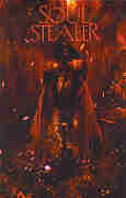
Fully painted -- or photoshopped -- it's about Kalan, a man born thousands of years before but who currently wanders the streets of a near future New York pining for his lost true love who, like him, is timelost and somewhere out in the world. In it you can probably detects echoes of everything from The Highlander films to the Crow comics to the legend of Orpheus.
I mentioned that this is a whopping 140-some pages and sees itself as the beginning of something. That's important. Because, frankly, very little actually happens in these pages. Between writer (and actor and sometime poet) Michael Easton's vague, sometimes inarticulate story and artist Christopher Shy's out-of-focused images where the same faces are recycled panel after panel, reminiscent of Dave McKean (and not in a good way), even when something does occur -- it's often hard to know what, exactly. But even after a second reading, once I had a better grasp on what was supposed to be going on, one can't escape the feeling that the same material could've been squeezed into a regular comic -- or maybe two.
There are some sort of interesting, but only vaguely articulated ideas in Soul Stealer -- but ideas that in and of themselves aren't exactly that fresh or original. We get a flashback to Kalan's Iron Age origins, as he falls in battle to the demonic Apis Bull who kills both him and his lover, Oxania. And they are both resurrected, but separated -- apparently for millennia, partly due to the capricious whim of the Gods (borrowing names from the Egyptian pantheon, with a few nods to Judeo-Islamic-Christianity). But it's all kind of fuzzy why -- Kalan is both a favourite of the Gods, but also ticks them off. There's a lot in the book that is like that, either as if Easton hadn't really thought it through himself, or knew it so well he forget to explain it to us. At one point, toward the end, a woman confronts Kalan and says that a priest has warned her about him. But it's not clear how this priest would know anything about him. Heck -- even the reader still isn't really sure what his supernatural abilities are at that point or what he does with them. Midway through the book, he is summoned to a meeting by someone who wants his assistance...but that person never shows up so it doesn't really add to the story, or our understanding (you can learn more about the story reading the back cover blurb than reading the story itself!). So Kalan just mopes about, has a few flashbacks to his origin, and pines for the lost Oxania -- but doesn't really seem to have any plan on how to look for her. Eventually Apis Bull shows up again for a "climactic" battle...but again, with little logic for how or why (again, I suppose, it's put down to the unknowable whims of the Gods). .
There are even a few technical inconsistencies, like the whole book being narrated by Kalan in the first person -- except for one scene where Kalan leaves a room and the caption describes things he can't see. Easton is deliberately writing in a pretentious way -- the poet in him, I guess. So people say things like: "You're drunk with memory and there's darkness in your soul." Dialogue like that isn't very realistic...without being lyrical enough to work on a more heightened level.
And all this is compounded by Shy's art, which is supposed to be haunting and moody. And it is...sort of. It's also just kind of murky and repetitious and not really very good at storytelling. And let's face it, a comic book artist is first and foremost a storyteller. Instead, settings are often dark and blurred, while Shy just recycles the same faces over and over, so there are few changes of expression in the entire story, and he colours over the figures with lines and scratches so people often look like they're sporting Maori tattoos. A lot of the images look like he's playing with photographs, while occasionally borrowing poses from old Conan paperback novel covers by Frank Frazetta and Ken Kelley.
And perhaps writer and artist cancel each other out. Maybe Easton's airy script paired with rich and detailed images would've worked, or a textured and nuanced script coupled with Shy's vague, dream-like images could've been effective. But all it is is a vague script coupled with vague art.
There isn't a lot of action, per se -- despite my referring to fight scenes, there are only about two or three in the whole book (and are hard to make out). And other than Kalan, there isn't too much in the way of personalities, and even Kalan isn't really defined that much beyond his melancholy. It would be easier to get caught up in the tragedy of his starcrossed romance...if we cared about him more.
This bills itself as "Book One", and does indeed have the feel of a "pilot" -- just establishing the premise. But so little happens here, and there's so little indication where it would go or what it would do when it got there, that it's hard to get excited about a "Book Two".
Now, after that thoroughly negative review, let me point out an obvious point. I likened it to both The Highlander film and the visuals to Dave McKean of Arkham Asylum fame. Well, guess what? I didn't like Highlander and I didn't like Arkham Asylum. Soooo...if you did like those, you just might find something in this that I didn't.
And good luck to you.
Cover price: $19.99 USA
or, Back to: