The
Masked Bookwyrm's Graphic Novel (& TPB) Reviews
The
Masked Bookwyrm's Graphic Novel (& TPB) Reviews
spies, private eyes, and detectives... (Page 1)
for a complete alphabetical list of ALL reviews start here
A - B - C - D - E - F - G - H - I - J - K - L - M - N - O - P - Q - R - S - T - U - V - W - X - Y - Z
for other espionage-related reviews try Alias, The Black Widow, Shang Chi/Master of Kung Fu, The Losers, Sandman Mystery Theatre, and others
 Codename:
Knockout: The Devil You Say 2010
(SC TPB) 160 pages
Codename:
Knockout: The Devil You Say 2010
(SC TPB) 160 pages
Written by Robert Rodi. Illustrated by Louis Small, Jr.,
with Yanick Paquette, Amanda Connor. Inks by various.
Colours/letters: various.
Reprinting: Codename: Knockout 0-6 (2001)
Rating: N/R (out of 5)
Number of readings: 1
Suggested for Mature Readers
Reviewed: Aug. 2015
Published by DC / Vertigo
A TPB like this is kind of hard to review -- because, honestly, pretty early into it I realized it wasn't for me. So on one hand one might say at that point I should walk away and leave reviewing it to people who are more in sync with its intentions. But in a sense, the point of writing a review is to put forward my personal opinion. What you, dear reader, do with that opinion -- whether you decide your tastes are similar to mine or not -- is up to you.
After all, I'm not saying I would be incapable of liking what it was trying to be. If that were the case I wouldn't have picked it up to begin with. But it just didn't work for me.
The series ran a couple of years, which can either be seen as proof it did connect with an audience (since readers must have kept buying it for two dozen issues) or an indication it didn't do that well since a successful comic often runs years, even generations. And the fact that it only resulted in this one TPB, and that was published a few years after the series came to an end, equally is open to interpretation (either fans were clamouring for a collection...or a reprint editor was convinced there was an untapped market, but sales didn't justify further TPB collections).
So anyway, Codename: Knockout is set within the milieu of spies and counter spies and secret organizations -- except it's a comedic spoof of that milieu (even as it's still meant to have action and adventure and plots that -- nominally -- unfold). And it's also deliberately meant to be racy and raunchy and R-rated -- more on that anon.
The central character is Angela, a blonde bombshell with tan skin (her mom is black, her dad white), who though living the carefree life of a dilettante keeps getting dragged into the kill-or-be-killed world of international intrigue thanks to the fact that her mom is the director of the spy agency G.O.O.D. and, as she learns within an issue or two, her hitherto unknown dad is actually the director of the criminal organization known as E.V.I.L. (yeah -- subtle comedy it ain't). Angela's best friend is the flamboyantly gay Go-Go, and he's also good in a fight (and quick with a sexual innuendo).
Part of the initial premise is Angela wants nothing to do with her mom (or her dad) but finds herself reluctantly drawn into essentially the family business. After resisting the call for the first few issues, she eventually agrees to work for G.O.O.D., leading then to her first real assignment as an agent (inbetween is a flashback issue showing how her mom and her dad ended up becoming romantically involved despite their opposite allegiances).
Now I tend not to be too keen on funny comic books. Specifically comics that are meant to be tongue-in-cheek riffs on the conventional action/sci-fi that dominates the medium. I don't know if it's just my sense of humour (or lack thereof) -- I'm not really big on "camp" in movies or TV either -- or just that comics, a medium of still panels and the written word, is not ideal for that kind of comedy which is often based on nuance and delivery (a line that lies flat on the page can be hilarious when uttered by the right actor). It isn't that I can't find comics a funny medium -- nor that I can't laugh out loud at wisecracks and wacky ideas in old Spider-Man or Fantastic Four comics. I do and I have. But I am aware that a lot of even well-regarded "funny" or "quirky" super hero or adventure comics over the years can leave me flat.
Or maybe the problem is I simply didn't care. The characters themselves just not really interesting, or engaging, or even especially likeable, so that not only am I not finding them that funny...but I'm not really liking them, either. Nor are we really meant to take them as "real" characters even within the silly stuff. Angela herself seems to just kind of be whiny and flaky in her complaints about her parents, and the fact that she sees joining G.O.O.D. or E.V.I.L. as being equal career options kind of suggests we aren't really supposed to attribute much depth to the scenario (I mean, her dad's organization is a criminal group called E.V.I.L. -- for most real people joining it wouldn''t even be an option kept on the table).
The other funny thing about the comic is the raunchiness and sexploitation. Nor is this all tease and no delivery -- it's a "mature readers" comic with occasional nudity from the leads, and drawn by artists who mostly know how to draw glamorous people. Yet that too is part of the joke. Which, in a way, is kind of weird. So the comic deliberately courts a kind of sexist, exploitive vibe (the very title "Codename: Knockout") with actual gratuitous nudity (though not perhaps as much as one might expect) -- yet presumably by presenting it as a joke, as a spoof of sexploitation, critics are supposed to wink and nod and pretend it's somehow different than what it's spoofing.
In other words, if they had done a serious spy comic featuring a glamorous heroine who occasionally doffed her togs, it would be dismissed as juvenile and exploitive and no doubt pilloried by critics. But you throw in a few tongue in cheek gags and suddenly we're supposed to pretend it's making fun of sexploitation. Riiighhht.
Funnily enough, maybe if it was more serious, and the characters given more depth, we could actually pretend we were attracted to Angela by more than just her measurements.
Though a funny side point is that, as mentioned, her sidekick Go-Go is gay, and written as one of those "outrageous" style homosexuals who's always quick with a sexual innuendo and leering at all the boys. And Go-Go, too, is sometimes shown in the buff, just to provide equal opportunity beefcake. But I was initially going to say that it said something about the presumed comic book readership that the naked women are presumably there to appeal to male readers...but even the naked men are assuming a male gaze. But then I read that scripter Rodi is, himself, gay, so maybe it's less about who he's writing for and more just about him writing what he wants.
Plot-wise the strongest part of the collection is the final two-parter in which Angela and Go-Go are finally sent on a proper mission and it really does turn into an actual story with a beginning and end and twists inbetween. But it still didn't fully engage me, largely for my earlier points about not really finding it that funny, nor really caring about the characters. The plot has them getting embroiled with an African dictator and, well, I'm not sure it's something you want to examine too closely. It can be read as both racist and anti-racist, sexist and anti-sexist in almost equal measures.
The art for the issues is generally impressive, albeit mixed. Louis Small Jr delivers most of the issues and has a hyper realist style that certainly suits a comic that is, "spoof" or not, selling its cheesecake and beefcake. Although it is a slightly stiff style, like maybe he's relying too much on posed models at times. Yanick Paquette helps out on a couple of issues, notably the flashback to Angela's mother (who actually spends almost as many panels naked in just that one issue as Angela does in the rest of this collection). He, too, is well suited to drawing the beautiful and glamorous stuff, with perhaps more of a feel for comic book storytelling. The final issue sees Amanda Connor take over as artist. Connor' style is more deliberately cartoony, at once muting some of the sexiness, but perhaps better bringing out the series' underlining comedy and camp, with her better able to indulge in more comically exaggerated expressions and pratfalls.
So as I say -- it didn't really work for me. Occasional nudity aside, it had a kind of comedy I didn't find that funny (finding it more grating, actually), while neither the plots nor the characters really held up outside of the humour.
Cover price: __ USA
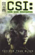
CSI: Thicker Than Blood 2003 (SC GN) 48 pgs.
Written by Jeff Mariotte. Illustrated by Gabriel Rodriguez, and Ashley Wood.
Colours: Fran Gamboa, Ashley Wood. Letters: Robbie Robbins. Edited by Kris Oprisko.
 Based on the the TV series.
Interview with creator Anthony Zuiker.
Rating: * * * (out of 5)
Number of readings: 1
Published by IDW Publishing
Media tie-in comics often used to be disappointing -- too often seeming simplistic or watered down versions of their inspiration. Maybe it was because too many comics seemed to be written and drawn by creators who often didn't seem that familiar with the source material -- and didn't much care! Or maybe it was that I just had too high a standards, taking it too seriously (oh -- so-and-so would never say that! What a stupid comic!) Whereas I'm more easy going these days.
Whatever, I've enjoyed some media inspired comics lately.
CSI: Thicker Than Blood is based on the hit TV series, CSI: Crime Scene Investigation. It's one of a series of CSI based stories from publisher IDW -- including other one-shots, plus some mini-series (not to mention comics based on the TV spin-off CSI: Miami).
And for fans of the show, it does a decent enough job evoking the series -- for good and bad.
Scripter Jeff Mariotte tells a straight, investigative/detective story, as the CSI team investigate two separate cases (as the series' episodes often split their attention) -- one involving an attempted mob hit, the other, the disappearance of an Elvis impersonator. And it all seems pretty evocative. The characterization is minimal as the heroes' personalities take a back seat to the cases -- like in the series -- but Mariotte has enough feel for them that the dialogue and quips seem appropriate to the different characters (like the opening scene where an off-the-cuff remark by Nick leads to Gill launching into a pedagogical speech revealing his knowledge of obscure trivia). And the Elvis case also evokes the series' penchant for having cases embroil the characters in various fringe sub-cultures and professions (actually, CSI -- the series -- is kind of reactionary when you think of it, tending to portray any alternative group as weird and twisted; I mean, this is a series that could make people who play a Scrabble-like game seem like freaks!)
Actually another way the comic evokes the series is in the short shrift given the Sara character. I'll confess, I think actress Jorja Fox is kinda hot, and I used to watch the series, in part, for her...and I began to notice that her screen time seemed less and less (I half wondered if she was being punished for a contract dispute she had with the producers, but the actor who plays Nick was also involved, and his part doesn't seem diminished). Anyway, in this story, of the five CSI's, her part is the most negligible (mind you the coroner guy only appears in a few panels!)
Artist Gabriel Rodriguez does a decent enough job evoking the actors, and has a realist, understated style that suits the story. And even his original characters look realistic, so that you don't have a jarring contrast between the actor-based drawings and the made-up characters (he might well use models for some of them, too). In a bit of gratuitous titillation, the characters' investigation requires them talking to some strippers...and Rodriguez handles the, um, aesthetics of those scenes quite well, too (keeping it just this side of being "mature readers"). Though the overall colouring is a bit drab and grey -- not quite evoking the glaring sun of the Nevada dessert. When the characters speculate about a case, and we flashback to re-enactments, a different, stylized art style is employed by Ashley Wood -- it's an interesting trick, making it obvious we're seeing a speculative flashback, though the style makes it hard to entirely tell what's going on.
The down side to all this is that the comic is full of talking heads, discussing facts and figures. Mariotte and Rodriguez do a good job keeping the energy up, but it's still a bit dry. As mentioned, the series itself is often more plot driven than character-driven, but even it usually works in some sort of emotional/character element. As well, there aren't many twists and turns to the cases (the way the series would often have a case start out seeming about one thing, then turn out to be something else) and there are so few suspects introduced, that there aren't many surprises in the solutions. And there was also some questionable logic, particularly regarding the time frame. I don't think the title has any meaning, per se, and I'm still not sure why the story seems to open with the explosion of a pirate ship -- nothing more is said about it, so I'm guessing I misread the visuals.
This also features an interview with CSI TV creator, Anthony E. Zuiker, which is perhaps as amusing -- unintentionally -- as it is insightful. Zuiker, for instance, says that after having done CSI and CSI: Miami, he thinks a third series could only be justified if set in another country, that something like -- to use his example -- a CSI: New York would be pointless. But, of course, just a year or so after this interview, they came out with CSI: New York! Zuiker also goes on to talk about the realism and accuracy of the series...when I've read articles interviewing real forensics experts who complain the series sets up false expectations of what they can do. And even a lay person can pick up on the implausibility of much of it (just like the series MacGyver used real scientific theories...but in unrealistic ways).
Anyway, enough of my snide tirade...
Thicker Than Blood isn't a classic example of CSI, but it does evoke the series, in story and visuals, and should be fun for fans during the dry months of summer reruns.
Original cover price: $__ CDN./ $6.99 US
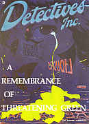 Detectives,
Inc: A Remembrance of Threatening Green 1980
(SC GN) 48 pages
Detectives,
Inc: A Remembrance of Threatening Green 1980
(SC GN) 48 pages
Written by Don McGregor. Illustrated by Marshall Rogers.
black and white. Letters: Tom Orzechowski.
Rating: * * 1/2 (out of 5)
Number of readings: 1
Recommended for Mature Readers
Originally published by Eclipse
This graphic novel, along with a later three issue mini-series, has more recently been released as a hardcover collection.
Originally published in 1980 (and apparently one of the earliest American "graphic novels"), Detectives, Inc was a slightly off-beat idea for a comic book...precisely because it wasn't off-beat. That is, in a medium largely dominated by the fantasy of super heroes and talking animals, Detectives, Inc was just a crime/mystery story about a couple of New York private eyes. Years later, it's not quite as unusual a genre for comics, but at the time, it was slightly atypical (though there was little too distinguish the heroes from any of a number of characters populating novels or TV series). The other unusual aspect was it was intended for "mature readers", with some adult subject matter, occasional profanity, and even some nudity and explicit sex (albeit only in a few panels...some of which was in silhouette, some not).
The plot of this initial graphic novel, "Remembrance of Threatening Green", has private eyes Ted Denning and Bob Rainier (one black, one white) being hired by professional mid-wife who suspects her lesbian lover's hit-and-run death wasn't just an accident.
Writer Don McGregor can be a bit of a polarizing figure among readers, with his penchant for sometimes overly flowery purple prose, lyrical monologues, and an attempt to derive meaning and symbolism from the most minor blade of grass. Some people love his ambition, his attempt to instill philosophical musings and probing characterization into a comic book...others find him ridiculously pretentious and sophomoric. I tend to waffle back and forth...sometimes finding him brilliant...sometimes not.
Unfortunately, Detectives Inc can lean towards the latter.
McGregor's over-written, indulgent style could be quite effective when he wrote the Black Panther, or Killraven, because of the inherent fantasy and exotic nature of those series, writing about African philosopher kings battling super villains, or set in an apocalyptic future. But Detectives Inc is set in essentially a very real, then contemporary New York...and for the most part, people just don't talk the way McGregor writes them. Occasionally, sure, they might wax poetic...just not all the characters all the time. Although in some ways, the opening scene where the two heroes are heading toward a rendezvous while pontificating on violence, guns and the best tasting Necco Wafers almost seems like an imitation of something Quentin Tarantino might've done -- years before Tarantino had shot his first roll of film! (Tarantino would be funnier...but more superficial).
Another problem is just the case itself. McGregor's tendency to draw out moments (so as to allow for all the musings and philosophy) can kind of throw off the pacing a bit -- almost a quarter of the pages are devoted just to a prologue! But, as well, normally in a story where heroes suspect an accident was a deliberate homicide, it's either because there was something unexplained about the death...or because there is an obvious suspect. Yet here, no sooner do they meet the client than she rattles off a list of possible killers -- no one more likely than the next. And though, yes, as a hit-and-run, it means a human agency was at work, there's still no overlooked but compelling evidence for premeditation. Their investigation amounts to simply interviewing the suspects the client suggested, who simply confirm their animosity toward the dead woman. No attempt to verify alibies or anything. They even suspect their own client, though the dubiousness of a killer deliberately drawing attention to a murder the cops were happy to rule an accident makes her guilt unlikely.
By the end, the heroes' investigation in no way is responsible for the solution and climactic confrontation!
Of course, part of McGregor's true interest is the characters themselves...with mixed results. On one hand, he is clearly trying to make Ted and Rob more than just props, giving them long, self-confessional monologues, as Ted struggles with his ambivalence for the inherent violence of their profession and Rob is on a downward spiral after a bitter divorce. And though these threads do tie into the main plot (as Rob begins to feel a kinship with the client, as they both "lost" a loved one) it's not necessarily in a way that has much impact on the nature or direction of the story.
The black & white art by Marshall Rogers is generally effective, utilizing greys and zipatones (unlike some black and white comics where it can look like they just ran out of money before they could hire a colourist). Rogers' figures can be a bit stiff and awkward, but can convey what needs conveying, with occasionally subtle expressions. His real strength is his meticulous details, his lovingly rendered clothes and his intricate backgrounds, whether of back alleys, or sandy beaches, that really allow the story to play out against an authentic environment that further roots it in a real world setting, the city a character in its own right. Though Rogers (with McGregor) plays around with panel arrangement at times, occasionally making it a bit tricky to figure out how a scene should be read, further muddied by spots where Rogers doesn't separate panels by a margin, meaning it can take a moment to realize you're looking at two separate panels. And the use of some small panels might make it a bit trickier when it was subsequently reproduced at normal, comic book dimensions for a later collection, where you might lose some of the clever additions Rogers throws in (like a small panel toward the end where the murdered woman's face looks down from an overhead moon).
I don't want to be too down on the story. It's not uninteresting in spots, the visuals are atmospheric, and it was certainly trying to push the conventions for the time, both creatively and in content (the sex generally more frank than exploitive). And, honestly, my complaints about the plot/mystery I could level at a few movies and novels, too. But it just doesn't live up to its own ambitions. As well, despite all the character insight, the heroes don't really emerge as that compelling, either. Perfectly okay heroes -- just generic. Which might explain why it was almost seven years before McGregor was able to trot them out again for a mini-series.
Original cover price: $__ CDN./ $6.95 USA.
Jack Hammer: Political Science 2015 (SC TPB) 156 pages

Written by Brandon Barrows. Illustrated by Ionic.
Colour/letters: unknown.
Reprinting: Jack Hammer: Political Science #1-4, Jack Hammer: Usurper #1-2 (2014)
Additional notes: I believe an earlier digest-sized TPB was released just featuring the Political Science storyline.
Rating: * * * (out of 5)
Number of readings: 1
Published by Action Lab
Reviewed March, 2015
Comic books have given rise to their own unique sub-genres and narrative hybrids. Because super heroes tend to dominate the medium (and have since the 1960s) sometimes creators try to draw upon the super hero genre while marrying it with another genre. In the case of Jack Hammer -- it's principally a hard boiled private eye story, but with a foot in the super hero oeuvre. Hero Jack Hammer himself has super strength and was (at least so we infer) once a conventional super hero, but gave up a costume for a fedora and the life of a gumshoe.
Whether it's appealing to creators who want to get away from super heroes but figure they must play to the market, or whether they simply see this as an off-beat take on super heroes, I dunno. But we've seen comics about beat cops in a super hero universe (District X) and politicians (Ex Machina) and, heck, Marvel's Alias (not to be confused with the TV series) was also about and ex-super hero turned private eye.
The advantage is that by mashing up different genres, you get two great tastes that taste great together. The disadvantage is that in trying to get away from one set of cliches you run smack dab into another set of cliches.
This TPB collects one four issue mini-series, as well as two issue micro-series, plus a two-part back up tale focusing on yet another super powered private eye.
In the main story, "Political Science," Jack is hard at work trying to trackdown a wayward employee for a big corporation. But when said employee turns up dead in the bad part of town -- Jack's employer considers the matter settled. Jack, not one to let a mystery lie unsolved, continues to pursue the case which embroils him with some super powered bad guys, secrets within the corporation and, as the title implies, political corruption.
On the plus side, it clips along at a good pace. There is action, naturally with super people involved, but it's also a lot of talking heads and wandering about, yet it never gets bogged down. Writer Barrows has a good ear for dialogue, capturing a naturalistic flow -- or at least, a cinematic-version of the way people talk. You could easily picture this same dialogue coming out of actors mouths. Sometimes when comic book writers try too hard to craft "realistic" or non-comic book-y dialogue, they err too far the other way, making the dialogue too self-conscious (Brian Michael Bendis comes to mind) or just muddled in its clumsy attempt to evoke speaking cadences. But not so Barrows. While the art by Ionic is effective, with well-proportioned figures and often nicely rendered faces -- at least in close-ups. Ionic has a good eye for story telling composition -- perhaps especially crucial in a story like this. I sometimes think a good visual storyteller is one where you aren't really thinking about it, because the artist generally selects the right angles and close-ups and long shots for the various scenes so it just flows as you read.
With all those good things, there are also problems. As much as the art is good -- it's also a bit stiff and lacking atmosphere. The figures rendered in somewhat angular, rigid lines and lacking contour, and the environments lacking much atmosphere. I've noticed variations on this style before and I wonder if it's a reflection of the video game generation. The art has the feel of video game graphics, as though the artist is less trying to evoke reality, and more trying to evoke the sort of game graphics the readers are used to substituting for reality.
While as much as Barrows' dialogue and pacing is good, there are story weaknesses. One is that the plot never really develops into much. The first couple of issues -- half the initial mini-series -- is spent doing the usual private eye thing, as the hero follows clues, interviews people who aren't being straight with him, gets double crossed and warned off once or twice. Then in the third issues there's kind of a big sense of "info dump" where suddenly we're being told a lot of stuff almost as if Barrows suddenly realized he had to start moving the pieces toward the climax.
Jack uncovers a sort of conspiracy. Except it's a kind of vague and simple one -- and not especially "mysterious" involving a politician (which you can anticipate since the story is called "political science" and TV's are often playing in the background of scenes featuring a local politician). Curiously the comic seems to take a counter-position to most comics, in that this politician is pro super beings and against legislation that would restrict them, and that's apparently bad -- often super hero comics take the opposite approach, that the evil politician is the one advocating legislating superhumans. The villain's plan is so vague that when, in the climax, he complains: "It's all gone to Hell! There's no way to salvage this now!" it seems hyperbolic. Honestly, if this was all that it took to blow his plan to hell -- it wasn't much of a plan, Stan.
The result can feel a bit like a story that has the spirit of a hard boiled private eye saga -- but stumbles in actually coming up with a mystery for him to investigate.
As well, Jack is a perfectly okay, but also perfectly generic, hard boiled shamus, with little to distinguish him from any other fedora wearing, five-o'clock shadow sporting PI -- with or without super powers. It's a bit of a "team" comic, in that Jack isn't just a lone wolf, but is aided by a cop who initially acts like he doesn't like him, but for the most part they're friends; Jack's girl Friday secretary; and a slightly spacy cab driver who acts as Jack's personal chauffeur -- and is arguably the most original character. It isn't that there's anything wrong with Jack or the others, but it relates to my earlier point about how sometimes mashing genres, instead of creating something unique, just ends up leaning on cliches. Jack Hammer may seem original viewed as a super hero -- but he's fairly generic viewed as a private eye.
The two-part tale "Usurped" is kind of similar. Holds your attention well enough (which is half the battle in storytelling) with solid dialogue and visual storytelling, but with a stronger first half than a second. The first half has you wondering what's going on, while the second half turns out to be pretty run-of-the-mill (particularly for a super hero story where a villain's main goal is just to get the hero). While the back-up two-parter, about another super powered PI (who moves in the same circles as Jack) is more light-hearted and is as agreeable as it is inconsequential.
I sometimes get criticized for writing reviews that smack of a "glass half empty" mentality, and this perhaps is no exception. Because in many respects I enjoyed Jack Hammer well enough -- it held my attention and it clips along and is well presented in terms of writing and art. But it can be bit like it's having trouble breaking away from the cliches of its respective milieus -- or at least putting flesh on them, or finding interesting spins to give them. It mixes a world where super beings exist, and politicians debate how to regulate them, that are mainstay themes of super hero comics, with a hard boiled private eye that isn't really unusual in terms of that genre, or in terms of his generic super power, where even the mystery/conspiracy he's investigating feels undeveloped.
Cover price: $19.99 USA
ON TO > Spies & PIs Page Two