science fiction... (Page 5)
for a complete alphabetical list of ALL reviews start here
A
- B - C - D
- E - F - G
- H - I - J
- K - L - M
- N - O - P
- Q - R - S
- T - U - V
- W - X - Y - Z
 Machine
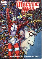
Man 1988 (TPB), 96 pgs.
Machine
Man 1988 (TPB), 96 pgs.
Written by Tom DeFalco. Illustrated & coloured by
Barry Windsor-Smith (layouts Herb Trimpe).
Letters: Higgins/Albers/Chiang/Novak. Editor: Larry Hama.
Reprinting: Machine Man #1-4 (1984 mini-series) - minus covers; subsequently re-published as Machine Man 2020 (a two issue mini-series)
Rating: * * * (out of 5)
Number of readings: 3
Published by Marvel Comics
I read n' reviewed this a few years ago, at a point when I hadn't read much of the old Machine Man comics. Then I re-read it again recently, now more familiar with the old series, intending to re-consider my review...only to discover that pretty much everything I was going to write, I already had in my original review! My opinion hadn't changed! Still, I've embellished a bit, here and there, but I just thought it was funny to realize that even read a few years apart, I had basically the same reaction.
This follow-up to the late-'70s comic book series has
Machine Man, the "living robot", being reassembled in the year 2020
-- a cyberpunkish reality almost 40 years from when he last remembers.
He hooks up with some black market rebels at odds with a power-onto-itself
mega-corporation...a corporation run by his old enemy, Sunset Bain.
Sometimes, when reviewing graphic novels, I use the phrase
"comic booky" as a compliment, meaning there's lots of colourful adventure
and a kind of earnestness-devoid-of-pretension. But sometimes the
phrase can have negative connotations, denoting a story that seems kind
of superficial. This Machine Man TPB (also known as Machine Man 2020) is
comic booky in the latter sense.
Don't get me wrong: it's reasonably entertaining and likeable and
I wasn't bored. But it never really becomes more than just an action story -- or a recycling of standard scenes and ideas from a dozen sci-fi cyberpunk movies and stories.
The plot seems a little half-baked (at one point they go to an underworld contact for help in escaping the city...then, when that doesn't work, they escape the city anyway!) and the future reality is not entirely
thought out. Tom DeFalco and company emphasize fight scenes, and short
change some of the emotion and human drama the premise promises -- in a
scene where Machine Man learns an old friend was murdered, he doesn't
react at all. And Machine Man at times seems like a supporting character
in his own book! Indeed, reading the old comics, written variously by Jack Kirby, Marv Wolfman, and DeFalco one gets the impression a big problem with it was they were all having a bit of trouble really settling on who Machine Man was. While the rebels Machine Man hooks up with have personalities that are cleverly established within the first few panels...but maybe that's the problem. They are kind of easily established as archetypes, and don't have anywhere to go from there (even a subtext of romantic infatuation never really develops into anything).
As well, it's not clear what the story's about. I don't
mean: what happens or why (although it's vague here and there). What I mean is -- what's the point,
the themes, the subtext?
The mega-corporation manufactures robots, so one might
infer that the story's about technology-out-of-control...except the good
guy rebels also manufacture robots. The whole robot-with-a-soul
idea that was at the core of the original series, of Machine Man seeking
acceptance and identity in a hostile world, is here kind of muted (until a climactic fight). Frankly, it's not even entirely clear why the villains are so obsessed with Machine Man, or why they fear him so much. In a way, it comes across as though DeFalco is trying to evoke a sense of epic, dramatic resonance...for, let's face it, rather limited run characters. Sunset Bain, here positioned as Machine Man's arch-foe, only made her first appearance in the old comics about three issues before its cancelation. Not exactly making her some ubiquitous adversary!
Conversely there are some cute touches, like the black
marketeers holing up in an abandoned McDonald's restaurant. And there's
imaginative future extrapolation, like future slang, and hints of socially
acceptable polygamy. And the scene where the characters first view Sanctuary
is memorable.
The art by Barry Windsor-Smith is, as always, incredible
to look at, in its detailed line-work. Though I'll admit I sometimes quibble with his work. He's a
truly great artist, no doubt about it, but there are better comic book
artists. His intricate style's a little busy in spots, and aloof. Still,
it's always striking. Indeed, Machine Man, despite his limited runs, boasts an eclectic art line-up, with such seminal, distinctive artists as Jack Kirby and Steve Ditko having drawn his old series.
Machine Man (originally called Mr. Machine) was created
by Jack Kirby in the pages of Marvel's problematic movie tie-in, 2001:
A Space Odyssey, and was sort of comicdoms answer to Adam Link. But whether he was essentially just a man, who happened to be made of metal (and given to wisecracks and emotional outbursts) or a more austere, computer personality (or a Silver Surfer-lite) was part of what I mean about it hard to get a grip on his personality. But he never really managed to be more than an
also-ran, a character with more potential than actual success. Even so,
some of those old issues strike me as slightly more ambitious than this story
line. I'll confess, I'm not necessarily a big fan of what I've read by DeFalco in general over the years, DeFalco often seeming as though he wanted to evoke the gee-whiz fun of the comics of his youth, and Stan Lee inparticular...but more often just resulting in clumsy plots and heavy handed dialogue (indeed, the one issue of Machine Man I read by him struck me as the weakest...though it was just one issue). Though with that said, this mini-series is certainly competent work in terms of dialogue and pacing. And returning to the character after a few years as he was, it might suggest this attempt at rebooting the character may have been
a labour of love...but it feels kind of workmanlike.
And whether this was intended as simply a one off apocryphal experiment, or was intended as a re-boot for a monthly series set in the future, I'm not sure. The story itself doesn't really build to a particularly satisfying climax...even as there doesn't seem enough here to really encourage future tales. Still, whatever the intent -- no subsequent series followed.
In the end, Machine Man is moderately enjoyable, on a non-think
level, but it could've been -- it should've been -- much more. Still, you've
got to love any story where "Sanctuary" is in Canada.
M.A.R.S. Patrol: Total War 2004 (SC TPB) 112 pages.
 Written by: unbilled: Pencils by Wally Wood. Inks by Tony Coleman, Dan Adkins.
Colours/letters: unbilled.
Additional notes: intro by Batton Lash, afterward by Dan Adkins.
Rating: * * 1/2 (out of 5)
Number of readings: 1
Published by Dark Horse Comics
Originally published by Gold Key comics in the mid-1960s, M.A.R.S. Patrol (originally titled Total War for its first two issues) was a short lived mix of sci-fi and military adventure. Despite the mis-leading acronym, the MARS in questions stands for an elite, fictional American military branch -- the Marine Attack Rescue Service -- and the action starts up when the U.S. is invaded by a mysterious army. At first it's assumed it's a foreign nation...until they get reports that nations all over the world, including the U.S.S.R., are likewise besieged.
This TPB collection from Dark Horse Comics reprints the first three issues that were drawn by comics legend Wally Wood, and they are fast paced action pieces as the core, four man MARS unit is sent to one hot spot after another as the invaders attack, then retreat, with equal mysteriousness. The characters even end up in Canada for a sequence, aiding the Canadian army when the invaders strike at both sides of Niagara Falls.
Why Dark Horse should choose to reprint these obscure stories now is a question. Perhaps with their recent successes publishing Marvel's old Star Wars and Conan comics, and a massive Magnus Robot Fighter hard cover on the way, Dark Horse is just hot for reprints these days. There is a modest enjoyment level to the stories -- they're fast paced and crisply illustrated by Wally Wood. But although Gold Key has had its peaks, it's not exactly known for its thinking man comics, and in the 1960s, it seemed happy to hold its ground of simplistic stories even as DC and, especially, Marvel, were attempting to break new narrative ground when it came to plotting and characterization in comics.
The plotting is pretty rudimentary, as the invaders attack various bases or towns, and our heroes fight them off. There are clever strategies, occasionally, but its all told with brevity -- barely do we know what the invaders next strike will be when, a couple of panels later, our heroes have devised a counter-strategy. There's little attempt to milk suspense from a sequence in favour of just keeping things fast and furious. It's also a combat/action series, so there's little (in these issues at least) of change-of-pace stories, either emphasizing suspense or human drama. Nor is there much obvious science fiction -- despite the back cover extolling Wood as a master of drawing SF comics. There's little characterization to speak of -- the MARS patrol men are a fairly generic lot where even the letterer and colourist sometimes had trouble recognizing who was who, occasionally with word balloons pointing to the wrong speaker, or one character wearing another's colours. Sgt. Ken Hiro seems the most likely to threaten to become an individual...and even he is mainly just a little feistier than the others.
Yeah, you read right -- Ken Hiro. An Asian-American. Whatever MARS Patrol lacked in sophistication, it gets point for its multi-ethnic heroes (also including a black guy and two whites). Practically unprecedented in 1960s comics -- and contemporaneous movies and TV. And they were of equal importance to the action, not just a white guy and his minority sidekicks (best exemplified in the third issue, where we follow each of the four on separate solo missions). The comic also touched on the idea of racism and, at least in the first issue, the grim realities of war, as the heroes (briefly) struggle with the morality of striking at the enemy, knowing innocent American civilians will be "collateral damage". All that stuff is surprisingly sophisticated, adult concepts...for a comic that, otherwise, isn't particularly.
The first issue is the best, creating a genuine sense of danger and paranoia, as the invaders strike without warning. Scenes of the heroes coming upon the aftermath of battles, or hearing gunfire in the distance, create an eerie sense of plausibility, moreso than if the heroes were always in the thick of it.
But by the end of these issues, you still don't know who the invaders are (though that may've been revealed in the subsequent, non-Wood issues that Dark Horse may or may not plan to collect). And there isn't even a sense that we're building to a revelation. Each issue ends with the characters reiterating that know nothing about the enemy...but it's not like there are any clues or hints accumulating from issue to issue.
Wood apparently worked on the infamous "Mars Attacks" trading cards from a few years previous to these comics, and one can see the influence, as plot and characterization is tossed aside in favour of what seems more like visual set pieces, as if MARS Patrol was all ready to be featured on its own set of trading cards (though it wasn't). Wood's art is good -- I've certainly been an appreciator for years. But I'm not sure it's good enough to justify this collection all by itself, particularly as that's what Dark Horse seems to be selling. Wood has a clean, clear style, but it works best when serving a stronger script. Who actually wrote the stories is a bit vague. Certainly some have implied it was Wood himself (the cover even says "Wally Wood's MARS Patrol"), but scenes where the visuals clash with the script (like having a Canadian flag flying overhead...after the characters have already returned to the U.S. side of the border) would suggest a miscommunication between a writer and an artist.
There's also a certain roughness to the presentation. Visually, it looks almost as though Dark Horse reprinted this from the comics, rather than the original galleys -- the reproduction is bit smudged at times. It still looks good, just not as crisp as you might expect. And there are even a few pages, in the second issue, that are printed in reversed order! On the plus side, although this only reprints three issues, each one was 32 pages, making the story page count a full 96 pages. But it's still kind of pricey for what it is, particularly given the lack of care taken in reprinting the issues.
Still, the book can be moderately fun, particularly for its fast paced tempo that means that it never slows down enough to be boring. And there's an appealing, childish innocence at work. At the same time, it is a war comic more than a science fiction one, and a violent comic at that. It's not gory or anything, but it is a brutal depiction of kill or be killed, total war (as the title indicates) -- a fact that then clashes a bit with the cavalier jingoism of the heroes, who seem to be able to take on any number of invaders and receive nary a scratch.
Written by Greg Potter. Art and colour by Ron Randall. Me & Joe Priest 1985 (SC GN)
48 pgs.
Me & Joe Priest 1985 (SC GN)
48 pgs.
Letters: John Costanza. Editor: Janice Race.
Rating: * * (out of 5)
Number of readings: 1
Suggested for mature readers
DC Graphic Novel #5 (tabloid size)
This was published back when the mainstream "big boys" of Marvel and DC were first experimenting with the "graphic novel" format -- usually involving over-sized (tabloid dimensions) format and sometimes "mature subject" matter. Though Marvel, which was first, tended toward a mix of super hero and original stories, DC initially tended more towards just original stories, often SF -- this being before their Vertigo imprint.
Me and Joe Priest is set in a kind of post-Apocalyptic future -- except one not brought about by bombs, wars, or mass destruction. Rather, everyone went sterile, resulting in a zero population growth...and a swift population decline (people continued to die...there were just no new babies to replace them). Lummox, the narrator, is a kind of biker who roams about the desolate Arizona desert with his gang seeking "experiences" -- in a future that seems pointless, their philosophy is just to experience whatever they can, while they can. And a new experience is when he encounters Father Joseph St. Simone -- a priest who is the last fertile man on the planet, and sees it as his God given mission to impregnate what few fertile women are left.
Oy! I hear you say.
Yeah -- though not especially graphic in visuals, the core concept is a "mature readers" one, and seems as though it's definitely trying to push a few buttons in a cheeky, snickering way. Which is actually kind of a problem. Because Me and Joe Priest seems a little like they weren't quite sure what they were going for. The premise seems a little like it wants to tweak the nose of religious conservatives, an impression further encouraged by Howard Chaykin's cheeky cover of a smirking priest looking heavenward with two beautiful women at his side. And there is an aspect of that. But very quickly it starts taking itself seriously, too. And it wraps itself around themes of faith versus logic, the heart versus the mind, so that, in a way, it actually isn't making fun of religion at all! It's a little as if writer Potter (a guy who popped up in the mid-1980s, then seemed to disappear) heard DC was looking for "edgy" material, so he pitched his outrageous concept -- "a promiscuous priest" -- but when it came time to flesh it out, he realized you couldn't get a whole story out of a one joke gag.
The religious aspect can also become a crutch as, once you get to the end, you realize that most of practical questions (why did people go sterile, why is Joe not sterile, how did he know this was God's plan) are just glossed over with a sheen of religious mysticism.
There's also a cult of rogue, villainous priests out to get Joe, but that too becomes problematic. They should seem like a formidable force but, other than hunting Joe, it's not clear what, if any, villainy they're up to.
After reading a number of "graphic novels", I'm beginning to wonder if 45 pages just isn't enough to tell a complete story. Barely do we feel as though we've been told all the pertinent information about the world and Joe's personal background...then we're suddenly moving into the climax. It's as if we've got Act I and Act III -- but are missing an Act II. As well, it's supposed to be a buddy story, involving the unlikely pairing of Lummox and Joe, but their relationship never quite gels into anything, and Joe inparticular never really becomes a person.
The art by Randall is basically serviceable, in that it conveys what needs conveying, in facial expressions and action, but it's not really anything more. Though the way he paints the sky line is rather striking (though contrasts with the more conventional way the people and landscape are coloured). Perhaps with a more dynamic artist, some of the weaknesses in the story could've been bandaged over a bit better.
The thing is, it's not that Me and Joe Priest is terrible (potentially sacrilegious aspects notwithstanding), but it doesn't fully come together as a drama, an adventure, a character study, a satire, or what have you.
Written by Neal McPheeters and Victoria Petersen. Illustrated and coloured by Neal McPheeters. The Merchants of Venus 1986 (SC GN) 48 pages
Letters: Todd Klein. Editor: Julius Schwartz.
Adapting the novel by Frederik Pohl.
Published in over-sized, tabloid dimensions.
Rating: * * (out of 5)
Number of readings: 1
Published by DC Comics
In the 1980s, when both Marvel and DC were first experimenting with the "graphic novel" format, both companies toyed with over-sized volumes, and material not directly related to their main super hero lines. Julius Schwartz -- DC Comics editor and one-time SF literary agent -- oversaw a series of graphic adaptations of various classic science fiction novels.
Frederik Pohl's The Merchants of Venus is basically a kind of gold prospecting yarn, relocated to the planet Venus. An ancient, extinct race, the Heechee, left Venus dotted with hidden caches of Heechee treasures and technologies, and amateur prospectors scour the inhospitable surface looking for them. Audee Walthers is a local guide, in need of money for a life saving operation, who hooks up with a couple of tourists, an enigmatic rich man and his girlfriend, and they set out to try and find a cache that'll make them all rich.
Although adapting established stories to comics might seem like a good idea, as they're drawing upon a proven concept, the trick comes about when shoe horning a novel into 48 illustrated pages. And material that might work well in a novel, might not read as well in a "reader's digest" version.
The problem with the Merchants of Venus is that, well, not a lot actually seems to happen. Perhaps in a novel, suspense can be better generated by teasing out a scene that, in the end, doesn't really go anywhere. But in the more abrupt comic, where we sometimes get condensed overviews of scenes as described by the narrator, you kind of find yourself waiting for something exciting to happen. Maybe they needed to leave more stuff out from the novel, but then better develop what they kept, better breaking it done into panels and dialogue, relying less on voice-over exposition..
Likewise, characterization is in a similar boat. Perhaps in a novel, our interest can be maintained by treating the story as much as a charactetr study of these three people, as anything. But in the comic, you don't necessarily feel like you get much feel for them. Oh, sure, they're well enough defined that, if this was a fast-pace action adventure, they'd probably be fine. But not if the characters themselves are supposed to hold our interest.
The plot itself is a bit unblieveable in itys simplicity -- which, again, may reflect an editing into the comic, more than the original novel. But it really doesn't seem like it's that hard to find Heechee hiding places!
The art is attractive in its vibrant colours (looks almost like coloured pencils) and bold figure work -- but there's also a certain cartooniness, too. Still, I liked it more than I didn't.
I'm unfamiliar with adapters Neal McPheeters and Victoria Petersen, and I certainly don't want to give the impression they did a bad job, per se. Nor did I think this was an awful work. It just seems a bit thin, a bit lacking in oomph, and I suspect the problems stem from trying to cram a novel into 48 pages.
Micronauts, vol 1: Rebellion 2003 (SC TPB) 110 pgs.
 Written
by Scott Wherle. Illustrated by Eric Wolfe Hanson, E.J. Su. Inks by Barbara
Schulz, with Steven Hall, Clayton Brown.
Written
by Scott Wherle. Illustrated by Eric Wolfe Hanson, E.J. Su. Inks by Barbara
Schulz, with Steven Hall, Clayton Brown.
Colours: Hi Fi Color Design. Letters: Dreamer Design. Creative direction:
Josh Blaylock.
Reprinting: Micronauts (Image series) #1-5 (2001)
Rating: * * (out of 5)
Number of readings: 1
Published by Image Comics for Devil's Due Productions
The micronauts was a line of sci-fi toys in the late 1970s, early 1980s -- inspired, presumably, by Star Wars. The villain of the toys, Baron Karza, looked a lot like Darth Vader (no, I mean, a lot). The toys gave rise to a Marvel comic book spin-off that, surprisingly, proved not only a decent commercial success, but also wasn't regarded too badly by critics (Marvel would score a few reasonably successful toy tie-ins, including Rom and G.I. Joe). Although I believe the comics out-lasted the toys, both had their day and were discontinued. But there remained a lingering affection for both in the consciousness of those who grew up with them.
And now, the toys have been re-released, along with some novel tie-ins and a new comic book series. Made by Devil's Due productions, not Marvel Comics, and distributed by Image Comics, the new series isn't a continuation of the Marvel series, but a re-invention of the concept. But the current creators are well aware that the Marvel comics left an impression, so there are plenty of subtle and not-so subtle homages to the original series. There's even a dedication to Bill Mantlo -- creator and chief writer of Marvel's version.
The story begins on earth, and a scientific investigation into a mysterious dimensional rift in the U.S. desert. Before too many panels have passed, armoured beings emerge from the rift, killing everyone save teenage Ryan Archer, who is dragged back through the rift. For what reason is the question...and it kind of remains the question for a long time to come.
Just out of nostalgic curiosity, I picked up the first issue of the new series and thought it was an O.K. but vaguely unsatisfying read. The art by Eric Wolfe Hanson was good, with detailed backgrounds and a kind of eerie, glowing cityscape that put one in mind of the 1980s sci-fi flick, Tron (also about an earthman drawn into an alien reality, ruled by a despot) -- although Hanson's Ryan didn't look much like the teenager he was supposed to be. The dialogue was O.K., but there wasn't a lot to the story. I picked up the second issue...and got more of the same. It wasn't bad...but there was nothing much to excite, either. The characters were largely ill-defined, the action was minimal (as Ryan continued being a prisoner), and the plot seemed to progress at a crawl. Without any hard feelings, I declined to continue with the series.
Recently, though, Image has collected the first story arc in a TPB. Knowing, then, that there was some sort of resolution after issue five, I decided to track down the issues I missed, and give it one more try.
And the result remains pretty much the same. It's not that this is truly bad...but not enough really occurs to make it good. The art chores switch in mid-story to E.J. Su, who does decent work, similar enough to Hanson that the change isn't glaring, while not being as good, and with Su evincing a slight Japanese Manga influence. Su also ratchets up the gore a little -- perhaps warranting a slight "mature readers" caution.
By the end of this story arc, Ryan is still a vaguely defined character who spends most of his time saying: "I don't understand" or "what's going on". Allies he acquires, like the armoured Acroyear are not badly depicted, but you don't get much sense of what their driving motivations are. There's eventually a prison break -- this first story arc is basically about how Ryan is captured and then escapes with some friends. And there's some running about and shooting and fighting. But a character briefly explains to Ryan the machinations involved in arranging the break...and you're left thinking depicting that might have made a more interesting story than what we got. By the end of these issues we have a sense of why villain Baron Karza captured Ryan -- apparently he has some ill-defined je ne sais quoi that makes him important, and by the end is even demonstrating strangely prescient abilities. But it all seems just a tad...wishy-washy. There isn't even much use of the "Land of the Giants" concept -- that the micronauts, when on earth, are only a few centimetres tall.
Reading it, you find yourself assuming the reason writer Scott Wherle is taking so long to get the ball rolling is because he's got some grand plan mapped out in his head and, confident of his great epic, he's letting it unfold gradually. But then it turns out issue #5 is his last issue and one begins to suspect the opposite. Wherle's taking so long to go anywhere...because he's got nowhere to go. He's just keeping the writer's seat warm until the next scribe comes along, who may or may not have a vision for the series. Perhaps the fact that Devil's Due president, Josh Blaylock, is credited with "creative direction" is the problem. The actual writer isn't given a creative freehand, the way Bill Mantlo was with the Marvel series.
What makes this all so glaring is comparing it to the original Micronauts comic -- where Mantlo stuck around for some 60 issues or so. Whether Devil's Due's version is derivative, or an intentional homage, there are clear parallels in this story arc to the first issue of the Marvel series, in which the hero -- Arcturus Rand -- is imprisoned and hooks up with Acroyear and Bug, a bug-like inmate (in this series we have a Vaerian). Rand -- a more proactive character than Ryan -- escapes with his new allies, but not before we learn there is something mysterious about Rand that Karza fears.
Sounds like a synopsis of this story, doesn't it? But all that took place in just one issue!!!
And Mantlo still managed to work in weirder and more esoteric ideas, little hints of characterization, and even made things a little more plausible in that we at least had some idea of why Rand might have something special about him...whereas here, we still have no idea how Karza even knew Ryan Archer existed! In that one issue alone Mantlo established, not just the primary conflict with Karza, but a secondary one between Acroyear and his traitorous brother Shaitan. Plus it was all beautifully illustrated by Michael Golden.
When trying a comic, it can be argued that you need to read a couple of issues to get a sense of the story, or the characters. But after five issues, I still felt I had very little sense of either. Granted, since a new creative team will be assuming the mantle, perhaps one can't judge the whole series by this. But, frankly, if you're looking for a blast of space opera, miniature people and nostalgia, I'm inclined to suggest that you hit the back issues bins of your local comic shop for the original series. Issues #1-12 are nicely drawn by Michael Golden, and though many of those issues feature self-contained adventures, they comprise an epic story arc (there's a lingering plot thread, so I'd say #1-14 brings full and satisfying closure to the first storyline). It's uneven, with some logic lapses and some questionable ethics, but overall, it's by far a more satisfying, faster paced, and exciting read. (I review it in my look at great uncollected story arcs here)
This initial story arc of the current Micronauts is not bad in scripting or art but, so far, it's been a tad underwhelming.
This is a review of the story as it was serialized in Micronauts comics
Mr. Monster: Worlds War Two
2004 (SC GN) 48 pages
a.k.a. ...vs. The Nazi from Mars
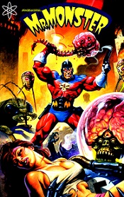 Written by Michael T. Gilbert. Illustrated by George Freeman (layouts by Gilbert).
Colours: Laurie Smith. Letters: Ken Bruzenak.
Reprinting: the story originally published in Penthouse Max #3 (1998)
Suggested for mature readers
Rating: * * * 1/2 (out of 5)
Number of readings: 1
Reviewed: June 2015
Published by Atomeka
Mr. Monster is a somewhat tongue-in-cheek adventure character who has appeared variously in his own series and in specials and anthology comics. Although created by American Michael T. Gilbert apparently the character's roots lie in a Canadian comic book character who appeared very briefly in the 1940s, and then lapsed into the public domain -- Gilbert's appropriation of the character more as an homage, or because he liked the name, rather than because the character itself was that brilliant (I think Gilbert re-invented him a lot) or out of any mercenary impulse (I'm pretty sure not many people had heard of the character when Gilbert recycled it).
Mr. Monster is also known as Doc Stearn and basically blends elements of costumed super heroes and pulp fiction adventurers like Doc Savage as he battles monsters and aliens and the like.
In Worlds War II (also known as Mr. Monster vs. The Nazi from Mars) the story takes place in a kind of alternate reality 1960s when earth is invaded by, well, Martian Nazis. It's all meant to be cheeky and evocative (the Martians modelled after a notorious trading card line from the period -- with appropriate nods to H.G. Wells' War of the Worlds -- except with added swastikas and a certain historical dictator's disembodied brain involved).
There isn't really a lot of deep characterization, or even a great deal of concrete plotting -- which makes it surprising it works as well as it does! At 48 pages it clips a long at a good pace, starting fast and furious and not really letting up much over the rest of the story (and is deliberately a bit gory -- in a tongue-in-cheek way). Mr. Monster finds himself playing hit n' run with the Martians (who have also infiltrated the army and halls of authority -- in addition to simply marching across the landscape incinerating everyone in their path) eventually taking him and his allies to Mars itself. As mentioned, it's all tongue-in-cheek, a style that I can be ambivalent about (as it means it's not really funny-funny, even as you aren't supposed to take it seriously or become emotionally involved) but here that style sustains itself better than I'd expect given the page count.
It helps that Gilbert, as mentioned, keeps the action moving, and does provide at least nominal plot aspects (even if it's just MM and a woman he's befriended seeking shelter in the sewers). It's also aided a lot by the visuals.
Gilbert himself provides the lay-outs (Gilbert also an artist in his own right) but the actual pencils and inks are by George Freeman. Freeman's an artist I'm something of a fan of and his style, which tends to blend super heroic-ism with cartoony caricature normally, suits this story's mix of heroic action, sci-fi horror, and camp silliness. In some other work I've seen by Freeman over the years, I've often thought the difficulty is finding an inker that is sympathetic to his light, feathery line work, with Freeman generally his own best inker (and Freeman has often worked simply as an inker over others). By this point in his career Freeman's own inking is firmer, heavier than the style he used to employ, but it's still good work, well suited to his pencils. (Gilbert and Freeman have collaborated before, notably on some Elric of Melnibone comics in the 1990s). Aiding the visuals are the vibrant, rich colours of Laurie Smith, giving the whole a kind of technicolour lushness (and perhaps further evoking the old trading cards). Perhaps it means that despite the frivolous plotting and tongue-in-cheek story, the visuals do create a vibrant world around the action.
(Interestingly: as mentioned, apparently the character's origins were in a Canadian comic, but Gilbert's version is inarguably American, and publisher Atmokea is American. However, both artist Freeman and colourist Smith (who I believe are married) are Canadian -- and in the opening credits, "colour" is spelled with a "u" rather than the American "color." I don't know why, but just found that interesting.)
Admittedly a qualm about the material is the whole frivolousness of it, with Gilbert treating the idea of Swastika-adorned villains and Hitler's brain as simply silliness, which one might argue trivializes the real life atrocities. But equally one could argue Gilbert's feeling is the Nazis were so obviously evil, it's not like he has to sombrely address that fact in a comic about Martians.
I'll admit, I picked this up partly just for the art (Freeman an artist too rarely seen) and with no knowledge of Mr. Monster, or much expectation of enjoying the campy style. And though I wouldn't want to suggest this is even a minor classic of sequential storytelling, it did keep me turning the pages to the end.
So -- a reasonably fun romp.
ON TO > SF Page Six
BACK TO < SF Page Four