The
Masked Bookwyrm's Graphic Novel (& TPB) Reviews
The
Masked Bookwyrm's Graphic Novel (& TPB) Reviews
Miscellaneous Superhero Graphic Novel and TPB Reviews ~ I - J
A
- B - C - D
- E - F - G
- H - I - J
- K - L - M
- N - O - P
- Q - R - S
- T - U - V
- W - X - Y - Z
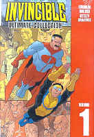
Invincible: Ultimate Collection, vol. 1 2005 (HC) 290 pages
Written by Robert Kirkman. Illustrated by Cory Walker, Ryan Ottley.
Colours: Bill Crabtree. Letters: Robert Kirkman.
 Reprinting: Invincible #1-13
Which were also reprinted in three TPBs: Invincible: Family Matters (rep. #1-4), Invincible: Eight is Enough (rep. #5-8), Invincible: Perfect Strangers (rep. #9-13)
Rating: * * * (out of 5)
Number of readings: 3
Recommended for Mature Readers
Published by Image Comics
The funny thing is, I've had this for a while -- but hadn't posted a review. And that's 'cause I found myself wobbling back and forth. In fact, I did post a review of the second TPB volume at www.ugo.com here. and, looking it over, I realize I was quite enthusiastic about the series. Strangely, Invincible seems to be something where the more I read, or the more times I re-read the same issues, the more my enthusiasm seems to wane. Or maybe I'm just a grumpy old cuss.
Invincible is about teenage Mark Grayson -- a second generation super hero whose father is the Superman-like Omni Man. But this is no family secret, no revelation Mark learns on his father's death bed or anything (as other stories about second generation super heroes have been). Rather, Mark lives in the bosom of his nuclear family, where mom makes the lunches and dad zips off to fight giant monsters, while Mark deals with the everyday of going to school, flipping burgers at his after school job, etc. When he suddenly begins to manifest super powers, Mark's reaction is a pleased but phlegmatic: "It's about time."
And thus he begins his super heroing career...and thus begins Robert Kirkman's mix of action, comedy, drama and parody, as Mark sets out to be a super hero in a world where his dad can show him the ropes -- and introduce him to the super hero community's costume designer! -- and where at his first encounter, he is invited to join the resident teen age group, the Teen Team.
The first four issues (originally collected as Family Matters) establish the core concepts and, though rambling and episodic, do tell a self-contained story arc -- literally! The first issue begins with an action scene...then we jump back six months and that scene isn't repeated until the fourth issue. But these early issues seem to be finding their way a bit, as the creators settle on the right mix of comedy and drama, in a series that is both a sly spoof of the super hero genre...and a serious super hero story where serious things occur with serious consequences.
Part of the point is to focus as much on Mark as on his alter ego of Invincible, where the day-to-day of his life at school and dealing with friends are given as much page time as his super heroing. And this sort of works -- putting a human focus on the super human story -- and it sort of doesn't. The problem, in a way, is that Mark's everyday life is rather, well, dull. He has few worries about money, math or dates -- in a way, his "normal" life seems as much a fantasy as his super heroing. If he has a hassle at work -- he just quits. When Stan Lee and the gang put as much emphasis on Peter Parker's life as they did Spider-Man's in the old Spider-Man comics, it worked because Peter's life was dramatic (and funny) on its own.
Kirkman and company also come from the "decompression" movement in comics -- where little scenes are stretched out over a lot of pages. Scenes that would be cute for a couple of panels get stretched out over a couple of pages, and conversations that might have more impact condensed into a couple of well chosen sentences take up reams of paragraphs. Kirkman and company even cheekily draw attention to what they're doing in a scene where Mark meets a comic book artist who talks about how scenes can be padded out by simply repeating the same image over again.
Kirkman also seems to be following in the footsteps of a lot of modern creators who like the idea of playing with an already established super hero universe -- even if it's not already established. So instead of developing this reality, we are tossed into an instant universe of pre-existing super teams and arch foes. And as part of this short hand creativity, Kirkman happily fills it out with characters that are meant to be knowing homages/rip-offs/parodies of established super heroes.
But by constantly throwing in homages to everything from Star Trek to comic book villain Kobra, Kirkman pretends he's creating a reality when all he's doing is piggy backing his ideas on others' creativity, while coccooning his lack of originality in a critic-proof shield of parody. And the idea of Invincible spending a few pages fighting a villain where we never really know why (because that "plot" happens off the page) seems a bit, well, lazy.
Ironically, Kirkman loves the idea of continuity -- but often more in its regards to throw away bits and jokes. In issue #1, Mark accidentally tosses a garbage bag into orbit. In issue number 5, we cutaway to the garbage crashing to earth -- in a scene that is amusing if you had read #1...completely bewildering and unexplained if you hadn't! The series is full of that -- little cutaway scenes that will make no sense if you haven't been following the series. Yet when it comes to the more serious plot developments, Kirkman doesn't thread things quite as cleverly. There's a major twist part way through these issues -- of the "nothing will ever be the same!!!" variety. Yet even re-reading the prior issues, you can't really say there are any hints or foreshadowing of it.
Which maybe is the fundamental problem. I first read volume 2, and really enjoyed it, loving it as much for its promise as for itself, aware that I was missing a lot of the greater context. But having now read the entire 13 issue opening arc, a couple of times, I find that Invincible is something which kind of loses, rather than gains, something in multiple readings. There's an inherent shallowness to it all...even despite its shift into darker, more serious turns. It's a breezy little confection that is initially fun because it's so obviously fuelled by a fan boy geek sensibility and a self-reflective sense of whimsy...but fails to quite rise above that.
Like so many modern comics (in the wake of Alan Moore's The Watchmen) seeking to find the "reality" in the fantasy, I'd argue once again, Kirkman and company (like Moore) have kind of missed the point. There are moments of believability -- a beautiful, minor scene where Mark is in outer space for the first time and just stops to look around him -- but in other ways, Kirkman doesn't seem to realize how a real person would react in certain situations. Kirkman imbues Mark with some autobiographical aspects by making him a fan of comic books and zombie movies (Kirkman writes the zombie comic Walking Dead), but then has Mark witness things like a school chum being blown up before his eyes...without so much as batting an eye!
In fact, Kirkman's cavalier approach to "collateral damage" undermines the very "humanity" that he would seem to be trying to emphasize (maybe being so into horror movies, as Kirkman is, really does warp your ability to feel compassion?!?).
And what started out seeming an "all ages" romp gets increasingly less so, with racy humour and ultra gory violence making it for "mature readers". If the series had started out that way, fine, but even Kirkman acknowledges in an editorial (printed in one of the TPB volumes) that he was aware the series was perceived as somewhat family friendly, and that people might be put off by the sudden -- and uncautioned -- switch. The series isn't even sold with any "mature warning" warning on the cover (hence why leaving publishers to rate themselves is a bad idea).
The art on the series starts out by Cory Walker, then is assumed by Ryan Ottley. Both men have sufficiently similar styles that there isn't a significant visual shift in the series, and the art is of an open, cartoony style that is kind of appealing -- energetic and telling the scenes well. But though the style suits the series, which, after all, straddles comedy and drama, it kind of gives it a sort of Archie Andrews look and maybe ads to my feeling of distance, of not quite getting into the emotional heart of the characters.
These 13 issues were also released in smaller TPB collections. The first volume (Family Matters) is still finding it's way in terms of tone, but at least it provides an appropriate jumping in point, and does introduce a story arc that begins and ends in those issues, making it the most satisfying read on its own. The second collection (Eight is Enough) is more problematic -- it was the first one I read, and I really enjoyed it, it exciting me about the series. But it's also obviously just a middle act, either featuring a dramatic revelation that will have less impact if you haven't read the earlier issues, or clearly setting things up for the next TPB. Still, it features enough stand alone parts that it can be enjoyed for itself. The third volume contains the big climax to the first year long story arc, but Kirkman is too much a part of modern comics writing (which tend to eschew text captions or recaps) so I suspect it really won't read very well on its own.
The story in issue #5 perhaps best epitomizes all the things Kirkman's trying for -- the quirky humour, the adventure, the portrayal of what it would mean to be a guy just becoming a super hero, all wrapped up in a single issue, coherent story (a thin story, but a story). It's a really good one-off issue. But too few of the rest of the issues rise to its level.
Heck, when you get to the end of the 13 part arc...you don't really feel like you reached the end of an epic saga.
Ultimately, there's a lot of fun, a lot to like about Invincible...but I'm just not loving it. (And, ironically, given my qualms about the comics' violence...apparently an animated TV series for kids based on Invincible is in the works!)
Cover price: __ CDN/ $34.95 USA
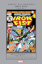
Marvel Masterworks: Iron Fist, vol. 1 (2011) 254 pages
Written by Doug Moench, Tony Isabella, Chris Claremont, Roy Thomas, with Len Wein. Pencils by Larry Hama, John Byrne, Arvell Jones, Pat Broderick, Gil Kane. Inks by Dick Giordano, with Al McWilliams, Vince Colletta, others.
Colours/letters: various
 Reprinting: Marvel Premiere #15-25, Iron Fist #1-2 (1974-1975)
Additional notes: intro by Roy Thomas; covers
Rating: * * * 1/2 (out of 5)
Number of readings: 1
Review posted: Oct. 2024
Published by Marvel Comics
These early issues of Iron Fist (well, beginning with a long run in the "try out" comic Marvel Premiere before getting a self-titled comic) reflect the weird pattern of a lot of comics from that era. Properties were seeming rushed into production with no creative hand at the helm, writers and artists dropping in and dropping out even as there's a story arc being developed.
I should also add that I've noted with a few Marvel Masterwork -- and other collections of sequential runs -- that sometimes, whether by wild happenstance, or careful dividing by the book editors, they sometimes satisfy as "graphic novels", with a storyline resolved in these pages. That's not true here. That's not to discourage buying it -- the initial story arc, bumpy as it is, does build to a resolution, but then another arc is begun. The final issue isn't a cliff hanger, but it ends in mid storyline.
But of course part of the appeal of these collections isn't just to read a "story" but to visit the seminal stories, the ones that laid down the foundation stones for any later developments.
So the series kicks off with Old Masters at the helm, writer Roy Thomas and artist Gil Kane. The two, according to Thomas' intro, collaborating on the series' creation. As I say: this was a time of expansion and comics got rushed into production often on the whiff of an idea. Thomas wasn't even a big martial arts fan, but martial arts were big in pop culture then and Marvel had some success with their Shang Chi, Master of Kung. So it seemed reasonable to try another martial arts hero. Borrowing bits from Lost Horizon (a time lost city in the Himalayas), the TV series Kung Fu airing then (with periodic flashbacks to our hero as a bald youth training in the temple), and a familiar comic book origin involving a murdered parent, plus an homage to an old Bill Everett comic from the 1940s, Iron Fist emerged.
And since the comic was meant to capitalize on the martial arts craze, the fight scenes are protracted -- even by superhero standards -- and Thomas (and the subsequent writers) carefully label the moves (monkey blow, etc.) so aficionados can feel like there's some verisimilitude to it all.
The first issue gives Iron Fist an origin, and an agenda -- one rife with more moral ambiguity than some superheroes as he wants murderous revenge on the man who murdered his father. The story is young Daniel Rand is taken by his father, along with his mother and his father's business partner, Ward Meachum, into the Himmalyas in search of a mystical city. But Ward murders Daniel's father and leaves mother and son to the elements. Mom gets killed, too, but Daniel finds the mystical city of K'un Lun (that exists in our world only every ten years) and is taken in, and trained in the martial arts, becoming the greatest of their number even acquiring the power of the iron fist wherein he can super-charge his fist through force of will.
Danny/Iron Fist returns to New York ten years later, bent on finding Ward and killing him -- and this is where the creative musical chairs begin. Larry Hama comes on board as artist (Hama better known these days solely as a writer!) and is quickly joined by Doug Moench as writer -- Moench seeming a good fit as he would have great acclaim writing Shang Chi, Master of Kung Fu. And it is a good fit, at least in the sense that he develops a voice for the series. But then he and Hama are gone after Moench's three issues. Hama's art was solid; he lacked Kane's dynamism but could be good at faces and close ups, and some stylish storyboarding (possibly part of Moench's script directions). His final issue seemed his best (and reflected a Neal Adams influence -- Hama apparently working in Adams' studio, along with inker Dick Giordano who became a mainstay over at DC Comics). It makes you wonder what might have been in later years if Hama had stuck with pencil instead of switching to a typewriter.
They're followed by Tony Isabella and Arvell Jones to, I'll admit, an increasing slide (from Thomas/Kane to Moench/Hama to them). I say that as someone who generally likes Isabella's writing, feeling he usually puts in more effort than just writing a twenty page fight fest. While Jones was a perfectly competent artist but one who never really had any particular strengths that overcome a general sense of average-ness (at least at that time; I'm not familiar with how his art evolved and given his art was fundamentally OK, I'm sure he improved).
But then came a seismic creative team change -- one that not only affected Iron Fist but, in a sense, comics in general. But before we get to that, we'll stick with the first few issues.
Because they are kind of decent.
As I say, this was a weird aspect of comics in the Bronze Age -- comics started but with a constantly changing creative team, making it hard for the series to find itself. How much the writers were following an out-line and how much they were just weaving new tapestries out of dangling threads left by the last team, I'm not sure.
The original arc is, of course, Iron Fist's quest for revenge against Ward Meachum -- but it gets more complex and twisty as it goes following the comic book formula of shorter arcs that run together forming larger epics. So Iron Fist is befriended by Professor Lee Wing and his adult daughter, Colleen Wing -- Wing Sr. in need of a body guard because an Asian cult has been hounding him for years. And while Iron Fist goes off to confront Ward Meachum (and finding that Ward has anticipated his return, sicking assorted killers and mercenaries on him) Iron Fist finds a mysterious ninja keeps appearing to aid him (and then disappearing again). Plus, along the way, Iron Fist gets (wrongly) accused of murder and hunted by the police. These threads overlap and eventually tie together, making for a run of issues that though leaning a bit hard on the action/fight scenes, does manage to get you curious about what it all means and how it all ties together.
When the mysterious ninja was introduced had his backstory been planned by the original writer? Had this denouement to Iron Fist's vendetta against the hollow and broken Ward Meachum been intended by Thomas & Kane? As I say: I don't know. But it works well enough in its twists and turns. And there's some interesting, low key atmosphere, especially in the Moench/Hama issues. Though as I say, I found the Isabella/Jones issues less effective.
One of the odd things is how Colleen Wing is introduced -- namely that little is said about her background (she even is conspicuously coy about her job). A few issues later Misty Knight pops briefly into the story, just long enough to allude to Colleen being her business partner and attract Iron Fist's eye. It's strange because, of course, to modern readers we know all about Colleen Wing and Misty Knight being private eyes and so I half-wondered if they had already been introduced in some other comic. But no -- these issues are apparently their first appearances. So it's unclear how much this backstory was established (was there a series "Bible" like TV shows have?) and the writers were just having trouble working it into their scripts, and how much they were making it up as they went. The first allusion to Misty Knight's bionic arm isn't until the final issue in this collection -- and even then it's slightly cryptic! If they were just making it up as they went, and Colleen wasn't necessarily a PI when she first appears, and Misty didn't have a bionic arm until later, it's interesting that in her first appearance there's a little spark of attraction between Iron Fist and Misty (an early inter-racial chemistry in comics) -- and that was something the later writer picked up on and developed.
The later writer. Yeah, that's where we get to that big change. Because after rotating writers, finally a writer settles in and decides to stay: Chris Claremont. His first couple of issues are drawn by Pat Broderick -- pretty early in his career. Broderick's art is among the best here (particularly in one issue inked by Bob McLeod) but he hasn't yet developed his quirky personal style he would come to have. And after Broderick comes -- John Byrne. Like most of the people here, this was early work for Byrne, but it's still arguably the best art in this collection (and it's interesting seeing Al McWilliams inking over his pencils in a couple of issues).
And this is what I mean by seismic because the Claremont/Byrne pairing proved quite a combo in the 1970s, working on a few different projects together, with the most significant their time collaborating on The X-Men.
Once they're together the comic takes on a whole other level of polish and professionalism. Byrne's art, even this early in his career, is solid and attractive, and Claremont's scripts mix action and fisticuffs with character stuff and ambition. He tries to find a character for Iron Fist (emphasizing him as a stranger in a strange land) and tries to flesh out his supporting cast, with Misty becoming a co-lead.
It's a bit odd, therefore, that I didn't like it more than I did!
Maybe it's a little too smooth, a little too sure-footed. It lacks some of the raw uncertainty of the earlier issues where part of the fun is seeing how the different creators pick up the ball and run with it. Maybe it's because with the early issues you can be caught up in the mysteries -- of Ward Meachum, of the ninja, of just Iron Fist himself. By the time Claremont and Byrne are on board, it's a more settled adventure series. Which isn't to say their work isn't good, it is (including later issues I've read from the series). But the original arc does boast a unique atmosphere of intrigue to it.
Claremont also starts to subvert the material a bit. Namely, he starts playing with the idea of sexism. Claremont was seen as maybe the premiere writer of "strong" women in comics at the time (for a man, anyway) and with Iron Fist he has ready made characters to play with: Colleen and Misty, making them default co-leads. But more, he adds in that Iron Fist is a bit unconsciously sexist -- and more, that K'un Lun was a sexist, patriarchal society. This is what I mean by "subvert" because prior to Claremont, K'un Lun was mostly presented as a kind of romantic ideal. Claremont brutally deconstructs it (especially in the flashback story that is told in the final issue in this collection). In a way, it can feel a bit like what a modern writer might do: taking on a beloved property then up-ending it with a "everything you thought you knew was wrong" story.
On one hand, it can maybe be because Claremont wanted to use the series to expound more feminist ideas. And the storyline he begins (and is left unresolved in this volume) involves them getting embroiled with a Middle Eastern nation with its own patriarchal and sexist attitudes. Again -- maybe because Claremont wanted something for his strong women heroes to push back against.
But I suppose equally it can seem a bit xenophobic. K'un Lun is no longer a Utopian Shangri La, the bad guys are foreigners, while America is the land of equality.
Which brings us to a controversy commonly brought up about Iron Fist today: the question of racism. Or specifically the idea of the white hero mastering the Asian martial arts. But the whole thing is a bit more ambiguous and curious.
The first thing I would point out is that Marvel already had an Asian Martial Artist, Shang Chi -- so the idea of making Iron Fist white might simply have been to make him "different" in a media landscape already dominated by Asian Martial Artist heroes (with Bruce Lee in the theatres, etc.)
What's equally interesting is whether there was some ambiguity about Danny Rand/Iron Fist's ethnicity -- and this maybe relates to the changing creators maybe losing track of threads. Because it's never explicitly explained how Danny's father knew about K'un Lun, and there are some cryptic remarks implying he was from there originally. So at some point in the creative process was Danny supposed to be Eurasian (ie: mom white, dad Asian from K'un Lun)? But it got muddled and lost in the creative change overs?
Equally curious is Colleen Wing. Because she seems drawn as Eurasian at best (with brown hair rather than black, pink complexion, and vague features); when I first encountered the character (in stories from a later period) I didn't realize she was supposed to be Asian! Her dad is drawn a little more Asian-looking but we don't see a mother in these stories. I guess my point is, I'm less troubled by Danny being white (given Shang Chi, etc.) than the feeling they weren't comfortable with making Colleen explicitly Asian.
And as I say, the propensity toward Asian/foreign villains, especially in the story arc Claremont/Byrne commence, is maybe more problematic than Iron Fist's ethnicity.
Anyway, bottom line: these early issues are another case of a comic seeming to bounce around, being tossed from creative hands to creative hands like a hot potato -- but that's kind of its appeal, seeing the character and his world slowly develop and be defined. The early issues are atmospheric and intriguing, precisely for their unevenness, and the Claremont/Byrne issues are solid and sure-footed. Making for a decent run of stories.
Jack Staff: Everything Used to be Black & White 2004 (SC TPB) 352 pages
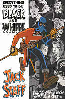 Written and illustrated by Paul Grist.
black & white
Reprinting: Jack Staff #1-12 (1st series from Dancing Elephant Press -- 2000-2003)
Rating: * * 1/2 (out of 5)
Number of readings: 1
Reviewed: June, 2010
Published by Image Comics
I'm a creature of impulses. I picked up (in the cheap boxes) the mini-series Albion, a modern series resurrecting some old British comic book characters. I hadn't liked Albion...but it had piqued my curiosity about a British comics era of which I knew nothing. This led to my picking up some hard cover collections of old British comic book characters. And then I stumbled upon references to Jack Staff, a series of which I'd also previously never heard, but which prior to Albion had also nostalgically mined the pages of old British comics for inspiration. And I immediately went about getting my hands on this TPB collection of the original 12 issue series.
Actually, Jack Staff isn't just mining old British comics.
Apparently writer/artist Paul Grist had first pitched the idea to Marvel Comics using their existing UK hero, Union Jack. When Marvel passed on the plot, Grist decided to use it anyway, renaming his hero Jack Staff (I believe a synonym for Union Jack), slightly redesigning his costume (and giving him a quarter staff evocative of the original version of yet another Marvel UK hero, Captain Britain). And Jack Staff joins the long list of modern day super heroes that exists as a kind of nostalgic homage, with occasional aspects of parody.
And, I'll admit, I'm beginning to max out on such properties that first really took root in the 1980s. The whole gimmick is to do comics that not only aren't original...but where they're supposed to conjure up feelings of warm nostalgia because they put you in mind of something else. Here even accidentally using pre-existing names like "The Freedom Fighters" and "Star-Spangled Kid".
In the case of the opening four-part arc (Previously collected as Yesterday's Heroes), it really was intended to be other characters. The story begins in the fictional English city of Castletown, where a series of vampire-like murders are occurring. Meanwhile, Jack Staff ("Britain's Greatest Hero" as we are constantly, cheekily, reminded) hasn't been seen in decades. But he hasn't gone anywhere -- or even aged apparently -- merely hung up his fighting togs. But the slayings bring him out of retirement, cuing periodic (brief) flashbacks to his WW II days with a bunch of other heroes, including the American icon, Sgt. Stripes, and how they find a vampire's victim among bodies pulled from a blitz bombing, leading to a showdown in underground caverns where the vampire is seeming killed by a stalactite. And, um, yeah, if that seems familiar, it's because that was the story in The Invaders #7-9 (except he was skewered by a stalagmite)! Now in modern Castletown, the vampire seems to have returned, even coinciding with Sgt. Stripes' visit to the UK, the good Sgt still alive thanks to -- wait for it! -- being frozen in ice for decades. Yes, I know it's a homage, and this really was intended to be a story for Union Jack and Captain America...but couldn't Grist have at least come up with some cosmetic changes, just to made it seem, you know...original?
Grist presents his own instant universe of heroes and villains, including a plucky "girl reporter" (there's a heavy helping of tongue-in-cheek throughout), a robot named Tom Tom, The Robot Man (modelled after an earlier British comic book character, Robot Archie) and a branch of the UK government that investigates the paranormal, called Q (whether they are based on a specific previous comic, or simply meant to evoke all the sundry similar concepts, I'm not sure -- possibly Grist was thinking of the TV series, Sapphire & Steel).
Initially the story seems oddly paced, cutting between different characters (and narrators) so that you often aren't even sure who the "main" character is supposed to be, and with distracting logos and titles filling up half the page. The pace is brisk, as Grist rockets from one scene to another, but it's kind of distracting.
But it's part of the whole homage thing. British comics were often anthologies of newspaper-like comic strips told in weekly two or three page instalments. Grist's use of two or three page sections, telling parts of the same story, yet focusing on a different character, is meant to evoke the old British anthology comics.
Once that opening four part story is over with, Grist throws himself even more heavily into his homage to British comics. Though it makes you wonder about the various copyrights. Grist brings back master criminal The Spider, by name, now elderly and semi-retired. Yet with others, Grist uses thinly disguised homages to old characters...so there's Victorian escapologist, Charlie Raven, who is meant to be Janus Stark, and a guy with a metal hand who can turn invisible, called The Claw, when the 1960s character was The Steel Claw. Though is the Spider portrayed here, an elderly gentlemen thief, really evocative of the bombastic 1960s super villain? Or Janus Stark had Elongated Man-like malleability, whereas Grist's Charlie Raven just seems like a talented, but otherwise normal, escape artist.
Given how long ago and obscure the British characters are, maybe Grist was attempting to pay tribute to characters...he only half remembered.
And it's not just comic book characters Grist pays homage to -- a long haired, bearded mystic in one scene may be intended as a nod to comics writer, Alan Moore.
This is obviously a labour of love on Grist's part for the very idea of British super heroes. Grist's introduction even assures American readers not to be scared off by the Britishness of the series. But that assurance is unnecessary. There are only a few throw away quips that betray its Englishness, references to sitcom star Victor Meldrew, or talk show hosts Richard and Judy. The most blatantly non-American aspect is perhaps the way Americans can be depicted in a somewhat unflattering light. And though I don't object to that (it's perhaps healthy for American readers to realize that outside of their borders, America isn't always viewed as an unarguable force for justice and righteousness), it can smack of setting up a straw villain.
But despite Grist's obvious enthusiasm for his material...it doesn't fully work for me.
Grist seems more concerned with form than content, style rather than substance. And this despite there being some clever aspects to the telling -- like the way Grist will use jumbled chronology (showing a scene, then cutting back to a scene leading up to it). But it can make it all just a little confusing, too. And sure, that's the point, to separate the lazy readers from those willing to put some effort into it. But the problem is, I just wasn't interested in the characters or what happened to them enough to invest that extra effort -- nor was the effort often rewarded.
So much of this is tongue-in-cheek homage (without being out-and-out funny -- camp more than comedy), too much of it is about the surface, where scenes and events are thrown in, just for the sake of throwing them in. There's a scene where we, the reader, are suddenly being addressed by a magician character, presumably meant to evoke those old Lee-Ditko 1950s fantasy stories which would similarly break the "fourth wall". Then he reappears a few issues later -- but for a similarly pointless effect. Well, pointless in terms of telling a story, evoking emotion, or developing character.
The title of this TPB collection is a joke on the idea of these issues being black & white (the later Jack Staff comics were colour), but would also seem to imply some deeper examination of ethics and moral complexity...but it doesn't.
Because the comic acts as one extended homage, Grist doesn't really seem to worry over much about the underlining glue that holds a narrative together. Heck, by the end of these 12 issues, we still don't really know much about Jack Staff himself -- he is a cipher, nothing more. Few of the characters really grow or evolve much over 300 plus pages. And as such, it's hard to care about them.
Like with so many others in the "homage" genre (which has seen the likes of Alan Moore, Kurt Busiek, Jeph Loeb, Robert Kirkman and others take it on), it all feels a bit lazy. Grist is just having fun, so he focuses on the scenes he wants to write and draw, but forgets drama has to be built on the lesser moments to, the scenes that aren't necessarily splashy, or clever, but provide foundation for the rest. It's like a musician who decides he only wants to play sharps, and so just skips over the flats -- resulting in an awkward, unsatisfying melody.
Grist's art style is also a bit problematic, at least for a super hero comic. He has a Spartan, cartoony style (in contrast to the more stereotypical British comics art style which tends to be more detailed and realistic). And though I've grown to appreciate such a style, Grist's particular version of it leaves me mixed. It can sort of be effective in spots -- he certainly has his own technique. But it further adds to a sense of superficiality. His panels are often devoid of much background or context, making it hard to orient yourself in a scene. His figures are stiff and cartoony, and the very simplicity of his art -- particularly here in black & white -- is that it's occasionally hard to recognize and/or distinguish minor characters from scene to scene. And given the frequent changes -- jumping from past to present, and different character chapters -- the series would've benefitted if Grist could employ differing styles. He does some clever things with composition and angles, but many of the stylistic/visual gimmicks are just that -- gimmicks. Form rather than content, the medium more than the message.
I fully appreciate some people love that stuff. I can, too. But storytelling tricks should serve the plot and characters...not the other way around.
And despite the inherent simplicity of the art, Grist is apparently a notoriously slow producer (presumably he has a day job). This 12 issue series was published over four years!
Even though this represents the complete 12 issue series, it immediately jumped to Image comics and continues to this day (still on a ridiculously slow schedule). As such, though the main adventure plots/story arcs do resolve by the end (there are four or five over these 12 issues), there are plenty of cryptic scenes, and unresolved sub-plots. Making it a tad unsatisfying. Heck, we still don't know why Jack Staff quit years before!
In the end, Jack Staff puts me in mind of that painting by Rene Magritte in which a picture of a pipe hovers above a caption that translates as "This is not a pipe." After a moment of puzzlement, the viewer is supposed to understand: it's not a pipe...it's a painting of a pipe. In a sense, Jack Staff strikes me as not being a super hero comic...so much as it's a comic about a super hero comic.
Cover price: __ CDN/ $19.95 USA
Back to