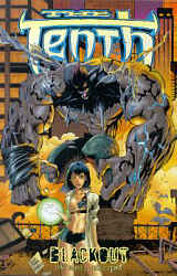
 The
Tenth: Blackout 1997 (SC
TPB) 112 pages
The
Tenth: Blackout 1997 (SC
TPB) 112 pages
The
Tenth: Blackout 1997 (SC
TPB) 112 pages
Written by Tony Daniel (plot), Beau Smith (script), Pencils
by Tony Daniel. Inks by Marlo Alquiza, others.
Colours: Paul Mounts. Letters: Kell-o-graphics. Editor: Bahareh Harandi.
Reprinting: The Tenth (monthly series) #1-5 (1997)
Rating: * * 1/2 (out of 5)
Number of readings: 1
Published by Image Comics
I picked this up (or, rather, the original issues) on a whim, knowing nothing about it. Originally published in the late 1990s, this was an Image comic at a time when Image had a rather, um, problematic reputation among comics critics, their comics tending to be seen as, well, more about the images than the story content (interestingly, in one of the accompanying letters pages, a reader remarks that he only reads Image comics).
But there is a kind of quirky fun to The Tenth. The premise involves Victor, the tenth of the title, who can mutate into a super strong monster (and has an apparent vampiric need for blood), Esperanza, a telekinitic, and her best friend, Zorina (not to mention her cat -- told you there was a quirkiness to it), who are on the run from the remnants of the evil cult that created The Tenth. Plus there's cutaways involving covert American agents, the Japanese secret police, a robot-girl killing machine, etc. It's kind of wild n' wacky and full of so many ideas just tossed at you you'd swear you were coming into the middle of an on going story, not the beginning issues.
Which it turns out you are! Because although these are the beginning issues of the monthly series, The Tenth actually kicked off in an earlier mini-series.
Which becomes problematic. If you haven't read that mini-series, things might seem a mite confusing, even as, as noted, it gives the series a kind of refreshing quirkiness as lots of "new" ideas are thrown at you and you're picking up on them as you go. On the other hand, if you had read that earlier mini-series, you might actually find there was a certain dearth of fresh ideas, as clearly a lot of the ideas, and the characters, are just being reiterated.
Still, there's a kind of quirky fun, with plotter-artists, Tony Daniel, and scripter Beau Smith not taking things too seriously (without sliding into being just a joke). Daniel's art is very much of the Image school, borrowing from the likes of Jim Lee and with a Japanese magna influence. And though I'm not always fond of that style, Daniel's style retains a (general) clarity, where, distorted monsters notwithstanding, you can generally tell what's going on. And there's a definite "Good Girl Art" aspect to it, as Esperanza and Zorrie are constantly being depicted in short-shorts, or mini-skirts that ride so high you can see their panties. But Daniel makes no pretence about his intentions -- the sexy babes are intrinsic to the marketing. And there's a logicless indulgence to it. There's no nudity, but the girls frequently find their clothes getting torn -- for no reason. Literally, one panel their clothes are fine, the next, there are gaping tears. Or, in some sort of fashion parade, Daniel will sometimes change what they're wearing -- when there was no time for the characters to actually change clothes!
Still, as mentioned, there's a kind of guilty pleasure fun to it all, as it clips along breezily. At least for a while.
But you can kind of tell this is an artist driven story, precisely because of all the wild ideas thrown in with little regard for logic or coherence. It's kind of fun, in a scene-by-scene, page-by-page way, but I wasn't really sure what was going on in a bigger "story arc" sense. And as someone who naively puts great stock in "storytelling", there's a certain problematical aspect to that. After all, the characters were first introduced in a "mini-series", which clearly didn't resolve much, as it leads into this series. These five issues were marketed as the opening story arc, but by the end, there are still a zillion things left dangling. So instead of being convinced Daniel can deliver on the plot, there's more a sense that he's just like Wile E. Coyote, running head tilt, hoping no one will look down and realize there's no ground under foot.
This is best regarded as a "mature readers" comic -- ironically, despite the blatant salaciousness, there's no nudity, but the violence does sometimes go over-the-top, and there is occasional profanity.
Ultimately, there is a kind of goofy fun to The Tenth, a kind of energy and infectious enthusiasm, with quirky ideas and underdressed babes...but after a while, I didn't really find myself caring overmuch, and there's a definite sense of disappointment when you reach the end of this story arc...and don't really feel like you've reached the end of anything. Interestingly, the comic carries accompanying hype notices about how it's taking the industry by storm and is becoming a massive hit.
Maybe yes, maybe no. Personally, I'd never heard of it, and I picked up these issues in the discount bin.
This is a review of the story as it was first serialized in the monthly comic.
Cover price: __
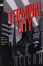 Terminal
City 1997 (SC TPB) 232 pages
Terminal
City 1997 (SC TPB) 232 pages
Written by Dean Motter. Art by Michael Lark.
Colours: Rick Taylor. Letters: Willie Schubert. Editor: Shelly Roeberg.
Reprints the original 9 issue mini-series (1995-1996) - with covers
Rating: * * * * (out of 5)
Number of readings: 1
Published by DC Comics / Vertigo
Terminal City is like coming home to a place you've never been to before. It's a delightfully evocative -- read cliched -- saga of opulent high rises, Damon Runyon-esque gangsters, misfits and dreamers...even as you're hard pressed to point to something else that's quite like it.
It's set in an alternate reality present where everything has a retro art-deco look that casts you back to a period somewhere between the 1930s and the 1950s, except this "present" is filled with robots, flying cars and airships. Terminal City is a once-great metropolis that has seen better days, as symbolized by the giant statue head that is the city's centrepiece -- it's a magnificent edifice, but it was intended to sit atop a body that was never built, a permanent reminder of the city's glory days gone by. The story revolves around the Herculean Arms, a lavish hotel that, likewise, has seen better days, and focuses on a variety of odd ball characters that inhabit it, or otherwise frequent it, and the various schemes they're either plotting or being caught up in.
Terminal City has a lot of strengths, and at least one major weakness.
Perhaps the principal character is Cosmo Quinn, a one-time superstar daredevil, the Human Fly, who's now a window washer at the Arms. His fall from grace occurred ten years before, when Terminal City was staging the Brave New World's Fair, at the same time various other characters -- Monty Vickers (a combination of Frank Buck and P.T. Barnum), Kid Gloves (a promising boxer), and Eno Orez (a famous actor) -- all saw their careers end. Now, in various threads, all of them have returned to Terminal City, for various reasons. Plus there's an albino lady mobster, Li'l White Lily, and various corrupt officials who are after a mysterious briefcase that literally drops into the Herculean Arms. They, and various sundry other characters, get caught up in the double crosses and machinations, twists and turns.
It's a lot of fun. Though Terminal City is something of a dystopia, there's a decided twinkle to the proceedings, a lightness. Terminal City is quirky, funny, and even silly...as well as serious and menacing. Writer Dean Motter doesn't let his quirkiness rob the characters of their reality, though, nor the story of its grounding. Weird and wonderful things may be happening (this is a world where Abominable Snowmen are on display at the local carnival and sleepwalkers walk on the side of buildings) but the characters react as real people would...if real people lived in such a world.
Though not a superhero story, per se, there are decidedly superhero elements in the larger-than-life characters, like Cosmo, who dons his Human Fly costume when forced to beard the bad guys, or an enigmatic Lady in Red who shows up in times of trouble with her bolo and pistols, and others.
The story can easily be seen as inspired by The Watchmen with its depiction of an alternate reality and a complex story about various characters stirred back to action ten years after their fall, told with some flashbacks. But it's a kinder, more whimsical version of The Watchmen. There are also, obviously, elements of film noire archetypes of gangsters, corruption and boxing rings, mixing with "Grand Hotel" and "Casablanca". Michael Lark's geometric art combines detailed realism and pleasing simplicity against a backdrop of lavish sets and little touches evoking early 20th Century cartoonists like George McManus and even Winsor McCay. And it's all boldy coloured by Rick Taylor.
Some of the in-jokes get a bit much, though, from a used robot lot peopled by every famous robot in film history to a robot clerk named Bazil who mistreats Manuel, the bellhop (echoing the classic British sitcom "Fawlty Towers") to a running gag involving a painter named Watt that invokes Abbott & Costello's "Who's on first?" routine. And many (many) more. Not to mention the endless stream of joke names and puns. It can pass clever and head directly to cloying.
But the main weaknesses with Terminal City are twofold.
One, an overall lightness, with characters who are likeable, even interesting, but a tad undeveloped. The thing's a genuinely enjoyable, twisty little tale, but remains steadfastly superficial. And as things progress, some of the coincidences seem a little too contrived, the resolutions too haphazard.
And two...well, just as this represents some of the best of comics, telling a tale that probably couldn't achieve the same effect of story and visuals just in a novel or a film, it also displays the flaw of so many comics folks. Namely the inability, or the unwillingness, to bring about closure. You read this complex epic of multiple characters and various sub-plots and you think "Gosh, how's he gonna bring this all together?"
The answer is: Motter doesn't entirely. Some of the main plot threads resolve, true, but other things never go anywhere and there are questions that are never satisfactorily answered. Either Motter didn't have enough of a grasp of the nature of storytelling, or he wanted to leave things to carry into the follow-up mini-series (Terminal City: Aerial Graffiti -- which I haven't read). The curse of comics is that everyone's looking for the franchise, the nest egg that they can keep coming back to. Not that Motter couldn't have resolved things tidily and still been able to return to these characters in the future. But I guess he just didn't trust the fickleness of the market enough.
I'm still giving Terminal City a thumbs up, 'cause it's refreshing and a whole lot of fun getting to the end...even as the end is a disappointment when it arrives. By doing so, though, I'm probably just encouraging one of the main problems keeping comics from being taken seriously by mainstream society, 'cause I don't think anyone'd get away with these kind of dangling plot threads in a movie or novel! It warrants a slight "mature readers" warning.
Cover price: $27.95 CDN./ $19.95 USA.
 Tom
Strong: Book One 2000 (SC TPB)
Tom
Strong: Book One 2000 (SC TPB)
Written by Alan Moore. Pencils by Chris Sprouse, with
Arthur Adams, Jerry Ordway, Dave Gibbons, Gary Frank. Inks by Al Gordon.
Colours: Tad Ehrlich, Mike Garcia. Letters: Todd Klein.
Reprinting: Tom Strong #1-7 (1999-2000) with covers
Rating: * * * 1/2 (out of 5)
Number of readings: 1 (some issues more)
Additional notes: "mock" biographical text intro about Tom Strong; character sketches.
Published by America's Best Comics
Tom Strong is the hero and champion of Millennium City, USA. Owing more than a tip of the hat to pulp hero, Doc Savage, Strong is a super strong, super intelligent adventurer/scientist/crime fighter with his own "family" of aides -- some literally family (his beautiful wife, Dhalua, and beautiful teenage daughter, Tesla, both almost as tough as he), and some figuratively (a robot, Pneuman, and talking gorilla, Solomon -- whose bickering relationship owes a lott to Doc Savage's Ham and Monk). Strong and his family are long lived, thanks to good genes and rare tribal herbs, and have lived in Millennium City for decades, acquiring a stable of recurring foes and a legion of admirers, including the fan club, Strongmen of America.
All of which is the premise of Alan Moore's mix of nostalgic homage, adventure, and tongue-in-cheek parody -- a premise that included over 30 issues of the Tom Strong main series, as well as assorted spin-offs and off shoot comics, from Tom Strong Family to Terra Obscura.
Moore, is of course, one of the most respected writers in modern comics, but as I've mentioned before, I tend to be more mixed in my reaction to his work -- liking some of his stuff, but other of his work leaves me cold, feeling Moore is too obsessed with intellectual deconstructionism than telling a story about people. Tom Strong clearly reflects some of Moore's vices...even as, at other times, it overcome them.
This collection of the first seven issues of the on-going series -- some stand alone tales and a four parter stretching from issue #4-7 -- are brimming with plenty of wild and imaginative ideas as Moore envisions his hero and his environs, coming up with clever -- and even genuinely menacing -- adversaries, like the Modular Man, a computer made up of individual robotic components that can literally overrun a city block (though Moore repeats himself, as later in this collection he throws in another foe that is basically the same concept, except organic rather than mechanical).
The art is mostly beautiful and effective throughout. Principal artist Chris Sprouse has a clean, clear style that is detailed, without being cluttered, and realistic, with just enough hint of caricature here and there to lend a deliberate cartooniness to things at time (Tom Strong is broad shouldered and implausibly top-heavy). And Sprouse has a nice eye for composition, capturing the necessary grandeur or mood of a moment. Adding to the art in occasional flashback sequences are such well-regarded talents as Jerry Ordway and Gary Frank. My main quibble (minor though it is) would be Arthur Adams, whose style is more cartoony than the others.
Conceptually, Tom Strong is part of a whole movement in comics, where one time fans turned comics professionals want to create their own properties...yet what they love about comics is the whole notion of the backstories and mythos that accumulate behind long established characters. So they create these "new" characters...that are deliberately meant to evoke established characters (or at least archetypes) and insert them into ready-made universes with an entire history of past adventures and "recurring" adversaries. (It puts me a bit in mind of an old Elric story by Michael Moorcock wherein a character wades into the chaos-stuff surrounding his known world, literally carving out new lands...including peoples who spring into being with their own history and culture already established). Moore's been this route before with Supreme and even The Watchmen, and Kurt Busiek's done it with Astro City, Robert Kirkman with Invincible, etc.
It's an irresistible idea (to be up front: I've done it myself in my own "small press" way). But it can also a bit lazy, as instead of building and developing your character and world, you just jump to the good stuff. But without the build up, it will never have the same resonance. Tom Strong having a showdown with his "arch" foe, Paul Saveen, fails to have the same impact as, say, Spider-Man battling Doctor Octopus...because Saveen barely appeared before. As such it has an intellectual, rather than emotional, resonance -- you enjoy it for what it's supposed to be like, rather than enjoy it for what it is. And sometimes it smacks of creators playing with the trappings of storytelling rather than the content -- like a painter more concerned with what colours he'll employ than what he's actually trying to paint.
In that vein, the opening intoduction text piece, done as a kind of pseudo history of Tom Strong, provides a bit of foreshadowing for some of the stories to come...but it's an introduction original to this collection, and wasn't part of the original comics!
With that being said, Tom Strong works better than some such examples of this particular sub-genre. As noted, Moore does offer up some clever concepts, and the plots are coherent plots, not just patched-together highlights. The "instant" history means that Moore (as he did in his Supreme run) will throw in flashback sequences supposedly showing an earlier adventure, often presented in a style meant to evoke older comics. And though there are aspects of Tom Strong that are clearly meant to be obvious rip-offs of other characters, Moore does offer some individualistic variations...such as giving him a wife and teen-age daughter to share his adventures. As well, sometimes in these sorts of projects creators can use their homage to stories of yesteryear as an excuse to dredge up attitudes best left in yesteryear. But here, Moore makes Strong's wife and daughter black.
Yet in other ways, Moore does happily employ archaic mentalities, such as Solomon, Strong's talking gorilla, being a product of Strong's experimentation -- something that older stories might've employed without a second thought, but modern sensibilities might regard as unethical and animal abuse. Though it does inspire an amusing joke when Tom first speculates on the idea.
And that's sort of the point -- and the problem -- with these sorts of projects. There's a sense that even the creators can't quite decide on a tone. Is it about characters and plots meant to stand on their own? Or is it mainly meant to be read as a nostalgic echo? Is it meant to evoke the spirit and sensibilities that the writer remembers imbibing from stories he read as a child...or is it meant to be a modern up-grade? Is it an affectionate homage to a simpler, less pretentious era of storytelling...or is it a snickering parody of stories the writer feels he, and his readers, have out grown?
And Tom Strong seems to be a little of all of the above. But, as such, some of the separate impulses cancel each other out...or at least dull their edges.
So there are aspects of tongue-in-cheek...even as there are other spots that are meant to be genuine adventure, or drama. But though Moore pulls it off enough that you can sort of like Tom and his family...you don't fully believe in them or their emotions. When, in the multi-issue arc, Tom's foes reveal the nature of their plan for ultimate revenge on him, it's dramatic...but not as dramatic as when it's been used in other stories which weren't cocooning themselves in a web of self-reflective artifice. And although there are amusing quips and humorous ideas, it's not really as funny as some other modern comics that come to mind -- comics that manage to take themselves more seriously, but nonetheless with funnier badinage.
Even the sensibility seems uneven. On one hand, Moore seems to be trying to evoke the wholesomeness of the days when comics were more family friendly...then can't resist throwing in raunchy and "adult" jokes, such as cleavage baring female Nazi pilots self-called "Slutstaffel".
And perhaps that's why I retain a certain ambivalence to Tom Strong. It is enjoyable, the plots decently paced, the ideas interesting. Tom Strong is a surer, more successful take on styles and themes Moore first tried in his Supreme run. It's beautifully illustrated by Sprouse and the others. For the most part it avoids some of the undercurrents that I feel have marred some of Moore's other works (albeit, I'm usually in the minority in feeling such undercurrents exist). For the most part it lacks the nastiness and violence Moore's stuff can revel in.
But at the end of this volume, you can find yourself entertained...but not really absorbed. The comic still more an intellectual game than an emotional journey. Moore's characters and their world likeable...but still more an echo than the real thing.
Coverprice: $__ CDN./$14.95 USA.
The
Town That Didn't Exist 1989 (SC
GN) 54 pages
Written by Pierre Christian. Illustrated and Coloured
by Enki Bilal.
Translated by Tom Leighton. Editor: Bernd Metz.
Originally published as "La ville que n'existait pas" (1977)
Rating: * (out of 5)
Number of readings: 1
English edition originally published by Catlan Communications
Slight Mature Readers warning
When a depressed town's old money patriarch -- who owns just about everything -- dies, no one knows quite what to expect. The disgruntled, impoverished workers -- many on strike -- and the bourgeois elite are all surprised by the arrival of the dead man's paraplegic grand daughter...and her unusual plans to make things better by literally remaking the city as a Utopia.
And that synopsis is part of the problem. In order to describe it, I have to practically give everything away. That's because "The Town That Didn't Exist" is basically a short story. Sure, many graphic novels aren't really novels, more like movies, but "The Town That Didn't Exist" isn't even that. I assume Pierre Christian intended it as more a fable or parable, rather than a full fledge story peopled by flesh and blood characters.
I'm not overly familiar with European comics, but this fits the (unfortunate) image I have of them. In fact, it's a bit like a European (or Canadian) Art movie. It's thin and shallow -- the idea, the high concept, is everything and there's little beyond it. It's not the town that doesn't exist, but the characters, who are essentially props rather than human beings.
Enki Bilal's art is nice to look at, but likewise cold and antiseptic. Comic book artists aren't just artists, but storytellers. Their images have to move the story along, conveying nuances, mood, etc. That doesn't really happen here. All the characters wander about with blank expressions (again, like an art movie) -- that is, when Bilal deigns to even show faces as opposed to backs of heads -- and the dialogue doesn't really flesh them out any better.
The premise is interesting, but not particularly original, and without enough story or characterization it just seems, well, awfully thin. In fact, if you pick it up, don't read the back cover description, or there really won't be any reason to read the interior.
Frankly, there was so little to it, I'm wondering if I came in the middle of a multi-issue story.
Original cover price: $16.75 CDN./$11.95 USA
The book has recently been re-issued in a slightly more
expensive hardcover version.
or, Back to: