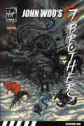
 John
Woo's Seven Brothers, vol. 1 2007
(SC TPB) 134 pages
John
Woo's Seven Brothers, vol. 1 2007
(SC TPB) 134 pages
John
Woo's Seven Brothers, vol. 1 2007
(SC TPB) 134 pages
Written by Garth Ennis. Art by Jeevan Kang.
Colours: S. Sundarakannan, Jeevan Kang. Letters: Nilesh S. Mahadik,
Sudhir B. Pisal, B.S. Ravi Kiran. Editors: Gatham Chopra, Mackenzie Cadenhead.
Reprinting: Seven Brothers (1st series) #1-5 (2006-2007)
Rating: * * * * 1/2 (out of 5)
Number of readings: 1
Published by Virgin Comics
Recommended for Mature Readers.
For all it's pretentions to grandeur and philosophy, Virgin Comics' line was very much of the gimmicky school adopted by fledgling comics publishers -- finding some pre-existing "name" to sell their comics. But instead of licensing a movie spin-off or toy line, they got famous non-comics creators to put their names on the comics...but how much active participation they had in the comics is the question since they didn't actually write and draw the comics.
Which brings us to Seven Brothers, credited to Hong Kong action movie director, John Woo (Hong Kong...and elsewhere, having made American and Canadian films as well), though this, the first of two mini-series, is actually written by comics scribe, Garth Ennis. Owing a tip of the hat to the old children's story about the Three Chinese Brothers (each with a special ability), Seven Brothers has seven guys of different nationalities and ethnicity summoned to a mysterious meeting where they are told they are each the descendants of an ancient Chinese sorcerer, each with a unique power, and they must unite to prevent an even more powerful ancient sorcerer, the self called Son of Hell, from conquering the world.
And the result is fairly vapid and thinly plotted...but a lot of fun, too.
Like a lot of modern comics, the actual story doesn't entirely justify being stretched over five months. The plot twists and turns are limited, and even the time span is one of those things where you aren't supposed to question it too closely (while the "brothers" are having their meeting and revelation...the villain is able to set his plan in motion, travel from China to Los Angeles, summon a supernatural body guard...etc. -- that's a looonnng conversation they're having!) And though there are seven guys (and one woman, the enigmatic Rachel who summons them), Ennis only really provides enough characterization for a few of them. That is, after five issues, you can't really say you especially care about the characters...or even really know who they are.
But that's all being critical.
Shutting off your brain, it's an enjoyable, breezy read. Despite my comments about a thin story, it nonetheless is paced out well, so that it doesn't feel slow or padded. There's a grandeur to the concepts, drawing upon real history (the saga having its roots in a real Chinese merchant fleet that set sail in the 1400s) and tying it into the mythical lines of power many philosophies believe ring the earth. There are off beat (if ill-explained) ideas, like Rachel's fighting ability that seems to defy time, or a pretty major mid-story twist where the brothers get pretty thoroughly defeated! The dialogue is generally good and colourful and there's a definite light-heartedness and comic relief element, particularly in the form of Rodney -- who talks in a never ending stream of street profanity and is a comedic would be pimp (we first meet him being beaten up by hookers). And Rodney ends up providing the closest thing the story has to a character arc. Now whether a pimp should really be portrayed as cute comic relief is a question for ethicists.
Of course this is Garth Ennis working with John Woo on a "Mature Readers" comic, so there's plenty of four letter words and brutal violence, just so's ya know.
The art by Jeevan Kang is quite striking and adds to the whole, particularly with rich, painted looking colours by him and S. Sundarakannan. The art is a sketchy and murky, and admittedly adds to why some of the "brothers" fail to quite stand out as distinctive figures (since it was hard to always recognize some of them). But it's generally effective, adding an extra sense of sophistication to the otherwise superficial story, with Kang nicely rendering the quiet scenes of people talking, the explosive violence of the action scenes, and the grandeur of the mystical and more apocalyptic scenes. If John Woo was involved in the actual plotting, one can see why he chose to present this story in a comic rather than on the big screen -- it would cost a fortune to film and still not be quite as visually striking.
And this actually is self-contained, coming to a climax that, though certainly intended to leave things open for a sequel (and Virgin published a follow up mini-series, by a different creative team) nonetheless it doesn't demand a sequel, with no glaring plot threads left dangling. It can be read for itself alone.
Don't go in expecting a profound or meaningful saga -- but as the comic book equivalent of a big budget summer action movie, this scores quite nicely. Stylishly -- occasionally breathtakingly -- visualized, with a brisk pace, some witty interplay, a grandly epic concept, and enough unexpected ideas to keep the pages turning, Seven Brothers is an engaging read.
This is a review of the story as it was serialized in the comics
Cover price: ___
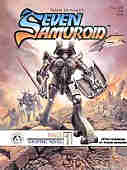 Seven
Samuroid 1984 (SC GN) 64 pages
Seven
Samuroid 1984 (SC GN) 64 pages
Written, illustrated, lettered by Frank Brunner.
Colours: Jan Brunner.
Additional notes: oversized, tabloid dimensions.
Rating: * * (out of 5)
Number of readings: 1
Published by Image International Publishing Corp.
Mildly recommended for mature readers.
The Seven Samurai/Magnificent Seven idea gets a hi-tech face lift in this graphic novel set in a galaxy spanning future. Millennia ago, robots with human minds were created to defend the defenseless, but eventually the robots became disillusioned and disappeared. Now on a planet being besieged by an evil warlord, a woman rebel uncovers one such Samuroid robot, who is reluctantly persuaded to join the fight for freedom, and he also sets out to recruit more of his long vanished comrades.
Written and drawn by Frank Brunner, this was a creator-owned property published by Image International -- no relation to the later comic book company. This was a branch of a New Zealand-based printing company that was, presumably, attempting to make forays into the comic book field. As a product, it's certainly well put together on glossy paper. As entertainment, it's O.K., but nothing more.
I'm not that familiar with Brunner's early work, such as his 1970s stuff on Dr. Strange that helped cement his reputation. Here, his style is a bit loose, and a bit rough, as though like a lot of artists as they progress through their careers, he was trying to open it up a bit, not being as rigid with his lines and details. It's certainly decent work, getting the job done (though there are a few panel arrangements that are confusing to read the first time through). But it's not exactly breathtaking, either, with neither the art, nor the composition, being that spectacular. It's the kind of art that is good -- don't get me wrong. But it works best in service of a strong story, but doesn't gloss over weaknesses in the script with awe-inspiring imagery.
And the story is only O.K., too.
There isn't anything that fresh here, which isn't unexpected, as the intentionally derivative title suggests. Brunner borrows plot ideas from The Seven Samurai, and a few sci-fi movies, with the central premise of a man's soul inside a metal body reminiscent of the comic book Rom, Spaceknight.
Brunner seems to have conceived of a much longer work that he, then, crams into 64 pages. There's a lot of exposition, a lot of telling us about things, rather than depicting them, or places where a couple of panels are bridged by a descriptive text caption. Handled right, it's a way a comic can cover a lot of ground, but here, there's just a sense we're more getting a synopsis, or an out line, of what should've been a larger work. Characterization likewise suffers. The main Samuroid, Ultek, is sweet on the woman who found him, but we kind of have to take his word for it, as it's another thing that is more referred to, rather than demonstrated. The story picks up most when Ultek discovers a space ship carnival where a couple of his embittered fellows are whiling away their years as exhibits. Ultek meets up with a quirky, misfit robot, Toto -- an "honourary" samuroid -- who probablyy displays the most personality of anyone, human or robot.
Brunner is best known as an artist, and his dialogue is largely workmanlike.
The history behind this is unclear. This was, apparently, one of the last things Brunner did in comics before moving on to other artisic ventures, and may well be the only thing he wrote on his own. So does that make this the culmination of Brunner's career, his dream project? Or was it just the last gasp of a talent getting bored with the whole medium? Did Brunner intend this to be his swan song...or did it just work out that way?
Certainly one can infer that Brunner was maybe intending to revist this reality, since there are things that are alluded to, but not followed up on in these pages. The story is self-contained, but cryptic references are made to "lost rune tapes" and a thread of robot rights/persecution is hinted at, but undeveloped. Or maybe Brunner was hoping to use this as a showcase for a marketing property -- after all, one can't help but notice the similarity to toys at the time, such as Rom, Shogun Warriors, and the Transformers. Though the occasional bit of "mature readers" material (violence, and one panel of a bare breast) makes it an unlikely commercial for kids toys. The back cover blurb acts as a kind of pre-amble, setting up the backstory for the book, and so should be read before you read the inside story.
Overall, the Seven Samuroid is a mild page turner rather than anything to get excited about. Because comics are so super-hero heavy, sometimes an SF (or whatever) story can be enjoyable just as a change of pace. In that sense, this graphic novel is O.K....but nothing more.
Original cover price: $9.50 CDN./ $6.95 USA.
Sgt. Rock: Between a Rock and a Hard Place 2003 (HC & SC GN) 140 pages.
 Written by Brian Azzarello. Illustrated by Joe Kubert.
Suggested for mature readers
Rating: * * * (out of 5)
Number of readings: 1
Published by DC Comics
Reviewed: Nov. 2017
Sgt. Rock was one of innumerable WW II-themed comics that came to prominence in the 1960s (Marvel had Sgt. Fury). I guess it being almost two decades since the end of the conflict it was felt enough time had passed for the war to become entertainment (likewise Hollywood movies and TV shows in the '60s also revisited that war). But Sgt. Rock stood out from some because writer Robert Kanigher (especially when in collaboration with artist Joe Kubert) seemed to be going for something a bit deeper than just gung ho war adventures. His tales having an at times dream-like aspect of fable, as well as an underlining grittiness and melancholy (again, I emphasize especially when Kubert was pencilling, Kubert having a moody style that somehow mixed gritty realism with a dream-like ambience).
Of course, a lot of the time the stories were still just gung ho war adventures -- it's just an edgier vibe lurked in the corners.
Jump ahead a few decades: Kanigher is long dead, but the comics industry has moved into higher end and more ambitious presentations. And so comes this lavish Sgt. Rock graphic novel -- a whopping 120 pages of original art and story, presented in both hard and soft cover, with Joe Kubert back on pencils. Kubert, a guy so respected in the biz he actually had his own art school! Joining him is comics scribe and novelist, Brian Azzarello.
For Sgt. Rock fans this held out the promise of being Rock done right -- the equivalent of doing a big budget movie of a fondly recalled old TV series (with the same cast -- given Kubert's art means everyone looks right).
And it sort of succeeds -- and it sort of doesn't. Or I should say: it succeeds at what it wants to be. But is that enough?
Clearly what Azzarello and Kubert want to do is a "serious" war drama, an evocation of life on the front lines and not just a silly comic book adventure set during the war. Basically the equivalent of all those "serious" war movies that are meant to land Oscars and win accolades from historians.
The kind where story/plot is kind of secondary.
It's a kind of rambling, meandering tale of Sgt. Rock and the familiar characters of Easy Company out in the field, taking some ground, falling back, moving forward. There are sequences of them traipsing through the forest, getting into fire fights, and other scenes of them back at camp, nursing their wounds.
The main arc/story thread involves the company taking some Germans prisoner, but during the confusion of a fire fight, the Germans end up dead (save one who is missing). And Rock is faced with the possibility they were murdered by one of his own. But it's a fairly simple thread, frequently pushed to the background as the comic progresses, and it feels like Azzarello and Kubert want to act as if they are tackling a dark, even controversial idea (of asking whether the "good" guys can be the "bad" guys) even as it's not hard to guess they aren't really interested in actually dealing with such themes (and therefore risk alienating some readers by suggesting it's OK to murder POWs or alienating others by insisting it's wrong to do so).
(It's actually worth noting there was a well-regarded old Kanigher-Kubert Sgt. Rock story callerd "Head-Count" that did tackle a similar theme head-on -- and I reference in my Great Comic Book Stories page).
Now the idea of doing a war story (in books, movies, or comics) simply meant to portray what it's like in the field (rather than wrapping it around some sort of narrative plot) is quite common, and often is what some audiences and critics like (I've sometimes seen stories get panned because they dared to throw in some sort of storyline, or a romance, or something). But I come down on the other side. Whatever your intentions, whatever the idiom you wish to explore -- you should still wrap it around a plot, a character arc, something. Although I suppose, especially given it's a comic, maybe it will seem fresher, edgier, because at least some of its audience won't have read/seen similar stories.
Still, there's no doubt Kubert is very much at the top of his game here, delivering his trademark rough sketchiness that somehow translates into evocative, atmospheric realism. I mean visually, this certainly lives up to the promise of being a lavish, high-production Sgt. Rock epic. And Azzarello certainly delivers solid dialogue and scenes.
Although the cast of Easy Company end up seeming a bit bland and anonymous here -- whether a fault of Azzarello (maybe deliberately sanding off their eccentricities to make it seem less "comic book-y") or simply that characters intended to fill out a few panels in 12 page adventures lack much nuance and dimension when asked to tramp across over 120 pages! Strangely enough, one of the gimmicks in the old comics was that almost all the characters had nicknames (I'm not sure we even knew their given names) yet here Azzarello shortens their names (essentially giving them nicknames for their nicknames) making it even harder to identify them with the semi-familiar characters...and robbing their names of their quirkiness. So in this story, I don't think you'd realize that the guy referred to as "Ice" is actually known as "Ice Cream Soldier" or that "Shot" was "Little Sure Shot."
Anyway, for what it sets out to be, Between a Rock and a Hard Place is fairly effective. It's moody and atmospheric, and if you're looking for a comic book version of "Saving Private Ryan" or something, it pulls that off credibly. But if you were hoping for a more story driven (or even character driven) epic, with a plot that develops and unfolds, and offers twists and turns...there's less of that on display.
Kubert would return to Sgt. Rock at least once more before he died, a few years later both writing and drawing the mini-series, The Prophecy (which was collected in a TPB).
Cover price: $__
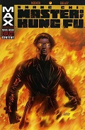
Shang-Chi: Master of Kung Fu 2003 (SC TPB) 144 pages.
 Written by Doug Moench. Pencils by Paul Gulacy. Inks by Jimmy Palmiotti.
Colours: Paul Mounts. Letters: Richard Starkings.
Reprinting: the six-issue 2002 mini-series
Suggested for mature readers
Rating: * * * 1/2 (out of 5)
Number of readings: 1
Published by Marvel Comics (MAX imprint)
This 2002 mini-series -- titled inside as "The Hellfire Apocalypse" -- reunited the title character's chief writer (Moench didn't create the character, but is the most associated with him) and one of its signature artist (though I think Gulacy last drew the character in the mid-1970s!). Moench and Gulacy being one of comicdoms most enduring on again/off again partnerships, the two frequently collaborating on an assortment of projects.
Originally, Shang-Chi was very much a product of its time. It arose when martial arts were a big theme in movies and TV, with a hero deliberately modelled after movie star Bruce Lee. And because comics are the great melting pot of creativity, the comic married it (after a few issues) with the espionage milieu trendy at the time (it was an American comic about a Chinese hero who came to work for the British secret service) -- an espionage milieu itself mixing elements of James Bond flamboyance with the world-weariness of, say, John LeCarre. And it rooted it all in pre-war pulp fiction by employing Sax Rohmer's Asian super-villain, Fu Manchu, as the recurring villain -- the premise being Shang-Chi was Fu Manchu's rebellious son.
(I've wondered: did Marvel create Shang-Chi, then decide to link him to Fu Manchu, or had they wanted to do something with Fu Manchu and felt a way to overcome the underlining racism was by making the hero Asian as well? In the same way that Marvel had in the 1950s created a Fu Manchu-like Asian villain, The Yellow Claw, and faced him off against a stereotype-defying hero, Asian-American government agent, Jimmy Woo)
To top it all off -- the comic was heavily philosophical, presumably inspired by the early 1970s American TV series, Kung Fu, in which the action was often a secondary point to the spiritual ruminations. Shang Chi wasn't that extreme -- it remained fundamentally an adventure-thriller series -- but there was no doubt it was leading with its brain and its heart.
The character had cropped up occasionally since the cancelation of his self-titled comic, and finally Moench and Gulacy were reunited for this story -- published under Marvel's mature readers MAX label. Perhaps Shang Chi was seen as a likely prospect for such a forum, as he was a familiar Marvel character -- but only nominally part of the super hero universe.
I'm not sure how (or if) this relates to the last time Shang Chi and his supporting cast appeared. The story starts, apparently, a few years after they last saw each other (though no one has aged much). Shang Chi has long since retreated to running a secluded monastery. He is dragged back into the game when he is visited by a couple of old colleagues -- Black Jack Tarr and Clive Reston -- who want his help. They are once more after a mysterious mad man intent on world domination and global destruction, and Shang Chi's ex-lover -- and Reston's current wife and fellow agent -- Leiko Wu may already be a prisoner. Shang Chi reluctantly saddles up and the game is once more afoot -- things further complicated by a third party, a cadre of British commandos led by a psychotic who's as eager to show up Tarr and his team as to bring down the bad guys.
I've long suspected that the reason the old Shang Chi comics have never been collected, despite their high critical regard, is because of the whole Fu Manchu aspect. Marvel would need to re-license the property in order to re-release the comics. So I wondered how they would handle the matter in this story. The answer: simply refer to Shang Chi's dad as his "father," or cryptically as "the ghost," and avoid giving him a proper name.
And the result is an enjoyable action-thriller -- albeit with some caveats.
In many ways, The Hellfire Apocalypse can come across like a big budget Hollywood movie of an old TV series. It boasts the rich, multi-tone colouring of modern comics (unlike the old single tone colours of the original series) giving it a richer, more lush visual look. The shadows darker, the atmosphere more palpable. It is presented as being for "Mature Readers." So there are occasional panels of extreme violence (limbs getting hacked off) and the crazed commando leader curses in a lot of four-letter words. And occasionally female nipples are outlined against shirts. But those aspects feel half-hearted, like the creators are doing it to satisfy an editor rather than out of any creative impulse. The story itself needs none of that and it only occurs in a few panels. But, again, it can feel like someone said: let's do an R-rated motion picture of a PG TV series just to make it feel more "special."
And though Gulacy's return to the series provides a nostalgic rush, his style has changed over the years. Once noted for his almost hyper-realism, it's skewed a bit toward cartoony or caricature. Oh, it's still recognizably Gulacy, and old time fans will appreciate seeing the familiar characters by a familiar hand. But part of what made Gulacy's old art effective, particularly on a series like Shang Chi, is gone. The figures can be a bit squatter, the proportions a bit distorted. Shang Chi is bulkier, more, well, comic book-y. Oh, it's still good work, notable for its detail (although maybe less detail than in his heyday) and the storytelling and composition is generally top-notch, which is important in an action/espionage story with its almost cinematic approach to the narrative and lots of running and fighting. But again, one can liken it to a movie of an old TV series, where it's great to see the familiar actors, but they are older and not quite looking or acting like they did.
Gulacy's modern style also clashes with the occasional (if conspicuous) stabs at salaciousness, of female posteriors thrust at the reader, or out-lined nipples, simply because the women themselves can look a bit cartoony.
Writer Moench seems to focus mainly on the action-adventure -- and some character stuff -- with the series' signature philosophizing rather minor. Perhaps unsurprising as Moench is decades removed from his younger self and may no longer be in touch with whatever inner muses were fuelling his earlier ruminations on life and love. Again it can feel like a dumbed down summer blockbuster of a more thoughtful original.
Though otherwise the characters remain in character, and old time fans should certainly enjoy seeing them back in action, while new readers shouldn't have much difficulty picking up on relationship dynamics.
The plot itself is fairly rudimentary and straightforward, with a clearly defined threat and strategy. In true James Bond style, a megalomaniacal mad man is setting up a super weapon on a remote island and the heroes have to stop him. It's well paced and, between the writing and the art, well executed in terms of storytelling, and taking place mainly at night full of dark, brooding atmosphere -- but after 120-some issues of the original series, it hardly seems like the Shang Chi epic to top all Shang Chi epics.
And perhaps even Moench wasn't sure how to approach the series -- whether to see it as a one-time return, a wrap up, or the potential start of further adventures. So it can feel a little like its overall significance is unclear. Despite flirting with the romantic triangle formed by Shang, Leiko, and Clive, the story -- and relationships -- end up pretty much as they began.
Still, for old fans it's certainly an enjoyable "big screen" return of the characters, even if conspicuously lacking some of the extra level of intelligence or philosophy to which they were accustomed. And new readers should enjoy it as a well-paced action-thriller with a James Bond vibe (though with deeper characterization and mood than the average Bond film) and with the pre-established character stuff easy enough to pick up on.
Cover price: $__
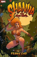 Shanna, The She-Devil
2005 (HC & SC TPB) 176 pages
Shanna, The She-Devil
2005 (HC & SC TPB) 176 pages
Written and illustrated by Frank Cho.
Colours: Dave Stewart. Letters: Richard Starkings, Rob Steen. Editor: Axel Alonso.
Reprinting: the seven issue 2005 mini-series
Rating: * * 1/2 (out of 5)
Number of readings: 1
Suggested for mature readers
Reviewed: Oct. 2014
Published by Marvel Comics
Shanna the She-Devil was created in the 1970s for Marvel Comics, as both a jungle heroine (a female Tarzan-type or, more honestly, just a rip-off of the older Sheena -- even the names are similar) but also as a semi-sincere attempt to add more female/feminist characters to Marvel's roster. Cancelled after a few issues, she was later relocated from her modern-day African jungle to the dinosaur-infested Savage Land of Ka-Zar (Ka-Zar being a male Tarzan rip-off) -- one of those examples of taking two not-quite-successful characters and hoping the sum is more successful than the parts (interestingly, Ka-Zar had similarly started out in a modern jungle, then was re-invented as guy hanging out with prehistoric creatures).
All of which has next to nothing to do with this revival.
I mean, it does obviously -- as it's about a jungle gal in a lost land of dinosaurs. But it isn't meant to replace the previous version in Marvel mythology. We are told that this Shanna is named after a comic book character, letting us assume that this is supposed to be a separate character/reality.
The real point of this series is not so much a showcase for the character of Shanna as a showcase for artist Frank Co (who also writes). Cho, no stranger to jungle babes and dinosaurs, and who is best identified with the whimsical Liberty Meadows series -- and whose primary fame is for drawing voluptuous, and semi-clad, women. That's what he's expected to do and that's what he delivers.
The premise here is that a group of (male) U.S. soldiers find themselves marooned in a prehistoric land (reminiscent of the old DC Comics feature, "The War That Time Forgot") and stumble upon a largely deserted Nazi compound wherein they find a naked woman suspended in embryonic fluid. Faster than you can say: "Break the glass!" They've revived the girl, Shanna, and find she's some sort of Nazi-devised experiment -- super strong, quick to heal from injuries, and with a feral ruthlessness (as befits what was presumably a super soldier project). Actually I guess part of her genetic engineering was to give her the limbs of an athlete/body builder -- and the breasts and buttocks of a swimsuit model.
Cho's art is, admittedly, impressive. And not just his beautiful heroine. Some "Good Girl" artists are great at drawing pin-ups but are less impressive with men, or environments, or composition. But not Cho. Even beyond Shanna the art is exceptionally good. The action scenes effective. The men's faces have character. There's a use of shadow and mood where needed. And the storytelling is effective -- even suspenseful (such as in the first chapter when they are wandering through the deserted base while being stalked by dinosaurs). Oh, and his dinosaurs are pretty spectacular, too! As well, his dialogue is also good, the interplay between the characters.
Where it falls apart is in the plotting.
Reading the first issue, and expecting nothing more than an exercise in cheesecake, I was surprised that it was reasonably effective and compelling. Unfortunately, perhaps reflecting an artist's priorities, Cho seems to have little grasp of, or interest in, the "big picture." We never learn who these soldiers are or how they came to be here (or where "here" is) or what their long term plans might be. We never learn why there's a Nazi base even though it seems to be set in modern times. They find one survivor -- but she never really tells them anything. At first you assume it's because Cho is trying to drag out the mystery. Then you realize it's because he just doesn't care. Soldiers. Dinosaurs. Nazis. Beautiful babe. That's the extent of his creative brainstorming.
Even what little plot there is is awfully thin. Shanna and the army doctor (who acts as the narrator) must return to the Nazi base and then get back to camp with an antidote to a disease. That's literally all there is to the body of the mini-series. Whole issues are just filled up with extended fights with dinosaurs (one sequence is about ten pages of dinosaurs fighting dinosaurs, with no humans in sight!)
It isn't that the action scenes lack imagination. There's a major sequence involving them having to cross a herd of literally thousands of Velociraptors (the dinos aguably made famous by "Jurassic Park") which is certainly a "concept." Though it's unlikely predators would travel in such big herds. I half expected that to lead to some revelation -- maybe they were fleeing a volcano, or an even badder predator.
But that would require Cho to be thinking in terms of "plot."
Now I'm not going to be a disingenuous hypocrite. Yes, Cho's Shanna is beautiful eye candy and you can enjoy watching her run and leap across the panels. Cho doesn't just draw her as some hard-bodied silicone fantasy but really seems to delight in portraying the almost pendulous swinging of her over-proportioned mammaries.
But all that only takes you so far. Or worse, because Cho's visual storytelling is so good, and his dialogue decent, you can't help thinking what could he have done if he had taken his buxom babe and actually given her an interesting story to react to. There was a British comic strip called Axa, also basing a lot of its appeal on pulchritude (Axa even getting naked from time to time!) yet though hardly a literary masterpiece, you could still enjoy it for the stories as much as the raciness.
The funny thing is Cho has subsequently parleyed his popularity into projects where he draws covers and gets story credit -- but leaves it to others to write and draw. But as I say: plot is his main weakness! Whole issues can be read in ten minutes or less. While Shanna herself is deliberately presented as an enigma (further adding to the sexist feel) with the "main" personality being the male army doctor (there's supposed to be a theme about the cold, emotionally stunted Shanna learning to warm up a bit).
And there are also ethical issues at work. Oh, not just the whole Nazi super woman thing -- though there's that. Or the fact that Cho is Chinese-American yet the comic remains typically very, very white. But also the way it kind of betrays the source character. Not just taking a character who was, in her way, meant to be a respectable female heroine and turning her into no more than a titillating pin-up. But Shanna was supposed to be a conservationist. In Cho's re-imagining, animals are just there to be stabbed, dismembered, or blown up -- when they aren't doing the same to the people.
All of which brings us to an interesting side-bar about the comics' history. Apparently the comic was originally intended for Marvel's MAX imprint -- a line featuring "mature readers" content but which still often featured their regular heroes. And Cho actually drew the comic with some nudity in it (you could find proof of the unaltered panels on the internet -- but they seem to be disappearing). How much nudity, I'm not sure (Shanna wasn't wandering around perpetually unclothed). But then Marvel got cold feet, more comfortable with violence than naked bodies. So Shanna was released with the nude panels redrawn. Though, typically, the violence remains untouched -- and it can get quite extreme at times (Cho particularly fond of eye balls -- human and dinosaur -- shooting from sockets). Which, as many have said about similar situations, is a bit disturbing: brutal violence is considered okay, but nudity is seen as offensive.
For a while there were claims Marvel would release an "uncut" version of the series as a collection. But they never did. Whether that was unfounded rumour, or whether Marvel themselves had announced it (maybe figuring the false promise would keep the fanboys quiet until they got distracted by something else) I don't know.
Nor can one say the decision was out of some last minute twinge of feminist conscience. Whether clothed or not, there's no disputing the comic is first and foremost about ogling the female form. (One of the leering slogan's for the comic? "Shanna is up to her, um, ears in trouble.")
If only we could ogle her and get an interesting story at the same time!
This was followed by another mini-series/collection -- not by Cho (reviewed below). Though Cho did return to the character -- this time, I guess the original, "true" Shanna -- for an arc in one of the Wolverine comics.
This review is based on the original comics.
Cover price: _ _
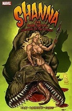 Shanna, The She-Devil: Survival of the Fittest
2008 (SC TPB) 104 pages
Shanna, The She-Devil: Survival of the Fittest
2008 (SC TPB) 104 pages
Written by Justin Gray, Jimmy Palmiotti. Pencils by Khari Evans. Inks by Jimmy Palmiotti.
Colours: Paul Mounts, with Christine Strain. Letters: Dave Lanphear. Editor: Warren Simons.
Reprinting: Shanna, The She-Devil: Survival of the Fittest #1-4 (2007)
Rating: * * (out of 5)
Number of readings: 1
Suggested for mature readers
Reviewed: Dec. 2014
Published by Marvel Comics
Survival of the Fittest was the second (and to date, last) mini-series to feature -- not the traditional Shanna, The She Devil, who had been created in the 1970s and still occasionally crops up as a guest star in Marvel Comics -- but a kind of revisionist/alternate reality version unleashed by writer/artist Frank Cho in the previous mini-series (reviewed above ^).
Both Shanna's are jungle heroines who hang out in modern-day prehistoric jungles, but the main difference is the traditional Shanna is a jungle heroine who has adventures and, more to the point, a personality. While this Shanna -- is basically just meant to be venue for a lot of action and T&A, with Shanna and her bouncing breasts bounding across the pages as she fights dinosaurs.
And the best thing one can say about Survival of the Fittest -- is it actually makes you appreciate Frank Cho's previous mini-series more. Cho has nothing to do with this sequel, the writing handled by frequent collaborators Justin Grey and Jimmy Palmiotti, and the art by Khari Evans.
Cho's series wasn't exactly a literary masterpiece -- indeed, Cho seemed to have little grasp, or at least interest, in story logic. Here Gray and Palmiotti seem to have run with that feeling, though they approach it with more self-conscious whimsy than Cho did, their tongues rammed more obviously and squarely in their cheeks.
So on Shanna's lost jungle island (you don't really need to have read the previous series to figure out what's going on) arrive a group of pirate/mercenaries. And hot on their heels come another group of gangsters who the first group stole some diamonds from. Shanna teams up with the first group -- I guess despite being pirate/mercenaries who, in fact, just killed some people we're supposed to find them lovable rogues! And there's a lot of running about and being chased and daring escapes for the run of issues. There are dinosaurs. There are the murderous mercenaries/gangsters. There's a strange Nazi city of gold that is inhabited by Neanderthals, some of whom wear Nazi uniforms.
And there's no real explanation for any of it! The point presumably is to just keep things fast and furious (and light-hearted) in a movie serial way, conjuring up old pulp fiction cliches. Which was pretty much true of Cho's story in which it was never really explained how or why there was a Nazi base even though it's modern times. So here we aren't really supposed to ask why the Nazis would build a city of gold on this island or how the Neanderthals relate (are they devolved Nazis -- and if so, how and why?) As I say, no doubt it's all just meant to be a tongue-in-cheek lark. But despite wisecracks and a comic relief character, it's not funny enough to be, y'know, actually funny. And the characters never develop enough personality that we can care about them even if their adventures don't hold up to even a passing scrutiny (and given they are murderous mercenaries, I'm not sure I wanted to care about them).
So -- yes, it's fast-paced, moves along at a clip, and has plenty of dinosaurs, cavemen, and lost cities. And I was, for the most part, bored.
And the other problem is that the comic is really just meant to be a showcase for the cheesecake -- of Shanna in her jungle attire running and leaping, her breasts even bigger than they were in Cho's series (though I suspect that defies the laws of physics). Yet the problem is, Evans is not Frank Cho. Oh, don't get me wrong -- he's certainly a good artist, and he does his part in exaggerating Shanna's curves. But he has a looser, rougher style than Cho did, which ultimately saps some of the sensuality, the eroticism, out of the images (Shanna's face inparticular is rather cartoon-ily drawn). In other words, it's a comic in which even the writers and editors would freely admit things like "plot" and "character" are just as an excuse to present pictures of a buxom babe, and for the visuals in general (jungle landscapes, dinosaurs, etc.). And it just wasn't as visually arresting.
So -- yeah. Kind of bored.
This review is based on the original comics.
Cover price: $10.99 USA
or, Back to: