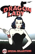
 Dragon
Lady 2000 (SC TPB) 144 pages
Dragon
Lady 2000 (SC TPB) 144 pages
Click HERE for a listing of all reviews, including character sections
Dragon
Lady 2000 (SC TPB) 144 pages
Written and Illustrated by Milton Caniff.
Reprinting: Amazing Comics #1-4 (which reprinted a storyline from the 1930s newspaper strip, Terry and the Pirates) plus a couple of non-Caniff short stories
Rating: * * * 1/2 (out of 5)
Number of readings: 1
Published by ACG Comics
Terry and the Pirates was a newspaper strip that
followed the adventures of young Terry Lee, an American boy living in the
Orient, and Pat Ryan, a rugged soldier-of-fortune type who acts as his
guardian. At least that was how the strip started out (Terry grew older
and became a young man as the strip progressed). This particular storyline
(which ran from the end of August, 1937, to the middle of February, 1938)
features the introduction of the Dragon Lady, an Oriental femme fatale
who just may develop a soft spot for Pat as the story progresses. Despite
seeming to meet her demise at the serial's conclusion, the Dragon Lady
would reappear in the strip, becoming highly identified with the series
overall.
Terry and the Pirates is something of a benchmark in the
evolution of the newspaper strip, and Caniff is an artist who had enormous
influence on succeeding generations of comicbook artists, so I'd been wanting
to read some of the strip for a long time.
A single story stretched out over so many months could
become tedious, but this turns out to be a convoluted affair, almost like
two or three stories that segue one into the other. Pat is hired to help
catch a spy stealing documents for a new plane. That spy turns out to be
the Dragon Lady. But soon the story has taken an unexpected turn and Pat
is in the Chinese jungle at the mercy of a warlord, with Terry and manservant
Connie in pursuit (despite being called Terry and the Piates, here
adult Pat is more clearly the main character).
The unfortunate thing about newspaper adventure strips
is that their artistic heyday was probably in the 1930s and 1940s and,
like Golden Age comicbooks themselves, it means that they reflect antiquated
attitudes. With Terry and the Pirates set in the exotic Far East, you can't
avoid noticing an underlying racism. Right in the opening strip we meet
a series regular, Connie -- Terry and Pat's comic-relief Chinese manservant.
Connie, unlike everyone else, isn't drawn particularly realistic; with
his huge teeth and big ears, he's a caricature. Dimwitted and goofy, he's
more uncomfortable that amusing. Though, to be fair, he is portrayed as
having a good heart. Which is better than most of the other Asian characters,
who are drawn less grotesquely, but are generally villains. Throw in ostensibly
good guys occasionally using racial slurs and it's enough to make most
modern readers cringe.
Though, and here's the paradox, there are occasional Oriental
characters who are not portrayed in quite so dismissive a light. And the
Dragon Lady herself is intelligent and seductive.
So, does that make Dragon Lady unreadable. Well,
no. If we dismissed every book or movie that was tainted by racism (or
sexism), we'd eliminate 60 percent of stories told prior to, say, the mid-1950s
at least. But we don't. If there's enough entertainment value inherent
in the rest of a story, we can hold our noses through the more offensive
bits.
I say "can", not necessarily "should". If someone feels
it would sour the story too much for them to enjoy it, then I respect that.
For my part, though, I found myself willing to look past the occasional
lapses.
Milton Caniff was considered a master of his craft, and
this epic storyline shows some of why. Older strips had more room to work
with than the few adventure strips remaining today: four panels a day,
often of enough size to fit in a fair amount of verbige. There was also
a defter handling of repitition, with less obvious reiteration of information,
making for a smoother read when the strips are assembled back-to-back (though
there's still enough repetition that its newspaper origins are evident).
It's a technique that has been lost somewhat in modern North American adventure
strips, though the British (at least into the early 1980s) were still expert
practitioners of the craft with strips like Modesty Blaise and Axa,
where repetition was kept to a minimum.
The exotic, Far East locale full of junks (Chinese boats),
warlords, and Chinese architecture is well depicted, making the story decidedly
atmospheric and enthralling. I'd never read Terry and the Pirates before,
but there's something delightfully evocative and nostalgic about it all,
as if I had read it long ago, in another life.
The story is well-paced and clever, taking unexpected
twists. The nice thing about these older newspaper strips is that they
had enough room to inject a little bit of characterization, to keep things
from being too breezy, and a touch of humour, even as they're written to
be fast-paced, like a movie serial.
As noted above, Caniff was an influential artist, which
is more clearly obvious in his later work which influenced the likes of
Frank Robbins and others. I actually find this, his early style, more pleasing.
He utilizes a less stylized, generally realistic art that I quite enjoyed.
The format for this book is worth commenting on. Firstly,
the first two issues contain a back up story not by Caniff (a horror story
culled from some old Charlton Comics title and a war story culled from
Fightin'
Marines). Neither story is especially memorable, nor thematically connected
to the main story. The final two issues dump the back up story, and switch
to reprinting the strips in a vertical format (meaning you have to turn
the book on its side to read it). Although that's not such a bad idea when
published in its comic book format, in this TPB it's a bit awkward as the
spine isn't as limber, forcing the pictures to curl a bit toward the spine.
As well, the editors were rather lax in reprinting the accompanying Sunday
strips -- sometimes they do, sometimes they don't. As such, there are occasional
jumps in the story (though with a text blurb to tell you what you missed)
and a whole week or so of dailies are skipped at the end (though you don't
notice it). There's also a couple of pages in the first issue that got
switched with each other. All of this means that, though not a bad re-presentation
of these strips, it's not the best, either.
This TPB is dubbed a "Special Collection", and it doesn't
so much reprint Amazing Comics as it literally collects them between
a single cover. It really seems as though it's the four issues glued together,
complete with front and back covers of a different paper than the story
pages, plus ads. It's also worth noting that this was apparently limited
to only 600 copies.
Unavoidably dated by some of its sensibilities, nonetheless
this collection of Terry and the Pirates is an entertaining adventure harkening
back to a bygone day of adventure and mystery. It gives an idea of why
the strip, and Caniff, is so well regarded all these decades later.
Cover price: $__ CDN./ $10.95 USA.
Dreadstar, Definitive Collection, part 1 2004 (SC TPB) 192 pages
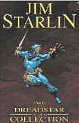 Written and Illustrated by Jim Starlin Inks by Starlin, with Joe Rubinsten.
Colours: Glynis Oliver. Letters: Jim Novak. Editor: Archie Goodwin, Jo Duffy.
Reprinting: Dreadstar #1-6 (1982)
Rating: * * * 1/2 (out of 5)
Number of readings: 1
Additional notes: intro by Walt Simonson; sketches; covers
Published by Dynamic Forces
These comics have been reprinted a few times: originally published as a deluxe format comic by Marvel's imprint, Epic, then reprinted in 1985 as a six issue, regular format mini-series still by Marvel called Dreadstar and Company, then in 2001 Slave Labour Graphics released a series of black & white TPBs reprinting the saga -- beginning with the precursor series "Metamorphosis Odyssey" -- of which these six issues comprised volume 4, sub-titled Plan M and finally Dynamic Forces has released issues #1-12 as both a single hard cover, and a two volume TPB collection. Whew!
Dreadstar is basically a chip off the Star
Wars block in that it follows a group of rebels battling intergalactic
tyranny. Except here the heroes are caught in the middle between two warring
tyrannies, the religious-fueled Instrumentality, and the royalist Monarchy.
As well, the series borrows a bit from super hero comics in that this rebel
group is just a team -- just five characters -- and some with super powers. And clearly the series has enjoyed a certain lingering "cult" appeal, given the number of times it's been reprinted over the years (or, at least, the times these early issues have been reprinted).
The first issue supplies a recap of what's gone before. Despite this
beinging with issue #1, hero Vanth Dreadstar had been around for a while, first
being introduced in Starlin's "Metamorphosis Odyssey" saga serialized in
Marvel's Epic Illustrated magazine (and collected in a TPB), and then
appearing in a Dreadstar Annual #1, then a Dreadstar graphic novel. And "Metamorphosis Odyssey" was definitely a "mature readers" story, moreso than the Dreadsat regular series.
All six issues here tell relatively self-contained
adventures (no "to be continued" cliff hangers between issues), meaning
it's not too hard to just jump in even if you just found one or two in the back issues bins.
These initial six adventures provide a reasonable introduction to Jim Starlin's
science fiction saga, and the characters drop references to a mysterious
"plan M" throughout that, then, is revealed in issue #6, creating
a sort of story arc. At the same time, these six issues were never really
meant to form a stand alone arc, building to a definitive climax in #6 (Dynamic Forces has released issues #7-12 in a second TPB and, I assume, those dozen issues do better form a story arc).
Even "plan M" isn't so much threaded through the series as a developing plot line,
as it's just referred to occasionally, before being revealed. So elements are introduced, but
not developed, and references are made that never lead anywhere. Even the very uniqueness
of a hero caught between two forces is muted, as Vanth by the end of these six issues forms a temporary
alliance with the Monarchy.
However, taken as just six issues of an on going series that don't end
on a cliff hanger or anything, Dreadstar and Company is a decent enough
read, with strengths and weaknesses. Each issue
totals about 30 pages of story (save the last issue, which is 22 pages). As such,
Starlin can take his time with the issues, mixing talkiness with action
scenes, and, as noted, crafting self-contained adventures. But, despite
that, the stories and the characters aren't especially elaborate. The issues
are enjoyable...without being that memorable after the fact, despite
what should be grandiose, memorable scenes -- like Vanth and pal Syzygy
trying to get out of the way of a nuclear bombardment! Likewise, issue
#2, for instance, is very much a character issue focusing on Willow...but
even after six issues, Willow remains a fairly bland personality.
The stand out adventure is #5, with Starlin working a little more humour
into the proceedings, putting a little more swashbuckling into his
space opera.
Starlin's art is appealing, if a lttle too prone to big muscles and,
sometimes, stiff postures. But his backgrounds are detailed, which is a
plus in a science fiction series where it's all about creating a reality
-- though, mayhap, it's a little too connsistent: the corridors in one ship
look rather like the corridors of another, which look a little like the
corridors on this planet or that. Along with the 30 pages, there are plenty
of little panels, meaning the stories don't feel skimpy.
And Vanth and his crew have personalities -- I don't want to suggest
they don't. It's just that, like with the action-adventure, little really
stands out.
Ultimately, this certainly leaves
one open to looking up subsequent comics. But neither
are these issues strong enough to necessarily make such a pursuit a priority. There's a feeling a lot more could be done, than
is. Even Plan M, when it's revealed, is a great, audacious, potentially
controversial, idea. But, at least as presented here, it's not handled
especially convincingly.
This was enjoyable, the leisurely pace making it a relaxed read, even
as it ends up seeming a little thin at times, with protagonists who are
personable if not much more.
This is a review of the comics based on the earlier reprint mini-series, Dreadstar and Company.
Cover price: $__ CDN./ $19.95 USA.
Written by Laini Taylor-Di Bartolo. Illustrated by Jim Di Bartolo.  The Drowned 2004 (SC GN) 80 pages
black & white
Rating: * * * * (out of 5)
Number of readings: 1
Published by Image Comics
Reviewed: 2004
The Drowned is set in early 19th Century France and is an off-beat mixture
of suspense and the supernatural, told with an under-current of fairy tale-
like whimsy. The main character is Theophile -- a young man who, as the story
begins, escapes from a Paris insane asylum...and we aren't entirely sure if
maybe he doesn't belong there. Driven by impulses he can't define, and pursued
by men who may or may not be there, Theo sets out to finish a mission that was
interrupted a few years before when he was incarcerated. His journey takes him
to his home town, where tragic things occurred years before -- though not
before he is waylaid in a creepy little village that only exists when the tide
is out.
Actually, the above description maybe makes The Drowned seem weirder, and
perhaps more inaccessible, than it is. As the story progresses, the logic to
things begins to emerge, and we realize Theo isn't (quite) as confused as we
might have first thought.
It's a testament to writer Laini Taylor-Di Bartolo's ability that she
presents a tale that straddles the needs of a literal narrative, featuring a
sympathetic protagonist, with an off-kilter edge, as though being fuelled, if
only a little, by the spirit of Lewis Carroll or Mervyn Peake. When strange
things occur, Theo seems to recognize they're strange...but doesn't maybe
recognize they're as strange as they are. Which is the point. This is a world
where the line between normal and the bizarre is occasionally rather tenuous;
a superstitious time when nervous villagers regularly paint good luck symbols
on their doors. And yet the story mainly keeps its footing, not going too far
in any one direction, and allowing us, for all the quirkiness, to still feel
anchored, even as there's an at times dreamlike ambience to things. Theo's
narration is dense and almost literary, without being so overwhelming that you
wonder why they bothered with the pictures -- this is a comic book where the
pictures convey as much information as the words. But it gives the book a
nice, literate, occasionally poetic, feel. And the dialogue is also well-
handled, with some nice, quirky humour and wit, as well.
The 19th Century French setting isn't fully evoked, though. Oh, it
certainly has a period ambience, to an extent, but not specifically France, or
even our world. The dialogue itself seems a little too English, as if Taylor -
Di Bartolo has modelled her characters after the very English "French"
depicted in colloquial English translations of Les Miserables, or old British
Hammer Films.
The black, white and grey art by Jim Di Bartolo suits the tone admirably,
presenting a wife-husband creative team that seems to be nicely in sync with
what they're both trying to do. He works in a semi-realist style, yet one that
has a thread of caricature through it: faces are gaunt and care worn, bodies
at times knobby, mouths often full-lipped (in an English sort of way). His
sense of place, in costumes and sets, is well presented, and the composition,
though energetic and frequently imaginative (with a low angle shot, or a high
one) doesn't get needlessly clever, which adds to the ambience. The weirdness
is accentuated precisely because he's not going overboard to make it seem
weird. There were a few times, admittedly, when the meaning and clarity of a
scene was a bit muddled (such as an early panel where Theo opens a box and
it's not immediately clear what's inside). But those are minor quibbles.
As with all stories, it probably loses some of its weirdness and mystery
towards the end as the inexplicable is explained -- rendering the climax a bit
anti-climactic. A revelation as to what's in another box isn't particularly
surprising, although Taylor - Di Bartolo throws in another plot turn that
should keep you from figuring out where it's all heading.
However, the biggest stumbling block comes with a kind of vague resolution.
Over the course of the story, Theo learns he has acquired a "gift" by
accident. This "gift" is crucial in the climax...and it's never fully
explained what that "gift" was or how it works. Obviously, it's an ability to
combat supernatural evil, perhaps even rendering him impervious to same...but
for such a long build up, one kind of wants it clarified. What is it that Theo
can do that another could not?
Part of the problem may be that the creators wanted to leave the door open
-- in true comic book fashion -- for seqquels. It's not that the story ends to
be continued or anything, or with any conspicuously dangling plot threads, but
there is a sense that what should've been a "graphic novel" ends up feeling a
little like a TV movie pilot.
With all that being said, it's a darn fine read, sure-footed and off-beat,
and one that actually encourages more than one reading. The first time through
you can enjoy the strangeness, the whimsy of it all...the second time through,
knowing where it's headed, you can enjoy re-reading scenes for the clues and
hidden significance you missed the first time through.
cover price: ____
or, back to