
Batman: The Bat and The Beast 2010 (SC TPB) 128 pages
 Written by Peter Milligan. Illustrated by Andy Clarke.
Colours: David Baron. Letters: Sal Cipriano.
Reprinting: Batman: Confidential #31-35
Rating: * * 1/2 (out of 5)
Number of readings: 1
Reviewed: Dec. 2015
One of the nice things about the story arcs in Batman Confidential was they were meant to be self-contained -- you can mostly read 'em for themselves and not worry about what's happening in the other Batman comics. Inheriting that position from the previous series, Batman: Legends of the Dark Knight, another characteristic was the stories were sometimes "retro" stories, set during earlier periods in Batman's career.
That's not as obvious here, although I do wonder if the story is meant to be a reference/re-imagining of an earlier Batman story, where Batman travels to Moscow to battle a rogue super-killer, the NKVDemon (Batman #445-447), which was a sequel of sorts to his battle with the KGBeast. Or maybe it's just inevitable that with an on going, never-ending saga like Batman's, plots inevitably evoke each other.
The premise here is that a Russian mobster, The Tsar, rules Moscow's underworld in large part through his control of sewer-dwelling beast-man. When the mobster tries to make inroads into Gotham city (in part through some nuclear blackmail) he arouses the ire of Batman who then flies to Moscow to tackle The Tsar and his Beast on their home turf, while also allying himself with a local Moscow police detective ala Gotham's Jim Gordon.
Writer Peter Milligan has been responsible for a few interesting, quirky Bat-tales over the years (some collected here) so that seeing his name in the credits kind of piqued my interest. But I wonder if Milligan's strength lies in the short, tell-it-in-one-issue sort of comics, where the actual plot is less important than the quirky ideas and twists.
Here delivering a five issue saga -- it's a bit run-of-the-mill. Nothing much happens that really surprises or zigs when you thought it would zag. The characterization remains pretty minimalist, lacking any true nuances. The Tsar is just bad guy. The Beast is established early as a kind of tragic dupe. The police detective is morally conflicted. Even the whole nuclear blackmail idea which plays out mostly in the middle of the story turns out to be a bit of red herring.
Milligan still coughs up a few quirky ideas, like Batman encountering another sewer-dweller -- a homeless dissident who (we infer) has basically been hiding in the sewers since the days of the Soviet Union. But even he feels a bit like Milligan isn't sure what to do with him, as though maybe an idea he jotted down in the story planning stages, but had lost the thread by the time it came to write the thing. Indeed, the whole saga feels a bit like some interesting ideas that never quite blossom into a proper story. For all the Beast is an important plot point, and intended to give the story some pathos and grey-shades, he never really seems to get developed properly.
Even the idea that in the final issue we discover the Tsar has a beloved pet dog when I'm not sure we'd seen the dog before can smack of Milligan kind of writing as he goes.
Andy Clarke's art is realist and features clean, clear line work, looking a bit like across between John Cassaday and Frank Quitely. But it does suffer from a certain lack of atmosphere (particularly in a Batman story involving a sewer-dwelling beast man) and a kind of formulaic-ness to faces. Often you had to recognize characters simply by streaks of grey in their hair (the cop) or a scar (like The Tsar) rather than because Clarke actually draws different bone structure. Heck -- even Batman's butler, Alfred, looks a lot like Bruce Wayne, just balding and going to seed! The storytelling composition is clear enough, but not altogether exciting.
A funny thing about Batman stories like this where he's abroad in foreign cities (or even unfamiliar neighbourhoods) is often the subtext is supposed to be Batman as a fish out of water. How does the master of Gotham city (and general control freak) fight crime when he's no longer in control or on his home turf of Gotham? But for the most part, such stories never really take that anywhere. And this is no exception. At times it's hard to even remember Batman is supposed to be in a foreign city, because he seems to operate just fine.
The result is a story that isn't really bad -- just kind of undistinguished. And probably could've been told just as well in a couple of issues. Mind you, that earlier story I mentioned (where he goes to Moscow to tackle the NKVDemon) I didn't think was that great either.
Cover price: $__.
Batman: Batgirl 1997 (SC GN) 48 pages
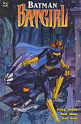 Written by Kelley Puckett. Pencils by Matt Haley. Inks by Karl Kesel.
Colours: Kevin Somers. Letters: Willie Schubert. Editor: Scott Peterson.
Rating: * * * * (out of 5)
Number of readings: 1
With the release of various of the Batman motion pictures, DC published one shot/graphic novels focusing on or otherwise utilizing key characters that appeared in that year's movie. Usually that meant the villains, either being a story focusing on the villain (ie: Mr. Freeze) or still focusing on Batman, but in conflict with the villain (Poison Ivy), or somewhere inbetween (like Catwoman Defiant). But since Batman Forever also featured Batgirl...it led to this one shot featuring everyone's favourite flame haired bat suited heroine. And though these were specials released to cash in on the movies...they featured the comic book versions of the characters, not the movie interpretations (so Batgirl here is Barbara Gordon...not Alfred's niece as she was in the movie).
And this was the longest single issue Batgirl story published to that date (the previous longest -- 1985's Batgirl Special -- was 38 pages). And possibly one of the longest Batgirl stories -- page count wise -- even including multi-part stories serialized in the back pages of Detective Comics and elsewhere. Of course, I say "page count" wise because, when you factor in the big panels and the sometimes brevity of verbiage, one could debate whether it's the longest in terms of actual content.
The other significant thing is that this is a "retro" tale, published more than a decade after Barbara had been crippled, and stopped being Batgirl (having adopted the persona of the wheelchair-bound cyber hacker, Oracle).
And the result...is pretty good.
It's set during the early days of Barbara's Batgirl career, featuring her first encounter with the Joker -- and as such is meant to be a slightly gritty tale, being a kind of "loss of innocence" parable as the easy going Batgirl must confront, for the first time, true, random evil in the form of the psychotic Clown Prince of Crime. It's not exactly a densely plotted epic of twists and turns -- writers tending to use the Joker as an excuse not to have to come up with much in the way of surprises (it's not like his scheme will have a hidden agenda or that the villain will turn out to be someone we didn't suspect). And the telling itself, with big, bold panels -- sometimes just three to a page -- hardly lends itself to layered plotting.
But on that level, it's enjoyable and briskly paced. One could argue, should Batgirl really be re-positioned as a female Batman? -- maybe her appeal should be that while Batman tackles killers like the Joker, she can battle bank robbers. But despite the desire to move her into the dark n' grittier milieu of Batman stories, writer Kelley Puckett does a good job of maintaining Barbara's distinctive personality -- so even though she's battling Batman's foe, she's not written as just a Batman substitute. A sequence where she is trying to escape from the Joker's hideout is effective precisely because Batgirl is more human and vulnerable, creating suspense as she must act with stealth as much as pugilism.
And the story is also nicely self-contained, resisting the urge to try work in too much continuity baggage (even though it's a retro story, there's no framing sequence tying it into then on going events). You can read it for itself.
Another plus is the art. Matt Haley has a clean, uncluttered, realist style -- with some nice use of shadows and mood. Although it is marred a little by a slight cartooniness that I can't fully put my finger on, moreso here than other pieces I've seen by him (perhaps a result of Karl Kesel's solid, un-nuanced inking?) Here it reminds me more than a little of Terry Dodson's style -- with a similar mix of pluses and minuses, and where the pluses more than carry the equation. Haley also draws a pretty Barbara. In fact, what's funny is that there are panels that seem to lean in a deliberate cheesecake direction (not something necessarily associated with Batgirl traditionally). Yet one wonders if this was Haley's inclination...or whether he was acting on instructions from above. Because although there are some shots of Batgirl in her sleek, form fitting Batgirl suit, emphasizing her physique (her cape conveniently flung aside) there are other panels in which Barbara's posterior is featured prominently in a panel...while wearing loose fitting pants that are hardly sexploitive! As though Haley was ordered to toss in some gratuitous shots of her backside...but deliberately did them in a way to mute the sexiness. (And I've probably wasted more time on this topic than it warrants, because this is a far cry from some exploitive "Good Girl Art" portfolio and female readers are unlikely to find much that is too distractingly salacious).
I started out mentioning that some of these Batman movie related one shots are legitimately "Batman" stories...while others feature Batman rather peripherally. Here Batman appears in barely more than a cameo. Yet because it focuses on Batgirl -- a heroine, and veteran of her own (long ago) solo adventures -- you don't feel cheated despite his name on the cover or like you miss him the way you might if the story focused on a villain.
Despite its length, Batman: Batgirl isn't vieing for a nomination as the definitive Batgirl epic. But it nicely satisfies as a stand alone thriller that harkens back to the days of Barbara/Batgirl's solo adventures, but presented in a later day prestige format of heavy paper, crisp colour, and solid writing and attractive art, with a decent sense of Barbara as a person, not just costume. And the very simplicity of the story, the brevity of the telling, allowing it to clip along and not overstay its welcome.
An enjoyable adventure.
Original cover price: $4.95 USA.
Batman: Black and White 1998 (SC TPB) 240 pages
 Writers/Artists:
various
Writers/Artists:
various
Reprinting: the four issue prestige format mini-series (1996) - plus covers
Additional notes: in black & white. Published, not quite at tabloid dimensions, but larger than the average TPB. Featuring an introduction by co-editor Mark Chiarello; layout examples; pin-ups; creator bios; cover reproductions.
Rating: * * * (out of 5)
Number of readings: 1 (and some stories more)
Various writers and artists deliver 20 eight page black & white stories of the Dark Knight. Black and White (the first volume -- there was a second one) delivers stories featuring various artistic intrepretations of Batman, ranging from mainstream fan faves like Brian Bolland to avant garde artists like Denmark's Teddy Kristiansen. The end result is a collection of interesting stories that are, for the most part, good. None are great, but as something to have on your shelf, to be delved into from time to time when you've got five or ten minutes to kill -- not enough time to tackle a full length comic -- then these hit the spot.
There's a sense the emphasis here was on the artists more than the writers -- the majority of the stories are by writer/artists, even a couple who aren't usually known as writers particularly. And when placing bios of the few writer-artist teams, the artist's bio is given prominence. Only five writer-only types were included, three of whom already had a long association with Batman (Denny O'Neil, Chuck Dixon and Archie Goodwin). The emphasis on art could explain why most of the stories aren't much more than O.K. And for all that Batman has long been cited as comicdoms most complex character, many of these stories aren't really about Batman-the-man so much as Batman-the-icon or Batman-the-myth. In some stories the Caped Crusader only appears as an enigmatic figure in a few panels!
The art varies wildly, from realist artists like Bolland, Howard Chaykin, Kevin Nowlan and the beautifully delicate line work of Gary Gianni to acquired taste, eclectic types like Kristiansen, Bill Sienkiewicz, Kent Williams and Matt Wagner. Though interesting, there's an ugliness to those affecting an underground style that can be a tad unrelenting if read together in one sitting. Strangely, despite the Black and White angle, much of the artwork doesn't actually seem to benefit from the presentation, either by exploiting black on white contrasts, or delicate, nuanced shading. Instead, much of it just seems like work that was intended for the colourist...but never made it that far.
Despite the claim that they recruited comicdoms best and brightest, reiterated in somewhat cloyingly sycophantic biographical paragraphs, many of the superstar names that are proudly proclaimed on the back cover (Frank Miller, Alex Ross, Neal Adams) only contributed a pin-up or a cover, implying that when it came to the stories themselves, the editors often only managed to recruit the best and brightest of those who had nothing better to do.
It's also kind of funny how, whenever people criticize superhero comics, it's usually to deplore the emphasis on violence, fisticuffs and mayhem, yet when artiste types, as many here are considered, take their shots at the genre...we get a surprisingly monotonous stream of inner city violence of street gangs, muggings, and serial killers. No "Batman tries to reunite a homeless woman with her estranged family" stories, no "Batman is in a race against time to locate a diabetic Alzheimers patient who's wandered off without his insulin", no "Alfred attempts to show Bruce the true spirit of Christmas" sort of things. And few stories stray outside the confines of established Batman "reality".
An exception is Neil Gaiman-Simon Bisely's amusingly surreal "A Black and White World" and the beautifully drawn "Heroes" by Goodwin-Gianni, which places Batman in the 1930s. Other memorable stories include Chaykin's wry "Petty Crimes" and a few others. In one of the editorial comments, Chiarello refers to a scene in a story by Klaus Janson that was changed from the original draft, a change that Chiarello still feels was not the right one. Whatever my two-cents are worth, it was the right change. The ending as originally envisioned would've been just plain wrong. You'll have to read the book to understand to what I'm refering.
This warrants a nominal Mature Readers warning.
Cover price: $31.00 CDN./ $19.95 USA.
Batman: The Black Mirror 2015 (SC TPB) 188 pages
 Written by Scott Snyder. Illustrated by Jock, Francesco Francavilla.
Colours/letters: various.
Reprinting: Detective Comics #871-877 (2011)
Rating: * * * 1/2 (out of 5)
Number of readings: 1
Reviewed: June 2016
Black Mirror collects a consecutive run of Batman stories (from Detective Comics) comprising two main stories, plus an interlude-type issue -- as opposed to being a "graphic novel" with a specific plot. It also was from a period -- I believe just prior to one of DC's periodic re-boots (either instigated because the company is so experimental it's willing to shake things up -- or has so lost control of its properties the only way it can fix things is to just nullify everything). At this point, I guess, the Batman brand was a franchise, with multiple Batmen running around -- so the hero of these stories isn't traditional Bruce Wayne, but his original sidekick, Dick Grayson.
I'm not really keen on the idea of constantly changing characters -- but I suppose Dick lays claim to a greater legitimacy than some such ringers. After all, he's been a mainstay of Batman stories -- of and on -- almost from the beginning.
And the weird thing is -- there's something inherently likeable about Dick. I don't know why that surprises me, but with a fictional character, written by zillions of writers, and who has changed superhero identities more than once (Robin, Nightwing, and now a Batman) you wouldn't expect too much consistency. But generally when Dick appears in a story -- you like the guy.
Which ironically means that, as much as the purist in me balks at not having Bruce Wayne as Batman -- this may well be the best Batman's been in a long time, by simple virtue of the fact that Dick is a more rounded, sympathetic character than Bruce is written these days.
Anyway, the collection is two main stories -- each three-parters. In the titular Black Mirror Batman uncovers an underground black market auction that specializes in grisly memorabilia associated with notorious crimes and criminals. In the other three-parter he investigates a murder that starts off with a killer whale -- yes, a whale! -- found dropped off at a business' lobby. Inbetween is an eerie, unsettling interlude where Commissioner Gordon's estranged son, James -- previously a psychotic sociopath -- has returned to Gotham, claiming he's better and on new meds -- but is he?
A significant tone I've noticed in some recent Batman comics is a distinct leaning toward less adventure or mystery -- and more toward horror and psychological thriller. I'm not sure how I feel about that (particularly for a medium whose roots lay in being kid friendly). Especially since more often than not it doesn't mean the stories are smarter, or more nuanced, or more adult -- it just means they up the graphic violence and grisliness while still telling the same old comic booky stories.
These stories do some of that, sure, but writer Scott Snyder (and his artists) also do seem to up the mood and introspection. At times the stories do seem a bit smarter, a bit more ambitious. To an extent.
In a way, the problem is that Snyder seems more interested in his set pieces -- the suspense-action scenes, or the character interaction or brooding rumination -- and the plot is just something to string it together. Given the two main plots are three-issues each, neither really warrants that; the plotting is a bit simplistic and not exactly plausible (I mentioned the whale in the lobby, right?) And even some of the action scenes are a bit confusing, either because Snyder and his artists aren't portraying it clearly, or they themselves didn't fully have an idea of how Batman was escaping various death traps.
At one point I wondered if I had missed an issue as Batman suddenly seemed to have a whole lot of info I didn't remember him collecting -- but it turned out it basically occurred between issues, as if Snyder wasn't really interested in the detective side of Detective Comics. And the problem with stories focusing more on being creepy and unsettling is it kind of excuses not having to come up with much motivational nuance (Snyder creates a villain, a kind of modern pirate -- Tiger Shark -- and has him escape in the end...but I can't say he was interesting or unique enough that I'm actually eager to see him return).
With all that said, where Snyder has his strengths -- he has his strengths. The scenes are definitely full of mood and a palpable atmosphere (more on the art in a minute) and with Snyder having a good feel for the character interaction, at least among the principals. I started out saying Dick is an inherently likeable lead, and that's true. There is some quirky bits and scenes -- at least enough to given them some oomph (like the whale in the lobby bit).
In a way, Synder shines best the further he strays from the conventional superhero stuff. In a way, the most effective -- most sophisticated, subtly handled -- part of the book is the whole sub-plot with James Jr. Especially in a flashback issue where we see James as a kid and Jim Gordon struggling with trying to decide if his son is just an odd introvert -- or a monster. It's chilling and emotionally powerful. I'm not sure how much this was part of established lore -- I'm assuming James-Jr-as-psycho had been introduced by other writers, but it's not clear given I'm not sure Snyder references any specific stories ("say...remember when James and the Joker teamed up?")
Unfortunately, that part also remains mostly a sub-plot to be dealt with in later issues. As well, part of what makes it unsettling is we share the heroes' unease -- unsure what the truth is. But by the end the reader knows that James is every bit the psycho the characters worry he might be -- which not only robs the plot of some of its tension, but also relates to my point about modern Batman comics upping the grisliness.
The art by, variously, Jock and ... is effective for what Snyder is going for. It's dark, and moody, and unsettling -- often because both artists realize it's what you don't see that can be more unnerving than what you do. It's a rough. sketchy style, not ideal if you like straight, realist art (which I'm not knocking, 'cause I do myself) but nicely evokes this world of dark shadows and darker motives, while maintaining enough underpinning of well realized faces and figures that it keeps a foot in realism. In a way, you could almost liken it a bit to Mike Mignola. As well, the composition and storytelling is quite good (save, as I mentioned, a couple of the action scenes). On one hand I grumble about thin stories stretched over multiple issues, but equally it has the advantage that the artists (and the writer) can take their time with scenes, building mood, rather than just squeezing a bunch of panels on a page.
I suppose the quibble I have is that, as a TPB collection, the result is that neither main story is long or complicated enough to really stand out above the crowd -- yet because of their length, it limits the amount of stories, as opposed to just being a TPB that could just be a bunch of enjoyable-if-minor adventures.
Still, moody, and with some smart writing, the result is a decent (if dark) collection.
Cover price: $___.
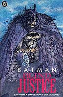
Batman: Blind Justice 1991 (SC TPB) 160 pgs.
 Written
by Sam Hamm. Pencils by Denys Cowan. Inks by Dick Giordano and Frank McLaughlin.
Written
by Sam Hamm. Pencils by Denys Cowan. Inks by Dick Giordano and Frank McLaughlin.
Colours: Adrienne Roy. Letters: Todd Klein. Editors:
Dan Raspler, Denny O'Neil.
Reprinting: Detective Comics #598-600 (1989)
Rating: * * * * * (out of 5)
Number of readings: 3
I should apologize to writer Sam Hamm.
Hamm co-wrote the 1989 Batman movie which I regard as, well, pretty awful -- in fact, all of the big budget Batman movies have been pretty excruciating (*I wrote that sentence originally before the Christopher Nolan films -- but though those films aren't awful, honestly, and with all due respect to their critical fandom...they still aren't great). As such, learning DC had landed Hamm to write a genuine comic book story (as a kind of cross marketing gimmick), I figured I'd give it a pass. I mean: puh-lease! Compounding my ambivalence toward this saga was my mixed feelings towards artist Denys Cowan's work. But my curiosity got the better of me, particularly as I started hearing how, like just about every screenwriter before him, Hamm's screenplay had been somewhat mangled before it hit the screen.
And so some years later I picked up the three issues (amounting to about 150 pages as the first and third issue were "80 page giants" in which, in addition to filler pieces -- art and short essays -- commemorating Batman's 60th anniversary, the story itself was some 60 pages each issue) that comprise Sam Hamm's Blind Justice in a back issues bin. And I've read it a few times since -- and each time (with only a few minor quibbles here and there) I emerge, if anything, even more impressed with it than I was before. Quite frankly, I consider it one of the best Batman sagas ever written and may well be the best mainstream Batman saga ever.
What do I mean by mainstream? Well, I'm discounting stories like Frank Miller's Batman: Year One and Batman: The Dark Knight Returns (not to be confused with the dreadful Dark Knight Strikes Again) as both, though brilliant, were a little atypical (one chronicling Batman's beginning, the other his end). And precisely what made them so effective, also made them a bit unsustainable. Miller's slightly unhinged version of Batman worked well in finite, stand alone stories, but probably couldn't have carried an on going series. Whereas Sam Hamm's Batman is very much a mainstream Batman -- dark, tormented, yes, but also rational, likeable and more easy to empathize with. And this is very much the comic book Batman, not the armour wearing, blow-up-the-bad-guys one from the movies.
Where to begin trying to explain why this is such an impressive effort?
How about the way Hamm deftly mixes nice, familiar super hero adventure, as Batman prowls the night, getting into battles with the Bonecrusher, with a sophisticated detective story where Hamm's not afraid to have scenes of people just talking, or of generating suspense and tension through sinister machinations as much as fight scenes? How about the clever plotting that means the story often zigs when you expected it to zag, going farther and farther afield before twisting about upon itself, so you're constantly curious about how the seeming disconnected elements relate, yet in a way that rarely seems contrived or slapdash? How about the grown up use of "guest star" characters, such as the woman searching for her brother, and the brother himself, when so many comics are satisfied with just wrapping the story around the same old familiar hero, recurring villain and regular supporting characters? How about the artful way we are treated to clever analysis of Batman's character and motivations...without it seeming as though Hamm is so in love with his psychobabble, he's forgotten to tell a story?
Re-reading it, I appreciate Hamm's clever turns of phrase, his thoughtful use of text captions. For a screenwriter, used to working only with dialogue, Hamm takes to the "multi-media" nature of comics quite well. There's a subtly written passage near the beginning, as Hamm relates how Batman can ignore pain, ignore discomfort, and ignore his nightmares, that takes a moment to sink in (ignoring pain, in his line of work, is good, but ignoring the neuroses at the root of recurring nightmares is potentially dangerous).
Everytime I read this, I'm reminded of just how good it is, how Hamm elevates the story with elements borrowed more from mainstream thrillers and detective stories, without ignoring, or belittling, the inherent colourful, comicbooky nature of the character and the medium. There are exciting action scenes, but also a leisurely restraint to other scenes. And he creates a saga that comes around upon itself, and intelligently threads themes of loss and family throughout (the woman searching for her brother is, like Bruce, an orphan).
And then there's the art by Denys Cowan, inked by Dick Giordano and Frank McLaughlin. I've generally had mixed feelings about Cowan's art, but here, combined with the inkers, it truly impresses. Cowan has a nice, eclectic eye for telling a story, an edgy use of close ups, and appropriate angles, but his style often looks rushed and hasty, with deliberately scratchy pencil lines. But Giordano and McLaughlin smooth that out, adding definition to his figures and faces, letting the best of Cowan's style shine through, while reining in the excesses. The result is art that is moody and compelling, and brings the story to life with a sophistication that matches the script.
What just leaves me stunned...is how much this saga seems to have been ignored by fans and pros alike (even though some of the plot would seem to have been cannibalized for the later Knightfall Saga). I mean, sure, it has been collected in a TPB, and generally when people mention it, it's favourably. But they don't seem to mention it very often. I find it amazing that in a medium desperate to find smart, sophisticated works, and where Alan Moore, Mark Waid, Grant Morrison, and others are held up as the "It" writers, Hamm's saga is generally ignored. Of course, part of that may be that industry folk figure there's little point in celebrating a story written by a man who isn't a comics writer by nature. What's the point of celebrating it, when Hamm presumably has little intention of writing anything more in the field (and maybe Hamm himself could never rise to this level again)?
Occasionally I wonder if I've exaggerated its greatness. Maybe it's not that cleverly plotted, maybe the characters aren't that carefully handled. But then I read it again...and, once more, I'm dully impressed. It's a little bit like reading J.M. DeMatteis' Going Sane and wondering how that can be ignored, while Alan Moore's The Killing Joke is held up as one of the greatest comics ever written?
I just don't get it.
I often find myself reading comics, looking for that "perfect" story, or story arc; the comic that has it all -- character exploration, clever plot, cool scenes -- and can almost be viewed as "the" definitive story of a certain character. The story that is "the" Superman story, or Spider-Man, or whomever. The story where, if I had to sell off my collection, and could only keep one story for each character, that would be the one -- the true "graphic novel". I haven't found my saga that so perfectly epitomizes Superman, or Spider-Man, or whomever. But I sometimes think that, when it comes to Batman, I have in Blind Justice. In many respects, it is "the" Batman saga.
Not that I want to get rid of my collection. But if I ever did... The story has Batman investigating when a new, murderous super villain arrives in town -- the Bonecrusher; a mysterious foe who seeming can die, then come back the next day. Meanwhile, in his alter ego of Bruce Wayne, he becomes involved in a woman's search for her brother, a Wayne Enterprises employee who has vanished. Both trails ultimately lead to a sinister conspiracy involving mind control within Wayne Enterprises itself -- and, no, the Joker, or Two-Face isn't behind it all. Hamm actually treats us to original foes.
This is a review of the story originally serialized in Detective Comics.
Original cover price: $11.59 CDN./$7.50 USA
Re-issue price: $__ CDN./ $19.99 US.
Batman: Blink 2015 (SC TPB) 176 pages
 Written by Dwayne McDuffie. Pencils by Val Semeiks. Inks by Dan Green.
Colours: James Sinclair. Letters: Kurt Hathaway. Editor: Andy Helfer.
Reprinting: Batman: Legends of the Dark Knight #156-158, 164-167 (2002-2003)
Rating: * * * * 1/2 (out of 5)
Number of readings: 1
Reviewed: Apr. 2015
Legends of the Dark Knight was, nominally, meant to be a comic where creators would tell stand alone stories, then a new creative team would come on board for the next story arc. But occasionally there were "sequels." An example of that was Blink and then Don't Blink -- two tales collected here by Dwanye McDuffie and artist Val Semeiks that are each self-contained, but connected.
In "Blink" Batman encounters Lee Hyland, a mild mannered con man whose gimmick is that, though blind (he was born literally without eyes) he can see through other people's eyes. Their paths cross when Batman is pursuing a vicious serial killer and Lee's gift makes him an unlikely, but vital, witness. While in "Don't Blink," Batman once more seeks out the help of Lee for a new case, only to get embroiled with a secret government agency that wants to exploit Lee's abilities.
McDuffie is a writer of whom I'd heard but, off the top of my head, I can't recall if I'd actually read anything by him before. But based on this collection -- I've become a bit of a fan. These are two solid, well-paced, exciting adventures. Part of the effectiveness is that it's not really like McDuffie is doing anything radical. These aren't a "very special" Batman story, or trying to be edgy or ground breaking. They're just conventional action-thrillers -- exceptionally well told.
For one, McDuffie manages to throw in a few twists and turns, a few disparate elements, to keep it floating above any cliches. The idea of the opening story being about a serial killer initially didn't impress me -- both for its inherent sordidness and because I tend to regard serial killer stories as the epitome of lazy plotting. But McDuffie quickly makes the story more complicated than that, the motives and agendas more layered (if, y'know, still sordid) so that the story zigs when you thought it would zag. While Lee makes a good supporting character. McDuffie doesn't fall into the hubris of making the story entirely about his creation -- it's still fundamentally a Batman story -- but by giving us a prominent, original character, it imbues the story with a fresh, human element. Lee, despite his con man activities, is basically a decent guy, trying to do the right thing.
Likewise with "Don't Blink" McDuffie takes familiar elements, from the sinister block ops government agents to a criminal black market operation (the case Batman needs Lee's help in cracking) and keeps us on our toes by frequently veering left when we thought it would veer right, or adding an unexpected complication or hiccup (which I won't detail for obvious reasons).
Neither plot follows a clear, straight-forward path to their resolutions.
Part of the appeal is these stories come across as "suspense-thrillers" rather than simply super hero action comics. Tension is generated as much through chases and following leads (and plot twists) as much as through fighting (though there's plenty of that). With nary a super-villain or arch foe in sight, it avoids the easy out of simply recycling a recurring foe and a familiar modus operandi.
Like a lot of Batman comics the story stays focused mostly on Batman, in costume, no time given over to his alter ego of Bruce Wayne or anything. Batman comics, perhaps more than most super heroes, really are about the super hero as opposed to the man inside the mask. But here it isn't a problem because McDuffie makes the case(s) he's investigating interesting enough (rather than simply a generic story of him trying to figure out which duo-themed object Two-Face is planning to rob this week, or whatever).
He also has a good approach to Batman himself. His Batman is definitely the no nonsense dark avenger common today -- but McDuffie doesn't make him one-note. Batman is stern, but not gruff, he has compassion, makes a few wry quips, is self aware enough of his failings (physically and ethically). In short, he comes across as more human and three dimensional than in a lot of Batman comics. (If McDuffie has a failing, it's in his depiction of Commissioner Gordon -- who seems a little too hard-boiled).
Rounding out the package is the art by Semeiks (and inker Dan Green). Semeiks art has a slight cartoony exaggeration -- Batman all big muscles, and with an exaggerated jaw -- but tells the scenes well. The story telling, the composition, the detailed tenement buildings and snowy streets, all effectively rendered. Despite the darker elements (such as the opening serial killer) there is a clean, openess to the visuals. I was familiar with Semeiks from the earlier mini-series, JLA: Incarnations, where I liked him well enough. But here his work seems even better -- whether a development of his skill, or whether it's a script that allows him to demonstrate his storytelling skills better (being more down to earth), or whether simply me just more accustomed to that overall style, I don't know. I think Green's inks help -- Green who years ago (ie: the '80s) I tended to think of as a soft inker, not really prone to detail, but here has a sharp, detailed eye. He also nicely rounds and shadows the imagery, too. In a way, the finishing reminds me a bit of P. Craig Russell.
Ultimately Blink isn't breaking any ground or re-defining the medium -- it does something better.
It takes some conventional Batman stories and shows that, with an ear for good dialogue, a feel for character nuance, and a willingness to have the story twist and turn and not just stretch out a simple plot for multiple issues, a "conventional" Batman story can be smart, engrossing, witty, and -- yes -- sophisticated. Cover price: $___.
Or Back to: