| I think it would have
been unusual to ask [Berkey] to draw a living creature. Hence,
why he
might
be expected to look around for inspiration. |
In the 1960s, comic book artist Jack "King" Kirby teamed up
with writer Stan Lee to create...well, just about any superhero worth
mentioning that came out of Marvel Comics during comicdom's "Silver
Age". Silver Surfer, The Hulk, The Fantastic Four, The X-Men, you
name it Kirby co-created it. (With the exception of Spider-Man). And all in just a few short years, a period reverentially remembered as "The Marvel Age".
Kong '76 fan (and a professional artist himself), Kirk
Jarvinen wrote me with an interesting, albeit entirely speculative,
theory connecting the two Kings...Kirby and Kong. But first, some
background info.
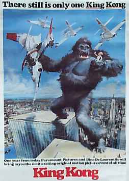
Barely had Dino De Laurentiis announced his intention to
remake King Kong and release it to theatres in exactly one year
(December 1976) than he commissioned the famous science fiction artist
John Berkey to paint a series of six pictures to be used in the
advertising campaign. The pictures depicted: Kong fighting the
snake; Kong breaking through the Skull Island wall; Kong wrecking the
subway; Kong destroying a power-station (?); Kong climbing the WTC; and
Kong straddling the tops of the WTC Towers. Of course, it was the
last of Kong atop the WTC that got the most exposure, its iconic image
appearing on all one sheets, half sheets and many advertisements.
That painting underwent a noticable metamorphosis, beginning
as a fairly impressionistic, crudely render image, then later redone in
a much more realistic style. At the same time, three noticable
changes were:
1) the transformation of the
crushed jet which originally
appeared in Kong's fist, which became a purposefully ambiguous hunk of
smoking wreckage and
2) the shadow cast by the rear
leg on the rear tower was
eliminated, hopefully to imply that Kong -- rather than straddling the
towers, which would have been impossible given the actual size of those
towers -- was leaping across the gap, just landing on the nearer tower
and
3) two of the jets circling
Kong's head were changed into
helicopters, to better reflect the climax in the movie.
 The earliest versions of that
image were given away free to
anyone who wrote in, a publicity gimmick that also served the purpose
of measuring the level of public awareness vis-a-vis the original
Kong. (De Laurentiis was pleased to find the majority who
wrote in were young, proving that even after so many years, King Kong
was still a viable proposition.) Those posters promised that the
new Kong would be in theatres "one year from today..." -- which means
that earliest image was done at least by December 1975.
The earliest versions of that
image were given away free to
anyone who wrote in, a publicity gimmick that also served the purpose
of measuring the level of public awareness vis-a-vis the original
Kong. (De Laurentiis was pleased to find the majority who
wrote in were young, proving that even after so many years, King Kong
was still a viable proposition.) Those posters promised that the
new Kong would be in theatres "one year from today..." -- which means
that earliest image was done at least by December 1975.

So, what is the Kirby/Kong Connection?
Kirk Jarvinen noticed a remarkable similarity between
Berkey's
iconic image of Kong straddling the towers and the comic book cover by
Jack Kirby for Captain America
#193, dated only one month later,
January 1976. [But released to stores in December
1975.] I will allow Kirk to
explain in his own words:
On the other hand, when you write your Kingdom Kong article about this, I want it to be clear that I am not accusing Berkey of any wrong doing. I'm not trying to tarnish his work, nor accuse him of plagerism, nor insinuate that he wasn't creative enough to create his own layout. Even if Berkey did reference Kirby's Captain America cover, there is nothing wrong with him doing so.
If Dino De Laurentiis had hired me to paint a "rush to print" poster of King Kong straddling the WTC, the first thing I would think to myself would have been, "how the heck am I going to draw that?" and then start scrambling to gather reference material.
It would have been impossible for any artist to paint that scene literally (compare Berkey's style to Frazetta's more realistic Kong vs.Snake painting), since it would be physically impossible for Kong to achieve that pose; even if he were 150 ft tall, he would still be doing the "splits" between the twin towers!
But the pose is possible if the artist were to approach the drawing from a "comic book-style" exaggeration, á la Kirby, as I believe Berkey did to make it work.
I think Kirk has a point. Both figures have the same
unusual positioning, especially in the legs. 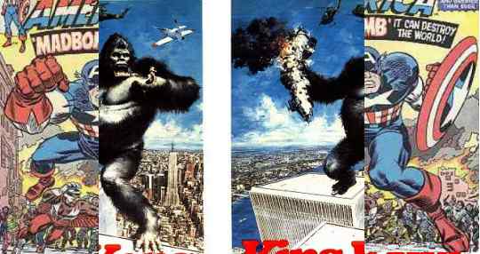 Furthermore, although the comic was
dated a month after the Berkey poster, comic books are routinely
post-dated a month or more after they
are actually released to stores. So, in December, when Berkey was
looking around for reference material for his poster, that Captain
America comic would have been staring at him from the spinner
racks.
Coincidence?
Furthermore, although the comic was
dated a month after the Berkey poster, comic books are routinely
post-dated a month or more after they
are actually released to stores. So, in December, when Berkey was
looking around for reference material for his poster, that Captain
America comic would have been staring at him from the spinner
racks.
Coincidence?
Berkey was mainly associated with science
fiction images (ie. spaceships). I think it would have been
unusual to ask him to draw a living creature. Hence, why he might
be expected to look around for inspiration.
Kirk goes farther, with several other possible similarities.
Again, in his own words:
1. The smoke clouds in the background behind Captain America at his waistline are like the cloudline in the sky at Kong's waistline.
2. When a pro artist like Berkey references another artist's art, he wouldn't outright copy it. Often an artist will borrow the pose, but adjust the angle to suit his needs. That said, If you reverse the image of Captain America's pose from the waist up, his shield (now on the left) becomes Kong's crushed airplane and his fist becomes the hand holding Dwan. (Couldn't you just see a tiny Dwan in Captain America's large fist?)
3. The detailed crowd of people on the horizonline behind Captain America "matches" the position of the detailed horizonline of the NYC skyline in the background of the Kong poster.
4. The running figure of THE FALCON inhabits the same amount of space in the composition of the Captain America cover that the north tower of the WTC occupies on the Kong poster.
5. The outcropping of the burning building in the background (just below Captain America's shield) matches the spot of pronounced outcropping of the Empire State Building in the background of the Kong poster.
6. The ground and horizonline in the Captain America cover is at the exact same angle as the front WTC tower in the Kong poster, and the 'foot' of each of the two different characters intersects the building ledge/horizonline in very nearly the exact same point.
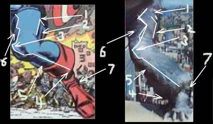
7. Kong's body outline
running from his large left shoulder all the way
down his left side of his body, down his left leg to the ankle is
EXACTLY
the same outline as the Captain America figure--as well as the right
side of
Kong's body starting from the barrel chest and then obviously the
foreshortened rear leg, again is exactly alike. The left shoulder of
both
figures are also both pronounced in the same proportion on both figures.
Man, if all of these points are just a coincidence, it's amazing! I mean, what are the odds?
As amazing as all this was,
what finally convinced me was the realization that Kirk's theory explains
something I have long wondered. It is seen only in the original
version of the Kong poster, not in the later more realist Kong.
In that early version, the hair on Kong's legs not only ends abruptly
above the ankle, but it even bells making him look like he's wearing
bellbottoms! [The markings on the above
pictures indicate similarities between the pattern of light and shadow,
again remarkably close.] Clearly Berkey realized the
bellbottom fur looked strange and removed it from the later
version. But why was it like that in the first place? Compare the bellbottom fur with Captain America's boot
cuff! Neat, huh?

When
Kirk Jarvinen first wrote to me, the preceding was about as far as he
had gone in unravelling the mystery of the "Kirby-Kong
Konnection". In passing, I pointed out that, if Berkey was
inspired by Kirby's Cap cover for Kong's body, where did he get
inspiration for Kong's head? I didn't seriously believe it would
be
possible to figure that out.
But
then Kirk emailed me a scan of a gorilla drawn by Kirby and pointed out
obvious similarities to Berkey's Kong. While it wasn't close
enough to have served as a reference, I realized he was on to
something. Berkey's Kong head could
easily have been drawn by Kirby himself, it showed so many of his
distinctive
idiosyncracies. So maybe Kirby really was the source for the Kong
head as
well? But where?
Bearing
in mind that Dino De Laurentiis had insisted he wanted Kong to seem as
human as possible, perhaps Berkey's inspiration
came, not from a Kirby gorilla, but from a Kirby gorilla-like man. And, sure enough, in Kirby's
New Gods from the early 1970s, I found
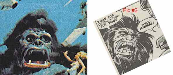
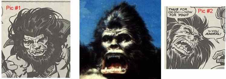
two pictures of... Kalibak!
Between those two pictures of Kalibak (See Pic #1 & #2 below), I think we just might have found the inspiration for both
early and later versions of Berkey's Kong face. I could list the
many
congruences, but I think pictures speak louder than words.
What do you think, Kongoisseurs? Do you think Berkey was
inspired by Kirby, or have we all just been staring at that Kong poster
wa-ay too much!